


Welcome to our latest blog series on color! It started with a fascination with psychology – particularly design psychology. But before you close out of this blog post thinking I’m going to get into the boring technicality of color theory, I want to let you know that creating your brand’s color palette can be an incredibly inspiring process – even if you don’t consider yourself an artist, designer, or creative.
.
When I work with a new brand, I enjoy finding the deeper meaning behind their style. We all have style preferences, and I think it’s so interesting to see someone’s imagination explode over their Pinterest board during the discovery phase.
Now that many of you have found your Enneagram type in our last series, I’m excited to show you how to communicate your beliefs and values through your brand’s style.
**I want to preface this series by saying that I am NOT trying to box you in or tell you what you’re supposed to like. I’m going to have fun making connections between personality types and color associations, but it is meant to be an exercise in looking at color through a different lens, not as a standard to live by. If you’re an aggressive personality type that loves robin’s egg blue, by all means – use it!
data-animation-override>
“If you want to learn more about the Enneagram and how to use it in your business, check out our online course Enneagram for Entrepreneurs today!”
Did you know…
Importance of Color
Color is important. But color is also one of the most relative parts of your brand’s experience.
If you were to say the color “blue” in a room of 50 people, all of them would think of a different blue. And if you were to say a particular blue, like “turquoise”, there would still be a distinctly different turquoise in each person’s mind. Even if you were to show each person in the room the same turquoise sheet of paper, you can’t guarantee that each person would perceive it the same way.
Why is this?
Our perception of color can be impacted by:
-
Personal preference
-
Experiences
-
Personal upbringing
-
Culture
-
Context
Color is dependent on personal experience, so it’s VITAL that you understand your target customer before deciding on your brand’s color palette.
However, the reason color is so important to branding is its direct association to a brand’s personality.
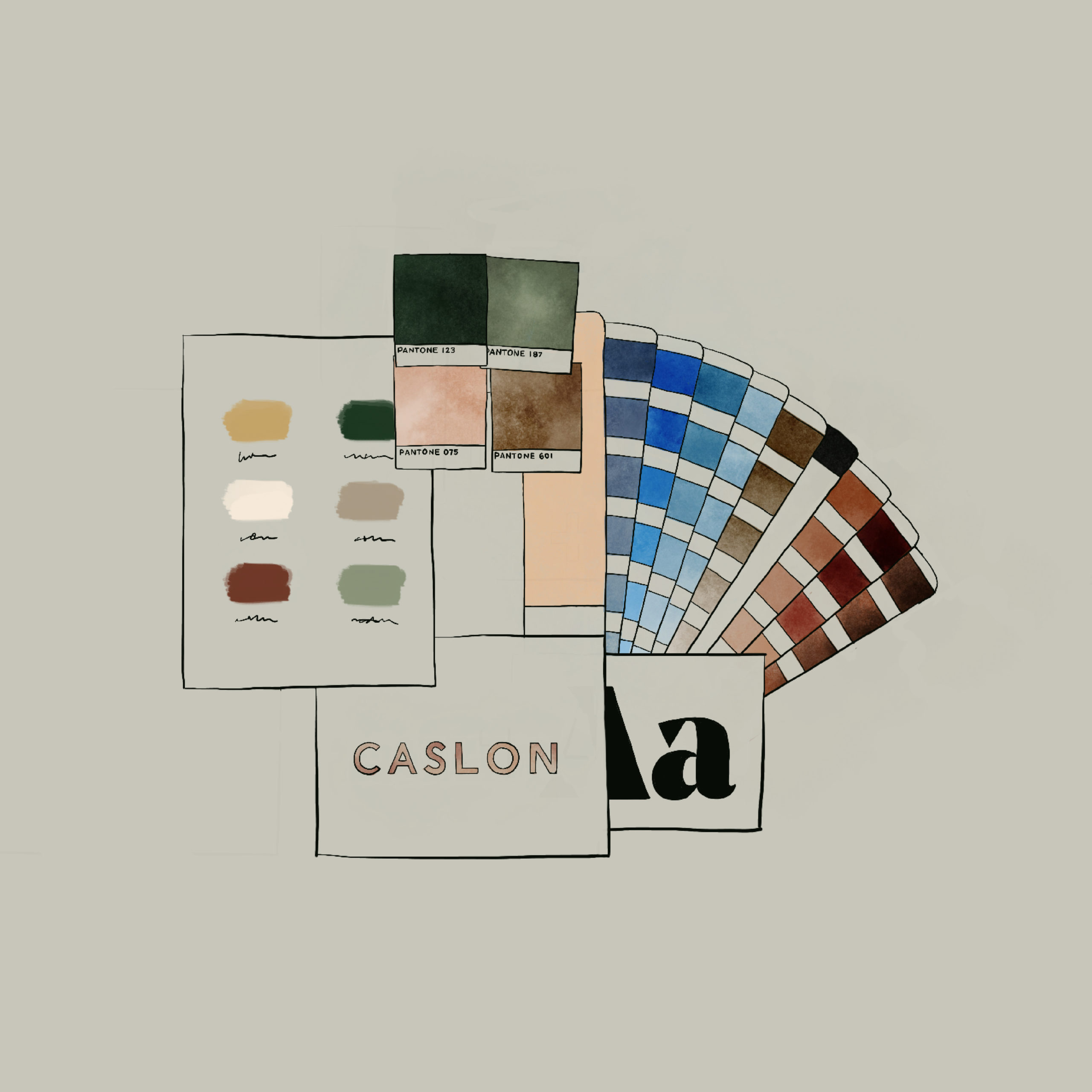
Every month, we work with several clients to identify their ideal color palette to compliment their brand design. A well-selected group of colors will instantly elevate a brand and make all marketing efforts look like a beautifully cohesive whole.
Inspiration
This series is inspired by a book called The Secret Lives of Color, which was recommended to me by a good friend. This book includes some of the most well-known color tones and gives the story behind their creation and rise in popularity.
Remember that scene from The Devil Wears Prada when Meryl Streep explains the evolution of Cerulean blue? This book is basically an extended version of that scene.
Each post in this series will include…
-
An introduction to the color family (white, blue, green, etc.)
-
The attributes associated with that color in marketing and advertising
-
A few stories about notable tones in the color family (from The Secret Lives of Color)
-
Seasonal palette examples for using this color in different contexts
-
Examples of brands who are known for using this color in their brand palette
Personality
Before selecting colors for your palette, consider your brand’s personality. Using human personality traits to describe your brand will make it easier to identify your brand’s style. Your audience wants your business to feel human and authentic, so consider:
-
What would your brand be like if it were a person?
-
If your brand was a celebrity, who would it be?
-
If your brand was a character from a book or movie, who would it be?
-
What is your brand’s favorite song, coffee drink, vacation destination?
-
Think about how other people would describe your brand – use descriptive and emotional words
When choosing colors for your brand, consider the context of your message. The feeling, mood, and image of your brand will all be affected by the color you choose to use in your marketing materials.
Seasonal Tones
A great way to begin creating a palette for your brand is to identify your brand’s seasonal personality. Before selecting individual colors, it’s best to think of your brand palette as a whole, and consider the overall message you’re trying to communicate.

A spring palette is full of optimistic energy and new life. The colors in a spring palette have not quite reached their peak intensity, but are crisp, clean, and approachable. This brand is lighthearted and playful, a business that enjoys personal interactions and organized simplicity.
When creating a spring palette for your brand, look for colors that are light, bright, and delicate. This palette is built on potential and growth. Keep colors crisp and clear, and use a stark white and soft charcoal as accent neutrals.

A summer palette is bold, elegant, and strong. This season is when colors reach their peak vibrance and bask in the intensity of the sun. This brand is compassionate, ambitious, and confident, feeling a strong sense of self and inner purpose.
When creating a summer palette for your brand, look for colors that are rich, warm, and vibrant. This palette is humming with energy and enthusiasm. Make sure that your palette is evenly balanced with some contrasting tones, and use a warm black and off-white as accent neutrals.

An autumn palette is organic, nurturing, and warm. This season is when colors lean into their muted, earthy counterparts and feel grounded, rooted in warmer undertones. This brand is graceful, passionate, and kind, creating an inclusive community of encouragement and support.
When creating an autumn palette for your brand, look for colors that are muted, natural, and intense. This palette is very grounded in earth tones and colors found in the natural world. Make sure that your palette still uses rich color tones, but paired with softer neutrals, and considering using a dark brown and warm white as accent neutrals.

A winter palette is dramatic, minimalist, and edgy. This season is when bright color hues fade away and we become more aware of the high-contrast between color extremes. This brand is distinct, focused, and strong, sure of who they are and their place in the world.
When creating a winter palette for your brand, look for colors that are on both extremes of the brightness scale – pairing deep, intense jewel-tones with crisp and cool lighter neutrals. This palette is meant to feel stark and minimal, so focus on creating a range within two to three color tones.
data-animation-override>
“How do you like this new series? Can you already tell which season matches your brand’s personality? Comment below with your own story!”
If you enjoy learning about design psychology, and want to learn more about the Enneagram and your own personality, you may enjoy participating in our Enneagram for Entrepreneurs course. Click the link below to find out more!


I’m almost positive the recent (incredible!) brand re-vamp you did for me was within the "winter" palette, and I LOVE it and cannot wait to learn more about the psychology behind it!
Yes ma’am!! I think the seasons add a layer of depth to brand palettes and make them even more fun to work with!