


Welcome to post number one of our new color series! Of course, I had to start with my favorite color of all – white. It feels like a fresh start, and I always return to it when I’m wanting to feel inspired and rejuvenated. We just painted our new studio Roman Column by Sherwin Williams and I am in love with it! White, to me, feels so timeless, elegant, and fluid. I chose this to be a part of Drop Cap because my primary goal is to bring other entrepreneur’s dreams to life, and I love that using white in our brand materials creates a blank slate for others.
In this series, we will be heavily referencing Kassia St. Clair’s book The Secret Lives of Color. Her introductions to each color, and short stories on the most popular ones, are a beautiful history on how color names originated. While I’ve only selected four famous tones to share, the book is full of fascinating stories and tales from each hue.
In each post, you’ll learn…
-
The artistic history of the color
-
Four famous color tones and their stories
-
How that color is perceived by consumers
-
How to use the color in the four seasonal palettes
-
Notable brands recognized for using the color in their palette
As always, take this as a starting point for building your brand’s palette. There is not a formulaic system for choosing colors, but beginning with color exploration is a great place to start!
The History of White
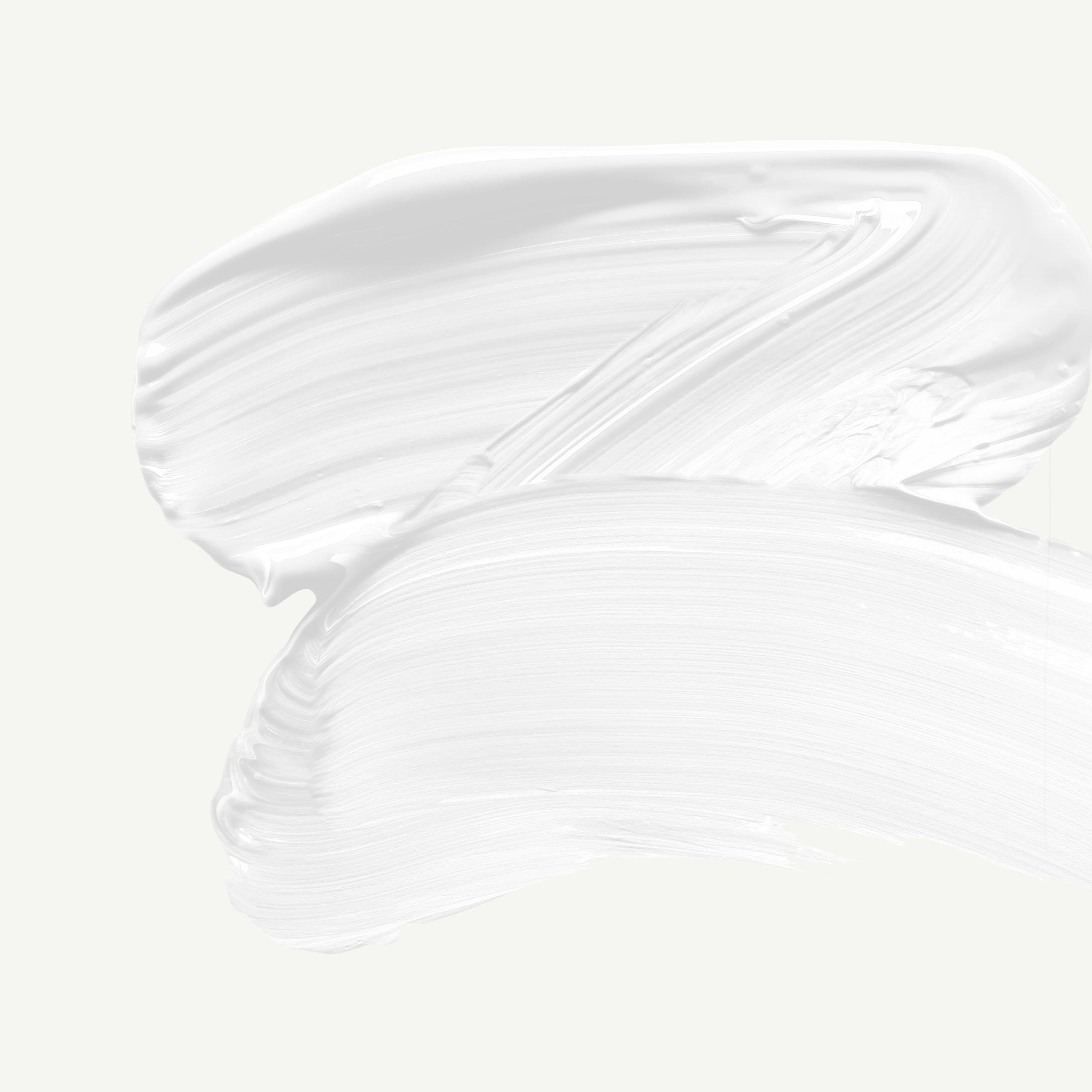
White is a magical color.
As the counterpart to black, it’s directly linked to light, which has given it an ethereal and spiritual reputation. When painting and purchasing clothes, white can be tricky because it’s the absence of pigment, so adding any color is only going to take it in the inevitable direction of black. In order to use white, you have to start with a pure white pigment, because you can’t mix your way to white with other paint colors.
Back in the day, white was dangerous to use and expensive to produce. Over time, white clothing has been linked to wealth, and white interiors linked to spiritual purification. In all cases, white had a transcendent quality to it and is always associated with cleanliness and purity.
The Psychology of White
goodness, innocence, purity, fresh, clean
In marketing, white is often associated with goodness, innocence, and purity. It can be a great color for creatives, because its fresh and clean nature communicate a clean slate, sparking the creativity of clients by experiencing a blank canvas.
When thinking about using white in your brand’s palette, consider the personality you want your brand to have. If you’re a solopreneur, you may want your brand to imitate your own personality. If you own a small business with a team, brainstorm the kind of personality your brand has that rallies the entire team and communicates your mission.
A great starting point for learning about your own personality and how it might play into the personality of your brand, is to learn more about the Enneagram, which is the most powerful and effective personality tool I’ve come across.
Learning your Enneagram number sets you on a path of growth and self-awareness that can quickly illuminate the ways you can create a brand and business with purpose.
If you want to learn more about the Enneagram and how to use it in your business, check out our online course Enneagram for Entrepreneurs today!
Famous Whites

Whitewash
This color has a fascinating story. It has been closely linked with purity and piety for ages. Back during the time of the plague, whitewashing was a way to stop the disease from spreading by painting infected areas of the city.
Whitewash paint is the cheapest of paints and has such a translucent and temporary quality that it must be reapplied frequently. The church has been known to whitewash over artwork that was deemed sinful or inappropriate at various points in history, only to have the original saints reappear over time.
The phrase “to whitewash” means to conceal unpleasant truths, and is is derived from the notion that this form of painting was inherently purifying. You may consider working with this color in your brand if you work in health, healing, or medicine.
Chalk
You’re probably looking at this color title and thinking of all of the Pinterest DIY projects you’ve come across. But chalk actually has a richer history than you’d think…
Chalk is a sun-bleached rock formed in the ocean from algae. Iconic impressionist artist Rembrandt used chalk to extend the life of paint and add texture to the canvas. Chalk was insurance for painters in Paris – “it will come out as soft as silk.”
Chalk is a color that can communicate depth and layers of meaning. It’s a substantial white, which tends to go against the ethereal norm for the color. Use a chalk white in your palette if you’re needing it to carry its own weight among other rich colors.
Beige
This color originated from unbleached sheep’s wool and has never been independently in fashion (at times, it’s a suggested accent colors, but never taking the lead.)
Because of its poor image, beige has been named and renamed countless times over the years to make the tone more appealing to consumers (going by aliases like latte, tan, toast, etc.)
Beige is a wonderful complimentary color, but on its own it can appear dull and safe. It has been deemed the “least offensive color,” and many have criticized its conformity and lack of inspiration (My own opinion is that beige is one of my favorite tones to add depth and complexity to a primarily white palette without feeling too heavy.)
Silver
Silver has a very rich and eventful history. Mined from the mountains of South America, silver has sustained empires and waged wars. The country Argentina is actually named after the precious metal.
In folklore, Silver has been linked to the fantasy realm and is the cure for combatting many beings, from werewolves to vampires. Silver has been known to warn against poison, which is how it became a common metal for dinnerware.
From space movies to modern fashion, silver is commonly associated with the future. Silver is often linked to the moon, as it has a similar wax and wane with polishing and tarnishing. When using silver in your brand’s palette, note the cool undertones of the shade and pair with other hues accordingly.
Seasons of White
I want to show you the ways that white can be used in seasonal palettes. When we talk about a seasonal palette, it doesn’t mean that you’ll change your brand’s colors four times a year. Seasonal palettes are another way that we assign personality traits to palettes and organize visual cues into a cohesive story.
If you’ve never heard about seasonal color palettes, check out our introduction to color post to learn more!

Spring
crisp, clean, light, delicate
When using white in your brand’s sprint palette, remember to select shades that are crisp and bright. With cool undertones, a stark white or crisp grey will compliment other light and delicate tones. You can even do a very bright and desaturated version of another color in your palette (like a white-sky blue) as a way to compliment the bolder color.

Summer
bold, elegant, strong, vibrant
When using white in your brand’s summer palette, look for shades that are substantial, rich, and vibrant. You may want to go with an off-white to compliment the rich color tones in the rest of your palette. Just remember to mimic the temperature of your other colors – if you go warmer, select a warm white. If your colors are cool, select a cool white tone.

Autumn
organic, warm, muted, intense
When using white in your brand’s autumn palette, look for shades that are earthy and muted, with warm undertones. This is a great palette to experiment with beige and warm cream tones to compliment the other muted colors in your palette. Remember to keep your white on the warmer side in this color scheme to compliment the warmer autumn tones.

Winter
dramatic, minimal, extreme, cool
When using white in your brand’s winter palette, look for shades that have high-contrast, with cool undertones. Using a light grey or blue-white will also work with this palette, if there is contrast elsewhere in your palette. Contrast doesn’t have to exist between every color – you can work with 2-3 whites paired with a strong black or navy to provide the range and drama you need.
Brand Examples

Chanel
It’s no surprise that Chanel is a brand that is built on elegance, luxury, quality, and minimalism. This puts them right in the winter palette, where they’ve incorporated bright white, cool grays, and a strong black to make them memorable. Chanel’s brand is simultaneously nostalgic, timeless, and relevant – which they have tied together with their minimal palette and attention to detail.
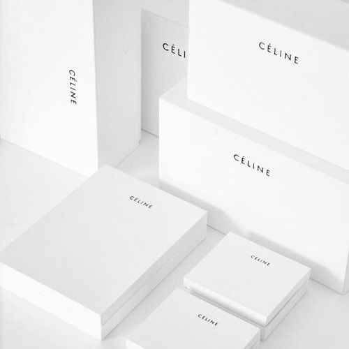
Celine
The Celine brand is also in the winter palette, with a refined and subtle sense of luxury. This French brand lives by the motto that less is more so a stark white and black palette communicate this inherent value for the brand. The Celine woman is “confident, strong, proud, straightforward, powerful, discrete, and comfortable.”
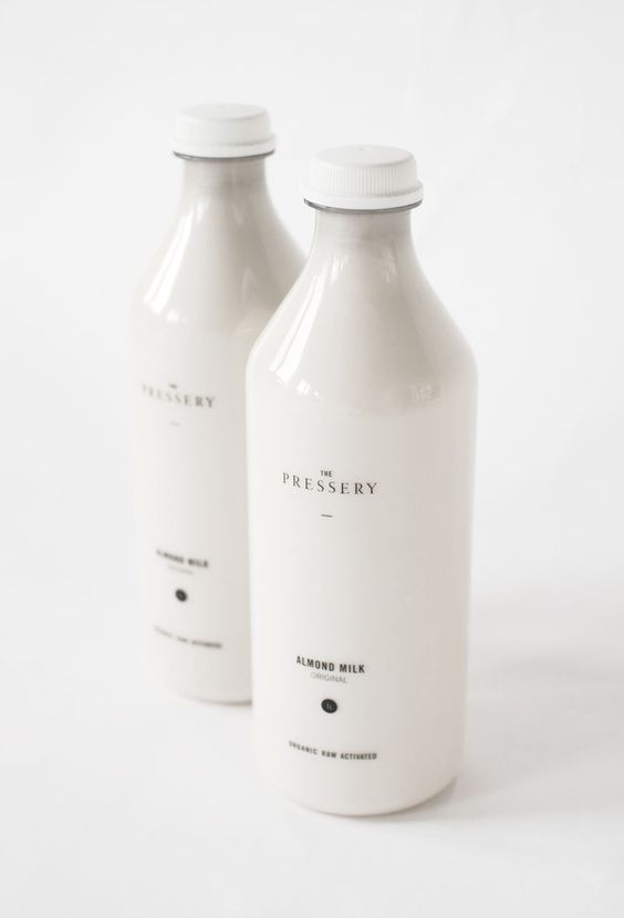
The Pressery
When two best friends came together to disrupt an entire industry, The Pressery Almond Milk was formed. Driven by the desire to create a product with a higher almond content and use natural flavors to enhance the milk, this brand is right on the edge of an autumn and winter palette. Pairing a warm white (that comes from the milk itself) ties the brand back to its earthy, natural roots.
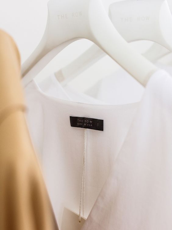
The Row
From the iconic fashion sisters Mary Kate & Ashley Olsen, we get The Row. With brand adjectives like “exquisite, precise, perfection, impeccable, and exceptional” this brand finds itself on the fence of a winter/spring palette. Their style is both understated and strong, and the minimal palette allows the silhouettes of their clothing to shine and gives them flexibility as fashion trends evolve over time.
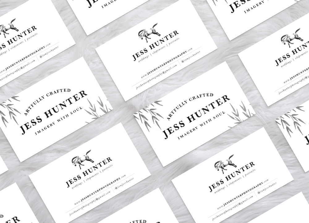
Jess Hunter Photography
Jess Hunter has been one of my favorite branding projects to date. This Georgia native found her way to the Pacific Northwest and brought style and grace to the dramatic backdrop of Washington’s terrain. Her brand was built on her love of nature and remnants of her time living in different locations. We went with a cool winter/spring palette of fresh, light neutrals and minimal, strong dark tones to create a nostalgic and emotional brand story for her to share with her clients.
data-animation-override>
“How do you like this new series? Which shades of white do you use for your own brand, if you use white at all? Comment below with your story!”
If you enjoy learning about design psychology, and want to learn more about the Enneagram and your own personality, you may enjoy participating in our Enneagram for Entrepreneurs course. Click the link below to find out more!

