

Rise on Balance
Devin Glenn spent nearly fifteen years at the top of her field as a Columbia Law graduate and former corporate attorney who traded litigation for a career in DEI, talent, and leadership strategy, ultimately advising executives inside of high-stakes rooms. Along the way, she noticed something: the women rising fastest were often the ones running on depleted reserves. They had the success, but no time, and no trusted resource for the well-being that was supposed to come with it, and didn’t relate to the more perfectly curated, aspirational wellness brands available for women at this level. Rise on Balance is her answer—a curated well-being platform for ambitious women navigating full, complex lives, built on a single conviction that success and well-being don’t have to be at odds. Pairing behavioral-science-backed strategy with the lived wisdom of a real, diverse village of women, the brand exists to take the overwhelm out of well-being, replacing the endless scroll of generic wellness content with something credible, clarifying, and unmistakably for her.
Devin came to us with some loose frameworks for the structure, but the mission was sharp, the audience was deeply understood, and she desperately wanted and needed a strong visual identity to birth this resource into the world. This was a brand-new venture, a deliberate step out of the corporate world and into her own name, aimed at a discerning audience for whom clarity, credibility, and visual impact are crucial for being taken seriously. She didn’t need help knowing what she stood for. She needed an identity and a voice elevated enough to match the life she’d built (as messy as it had become!)
The Project Scope
Custom Brand Identity
Website Art Direction
Website Copy & SEO
Client Experience
Lead Magnet Design
Email Design
Location: Washington, D.C.
Industry: Coaching & Education
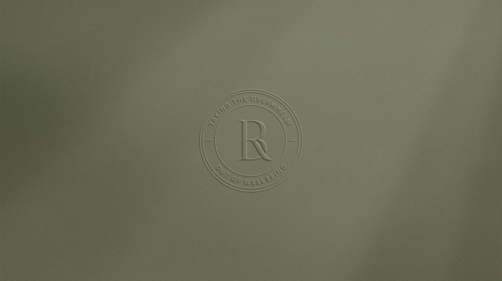
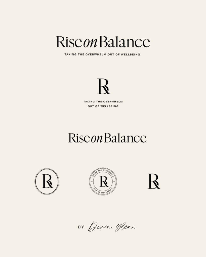
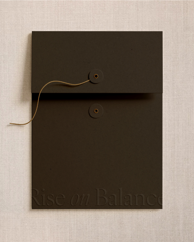
Logo Suite


The Challenge
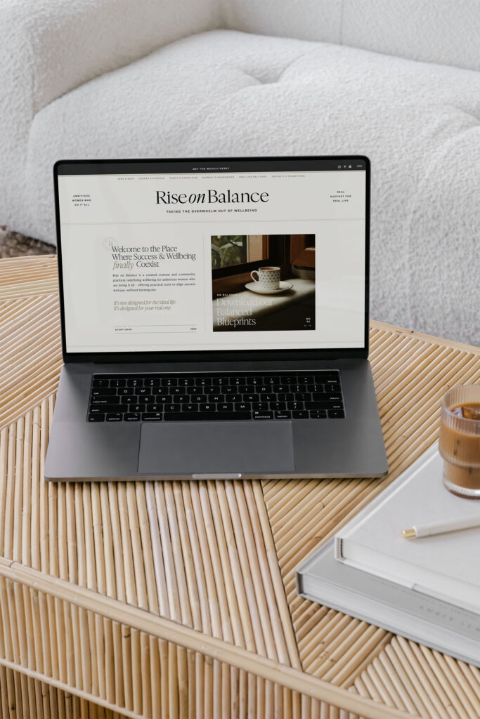
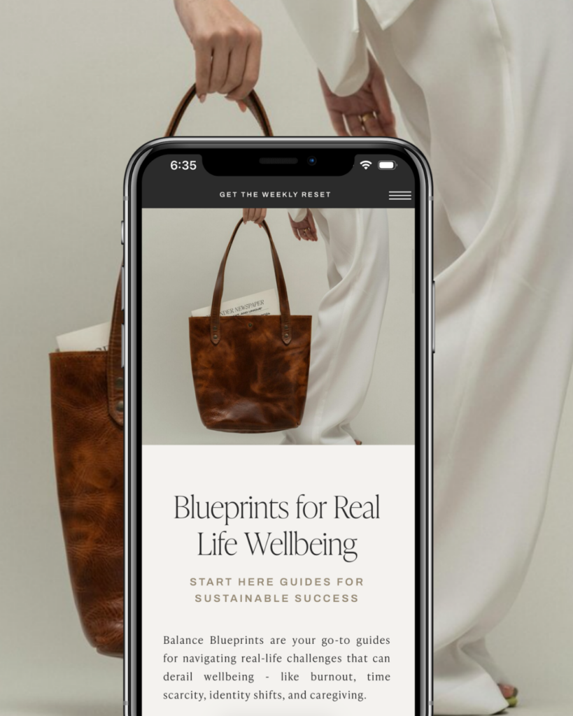
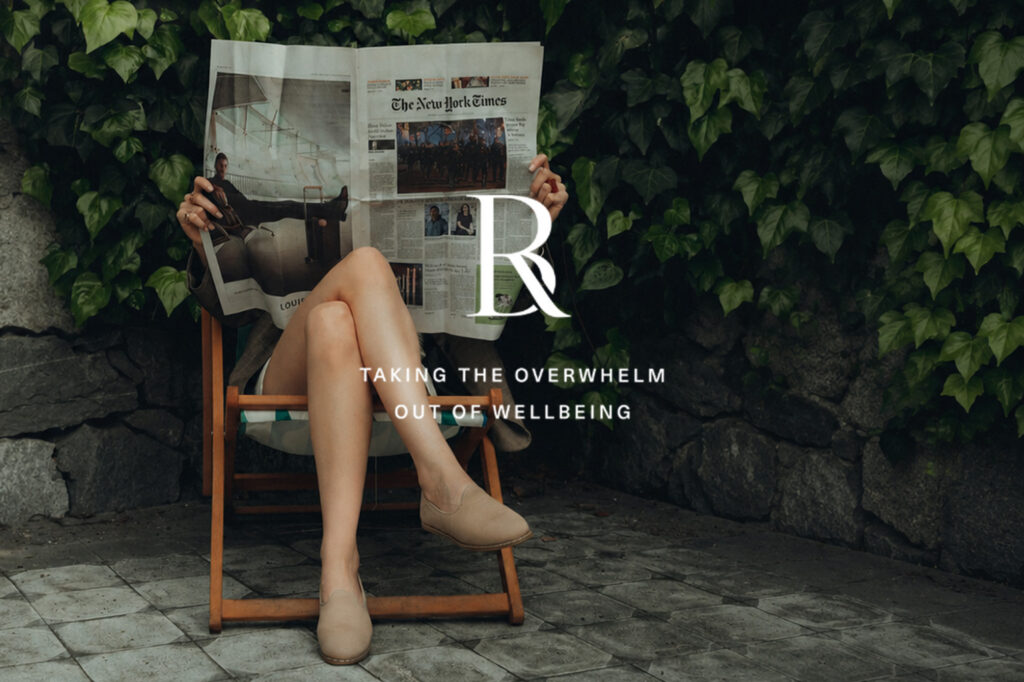
Not only did we craft a complete brand identity for the consumer platform—a full logo suite, an editorial type system, a calm neutral palette, and a library of art direction—we also built the verbal brand and website copy, then extended the same identity to Rise Talent Strategy, Devin’s corporate advisory arm. The throughline across all of it was an editorial, quiet-luxury sensibility that felt like a trusted publication and a break from the hustle of the day-to-day. The biggest challenge during this process was designing a well-being brand for a woman who is skeptical of well-being brands. Devin’s audience finds most wellness content fluffy, woo-woo, and not built for their lives, so anything soft, clichéd, or aspirational-for-its-own-sake would have quietly undermined the credibility the brand depends on. Compounding that, we made a deliberate choice to feature no people in the imagery, removing the easiest shortcut to warmth and representation. It would have been easy to drift into beige wellness sameness or lean on the usual tropes, but by anchoring the brand in newspaper-inspired serifs, a paired-down black-and-neutral palette, and art direction built on textures, objects, and micro-joys rather than faces, we let the system itself carry the warmth. The clarity of the brand became the proof of its promise, taking the overwhelm out of well-being.

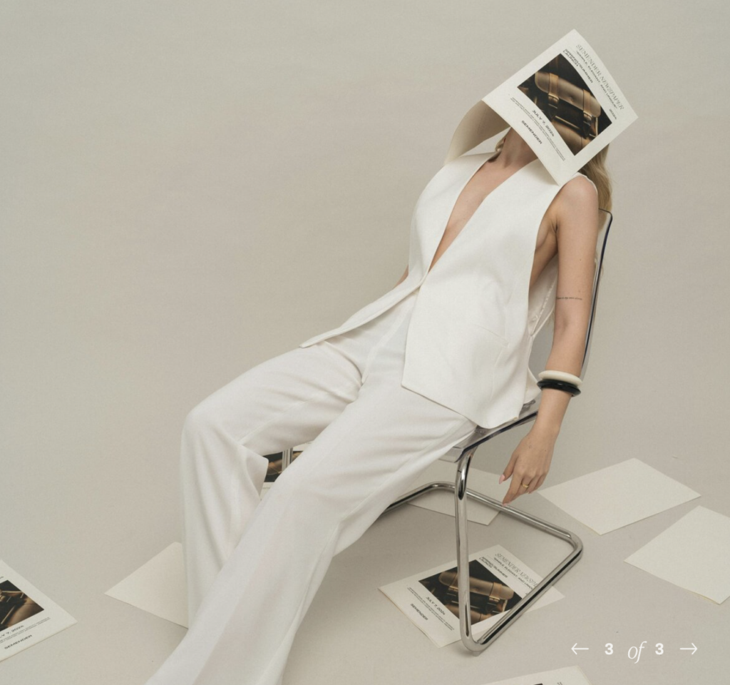
Art Direction
quiet luxury // editorial restraint // newspaper serifs // soft neutrals // textures over faces // micro-joys // elegant ease // uncluttered & calm // refined but unfussy
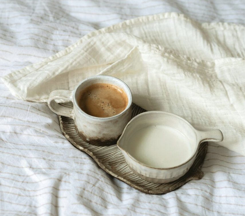
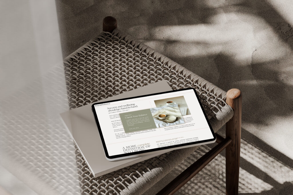
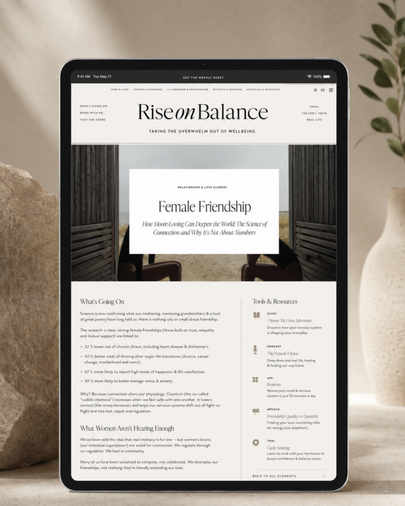
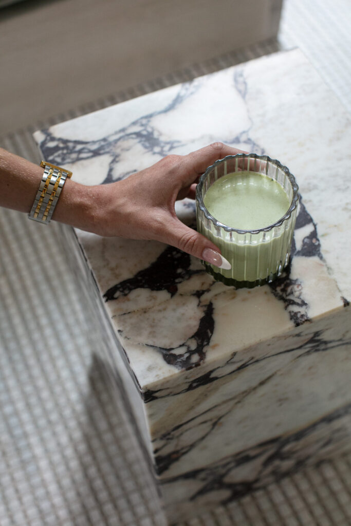
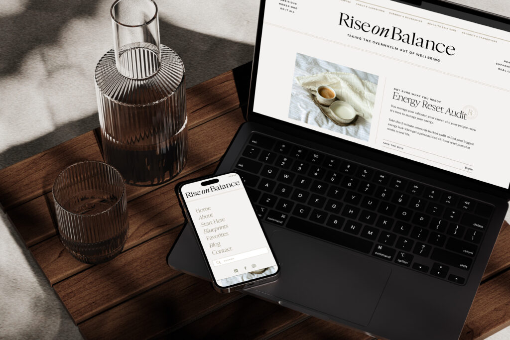
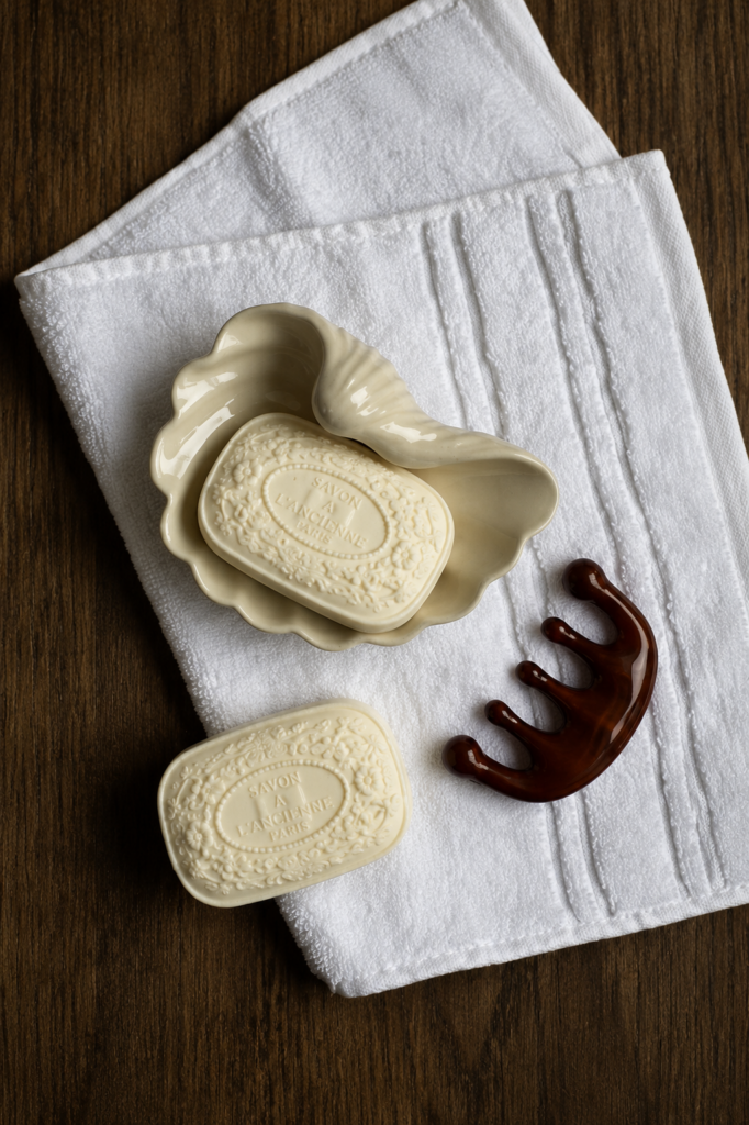
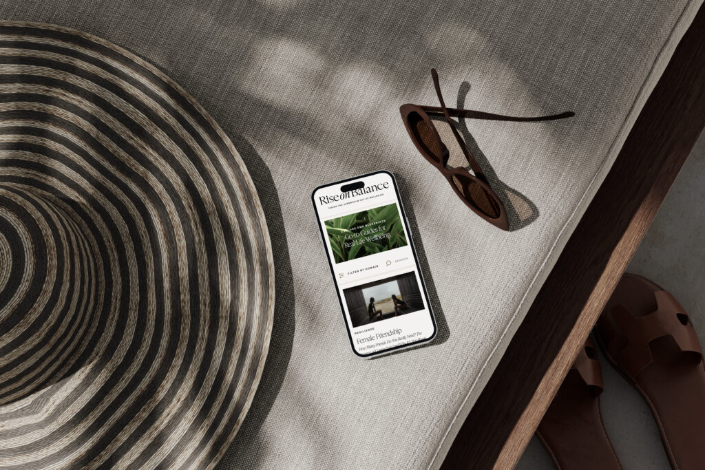
The visual direction for Rise on Balance was built on a foundation of editorial restraint — a quiet-luxury sensibility that treats the brand less like a wellness platform and more like a trusted publication. We leaned on three guiding themes drawn from Devin’s discovery: Poised Ambition, a clean, white-space-forward look that feels capable and composed, like a woman ready to greet the day with elegance; Elegant Ease, an effortless, aspirational-yet-attainable grace that balances the polished and the human; and Daily Wellness, the world of small rituals and micro-joys — cold water in beautiful glassware, dried lavender, the warmth of an afternoon — that makes well-being feel like a treat rather than a chore. Anchoring it all is a paired-down palette of black, white, and soft neutrals — linen, stone, suede, muted blush, and sage — and a typography system led by newspaper-inspired serifs (IvyPresto, with Archivo and a Blackstone script accent) that signals intelligence and editorial credibility over wellness cliché. In a deliberate departure from category norms, we featured no people in the imagery, letting textures, objects, and quiet moments carry the brand’s warmth and representation instead — so the work feels universally for her, regardless of who she is. The result is a brand that is calm, uncluttered, and unmistakably refined: warm without being soft, elevated without being precious, and built to feel like a respite for the discerning woman it serves.
The Identity
An editorial sanctuary of soft neutrals and quiet luxury and well-being that feels like a respite, not another thing on the list.
The world of Rise on Balance is a calm, editorial sanctuary—a respite from the noise that defines most of the wellness category. Step into it and you feel the quiet immediately: expanses of white space, soft neutral tones of linen, stone, and sage, and the considered restraint of a brand that refuses to shout. Newspaper-inspired serifs lend the intelligence and credibility of a trusted publication, while tactile details — sunlit textures, dried lavender, cold water in beautiful glassware — bring warmth and the sense of small daily rituals worth savoring. Notably absent are faces; in their place, objects, moments, and texture do the emotional work, making the world feel universally for her, whoever she is. The overall experience is one of poised ease — capable yet unhurried, elevated yet unfussy, aspirational yet entirely attainable. It’s a brand you don’t just look at but exhale into: a low-cognitive-load space that respects a woman’s time, intelligence, and mental energy, and makes the pursuit of well-being feel less like another task on the list and more like a luxury she’s finally allowed herself.
LAUNCHED 2026 / @RISEONBALANCE
“Working with kadie is a truly special & gratifying experience”
She listens intently, shares ideas you never even would have thought of, and knows exactly how to bring concepts together with such an elegant and timeless flair. She’s not only branded Copy Uncorked, but both of my courses. I literally want to keep creating brands & offerings just so I can keep working with Kadie on them! I can definitively say that Brand Identity with DCD takes your business to a new level. Not to mention, going through Drop Cap’s creative process is always a highlight of my year and I simply cherish the end result.
KAITLYN PARKER
Copy Uncorked
Inquire about a Custom Branding Experience
Get Started
We don’t just create logos; we develop story-driven identities that help you connect with your audience and be recognizable online. From this holistic approach, you’ll have more than a style guide at the end of your project; you’ll have an entire brand ecosystem ready to disrupt your industry.
STRATEGIC, TASTEFUL, & PERFECTLY TAILORED TO YOUR BUSINESS
Brand Strategy Workbook
Story-based branding will give you the foundation you need to let your ideas grow and evolve while tapping into a deeper purpose. Download this free workbook to begin crafting your brand strategy and vision today.
TheUltimate
a guide to crafting the visual strategy for your brand

