


Walk into a space designed with feng shui principles, and you feel it immediately—the intentional flow, the sense of calm from intentionally chosen materials, the way every element seems to exhale together.
Just like feng shui shapes how energy flows through a space, branding shapes how energy flows through a business.
Both disciplines ask the same essential question: What atmosphere are we creating here?
Whether you’re arranging furniture to invite deeper conversation or choosing typography to inspire trust, you’re working with the same fundamental truth: design has the power to make people feel something.
And in the wellness world, that feeling isn’t just nice to have, it’s everything.
Designing for wellness brands is about alignment, balance, and creating a sense of ease. What we’re trying to do is build an identity that doesn’t just look serene, but actually helps people breathe a little deeper by embodying long-standing design principles.

Wellness Beyond Aesthetics
Here’s what we’ve learned working with wellness brands: the story has to go deeper than calm because otherwise it’s just going to be a stereotype of the industry.
Anyone can slap some sage green and delicate typography on a website and call it a wellness brand. But the brands that truly succeed in this space understand something deeper.
They know that their visual identity needs to do more than appear peaceful—it needs to speak to the lifestyle and circumstances of the audience they’re trying to impact.
Whether it’s stay-at-home moms reclaiming their sense of femininity and self care, or tired executives finding balance and mental clarity in stressful situations, or a luxury home wanting to invite harmony instaed of being cold.
When the identity is built intentionally, it reduces friction and invites people to exhale because they know they’ve found their place. It becomes a container for the healing work that happens within it.
Think about it like hospitality. The best wellness brands understand that their role begins the moment someone encounters their identity and sees themselves in the story as the BEFORE. They’re not just communicating the specifics of their services; they’re creating an atmosphere of welcome, safety, and restoration. Plus painting a picture of what life COULD look like if you changed your lifestyle or approach.
Every color choice, every word, every visual element is asking: How can we help this person feel seen as they are today and have a glimpse of who they could become tomorrow?
This is where the magic happens—when a brand becomes less about marketing and more about creating a container that invites people in and considers how they feel at every touchpoint.
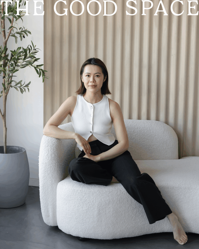
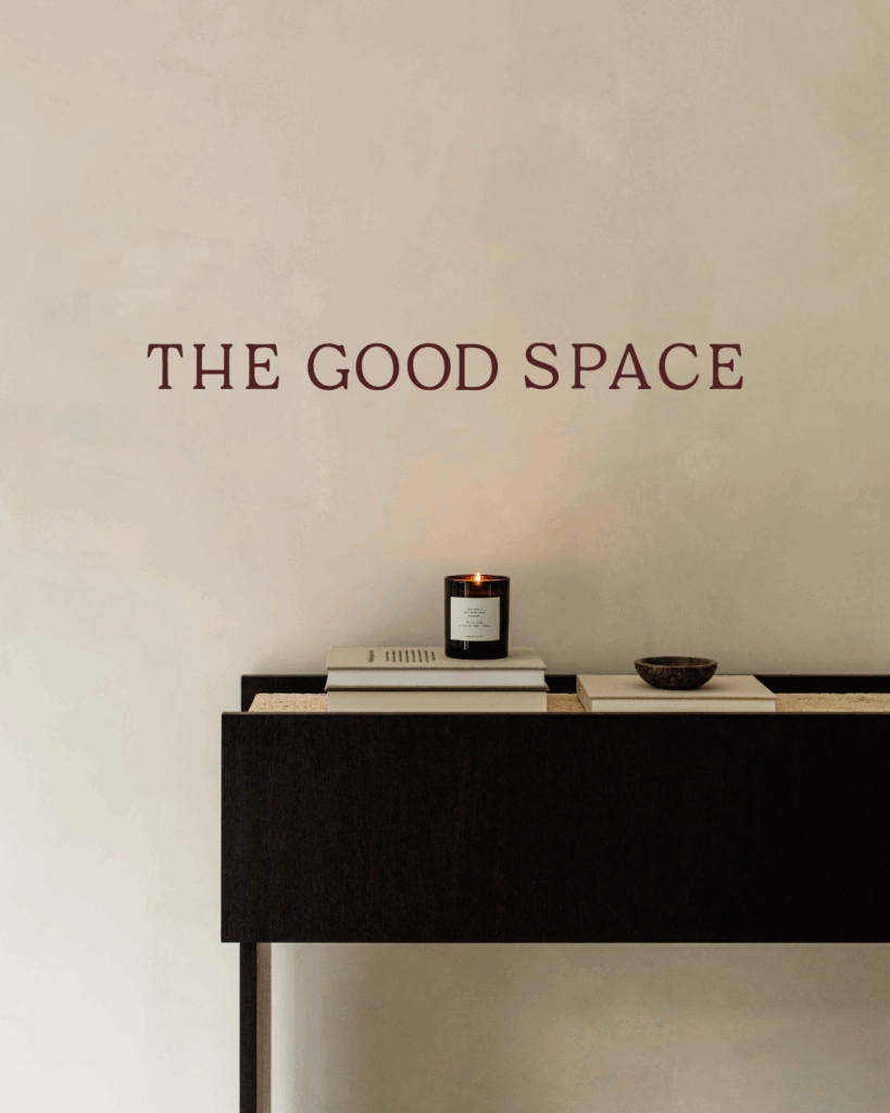
Case Study – The Good Space Feng Shui
When The Good Space came to us, Vivian had a beautiful practice built around using feng shui principles to harmonize spaces for her clients. But her brand wasn’t quite capturing the transformation she was creating in people’s homes and lives.
Her work is deeply rooted in intention, and her emotional foundation was clear: she helps people to feel peaceful, balanced, and intentional in their homes. Everything she does in her process is about creating harmony—not just in physical spaces, but in the way people moved through and experienced their environments.
We knew this brand identity needed to embody those same principles.
Our design choices reflected their philosophy:
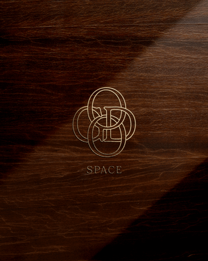
The logo monogram is well balanced. We paired feminine but strong serif fonts that felt approachable and modern with really grounding elements that anchored the design. This wasn’t accidental, it was meant to show the balance of both energies, the way good feng shui lifts and grounds simultaneously.
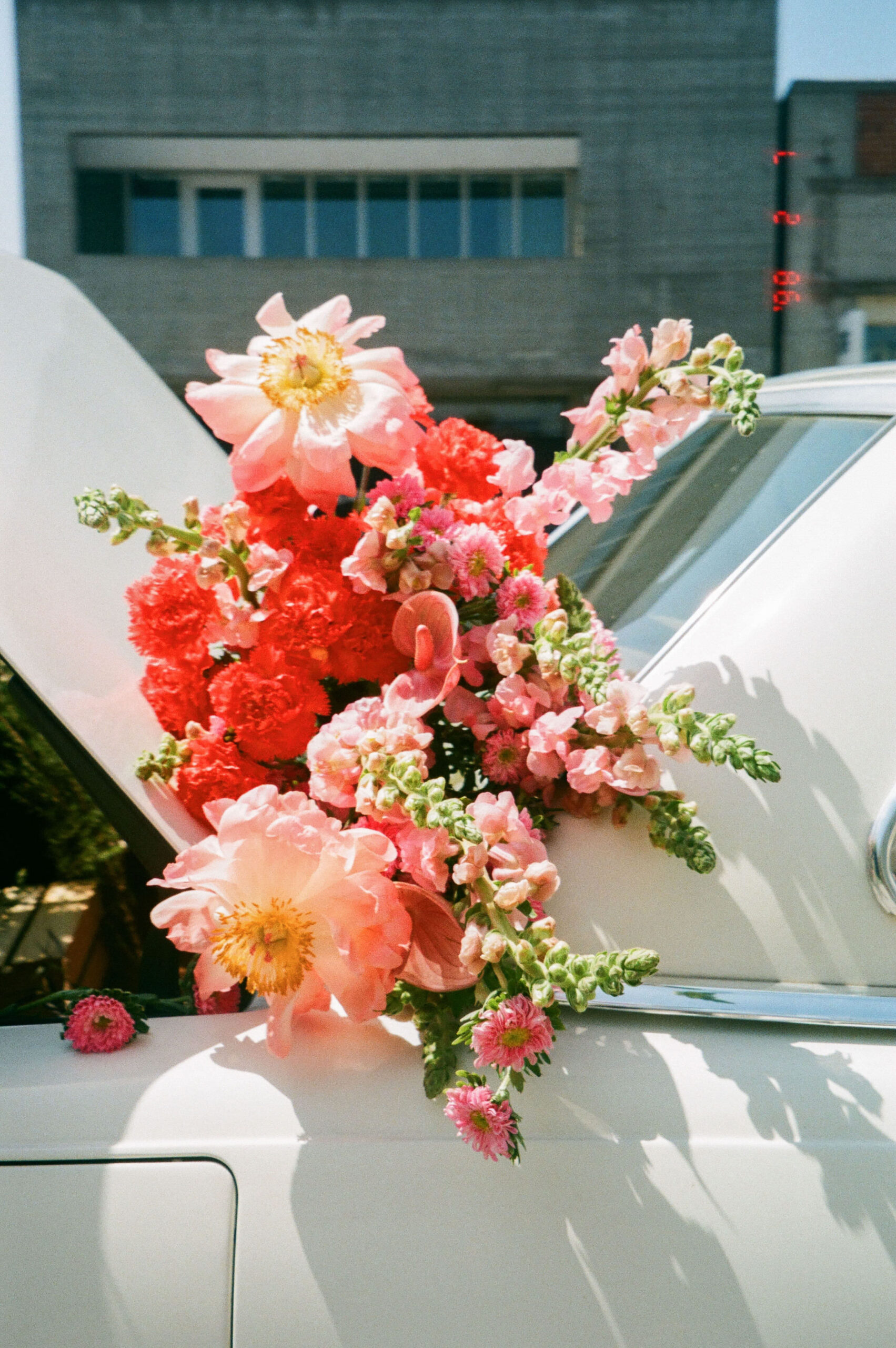
The color palette drew from nature’s most calming elements: muted earth tones, soft sage, warm neutrals. These weren’t just pretty colors—they were colors that reflected calm and grounded energy, the kind that makes your nervous system settle. And are deeply tied to the practice of feng shui.

For iconography and graphics, we created elements that nodded to balance, flow, and movement without being too literal. We developed icons that mirrored the five elements of feng shui, weaving ancient wisdom into contemporary design in a way that felt fresh and accessible.
The resulting identity is a brand that feels like stepping into a space that’s already in harmony—soothing, inviting, and deeply trustworthy. When potential clients land on their website or receive their materials, they’re not just seeing a service provider. They’re experiencing the transformation before they’ve even made the call.

Designing Wellness Brands
After working with dozens of wellness practitioners, coaches, and healing spaces, we’ve learned some essential principles that separate the brands that truly serve their communities from those that just look the part:
Align with intention.
Every single choice—every color, word, shape, or spacing decision—should support the feeling of balance you’re trying to create. Wellness brands desperately need white space. Not just because it looks clean, but because visual breathing room creates actual psychological breathing room. When people feel overwhelmed by a cluttered design, they can’t access the calm your services promise.
Communicate calm through simplicity.
The most effective wellness brands understand that simplicity in design helps reduce overwhelm and create clarity. This doesn’t mean boring—it means intentional. Every element should earn its place by contributing to the overall sense of ease.
Focus on trust above all else.
Wellness work is intimate work. People are sharing their vulnerabilities, their pain, their deepest hopes for healing. Your brand needs to feel authentic, grounded, and profoundly safe. Trust is built through consistency, transparency, and the small details that show you understand how precious this work really is.
The Flow of Branding
Both feng shui and branding are ancient arts of directing energy with intention. Whether you’re positioning a mirror to reflect light or choosing colors to reflect your values, you’re working with the same principle: everything affects everything else.
The most effective wellness brands don’t just look pretty—they feel balanced. They understand that their visual identity is part of the healing container they’re creating for their clients.
When branding is in harmony, it becomes a natural extension of the calm it promises. It stops being about marketing and starts being about service. It becomes another way of holding space.
Ready to design a brand that feels as restorative as the service you provide? Start a project with Drop Cap Design.