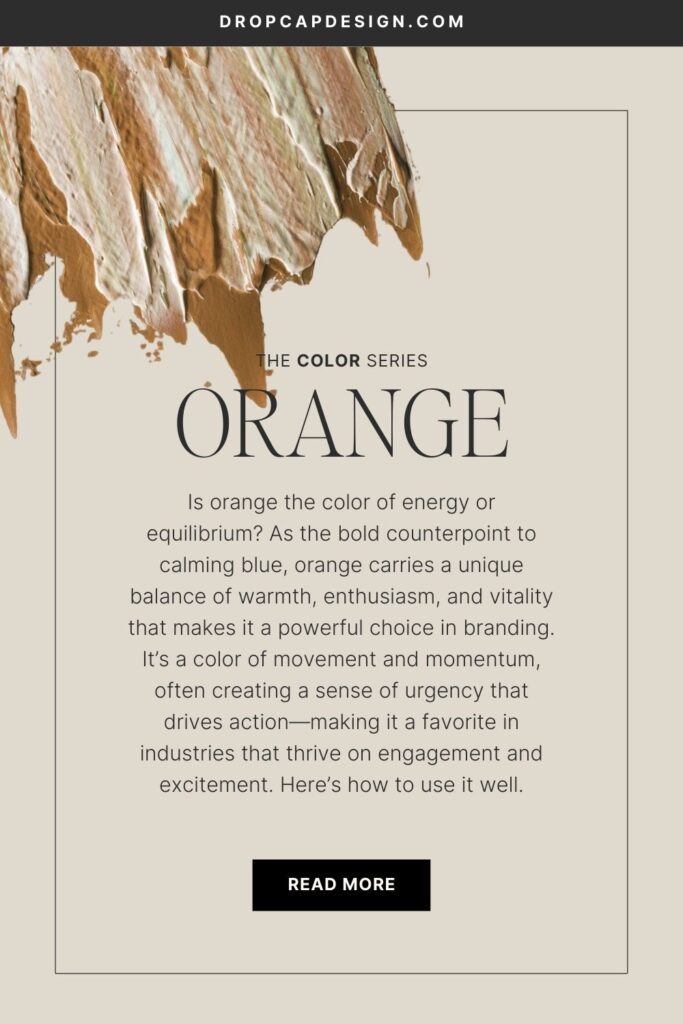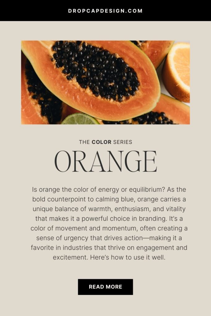


How to Use the Color Orange in Your Brand’s Palette
Welcome to post number three of our color series! Today we’ll be talking about orange! Orange is such a confident and often unexpected color to work with in design. It ranges pretty drastically from techy orange to more subtle skin tones. I’m excited to share more insight into this confident color, and explain how it can best be used in branding.
In this series, we will be heavily referencing Kassia St. Clair’s book The Secret Lives of Color. Her introductions to each color, and short stories on the most popular ones, are a beautiful history on how color names originated. I’ve only selected four of her famous tones to highlight, but the book is full of fascinated stories and tales from each hue, so be sure to pick up a copy!
In each post, you’ll learn…
The artistic history of the color
Four famous color tones and their stories
How that color is perceived by consumers
How to use the color in the four seasonal palettes
Notable brands recognized for using the color in their palette
As always, take this as a starting point for building your brand’s palette. There is not a formulaic system for choosing colors, but beginning with color exploration is a great place to start!

The History of Orange
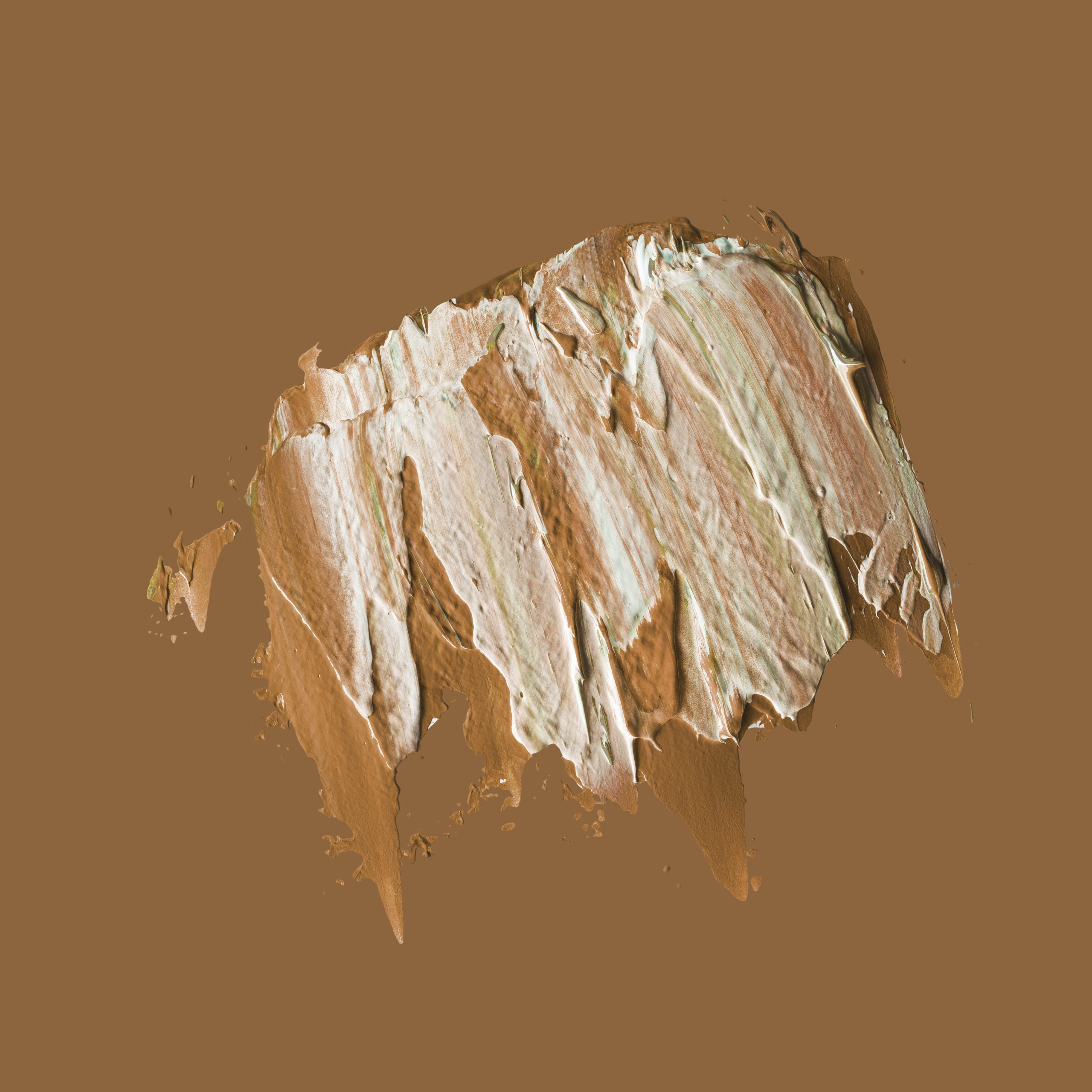
Orange is a confident color.
For those who wonder which came first – the color or the fruit, The Secret Lives of Color gives a definitive answer – the fruit! The color orange was not recognized as an independent color from red and yellow until the 1500’s. The color is most associated with the Dutch and Irish Protestantism. It’s also a color used in transportation and wartime as a symbol of approaching danger. The Impressionists were the ones who gave orange its independent identity.
The color wheel counter-part to calming blue, orange has a sense of urgency. Because of it’s most recent history, as opposed to other colors, it can often be misidentified with red, yellow, or brown. It is best used as a contrasting tone to stand out against blues and greens. Orange has a very commanding and confident presence on the color spectrum.
The Psychology of Orange
Confidence, Energy, Playful, Enthusiastic, Friendly
In marketing, orange borrows from the energy of red and optimism of yellow, making for a confident and playful color. Orange is a bold choice, and many have a love/hate relationship with it. Part of this color controversy is what gives orange an unexpected and attention-grabbing reputation in branding and marketing. Because of its enthusiasm, athletic teams and children’s brands have had success using orange as a primary brand tone.
When thinking about using orange in your brand’s palette, consider the personality you want your brand to have. If you’re a solopreneur, you may want your brand to imitate your own personality. If you own a small business with a team, brainstorm the kind of personality your brand has that rallies the entire team and communicates your mission.
Orange makes such a confident statement that it’s important to strongly consider your brand’s tone before utilizing this hue as a primary color. A great starting point for learning about your own personality and how it might play into the personality of your brand, is to learn more about the Enneagram, which is the most powerful and effective personality tool I’ve come across.
Learning your Enneagram number sets you on a path of growth and self-awareness that can quickly illuminate the ways you can create a brand and business with purpose.

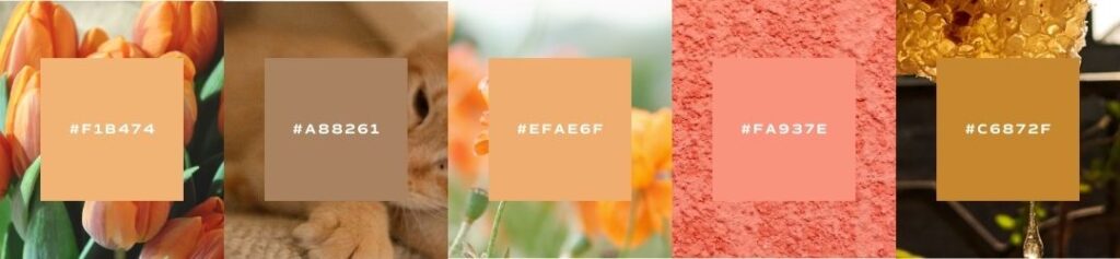
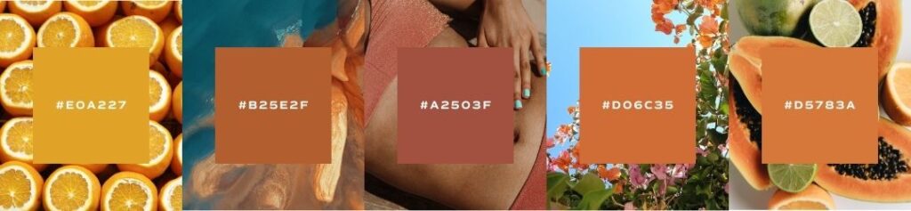
Famous Oranges
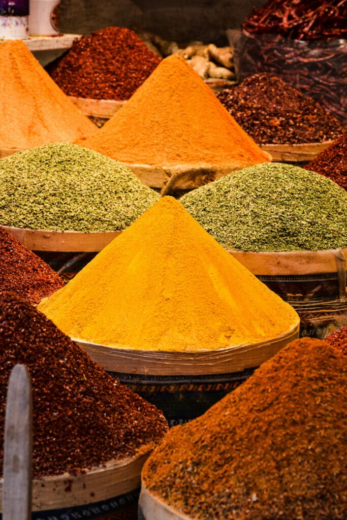
saffron
Saffron is a spice made from the center of flowers originally found in Iran, Spain, Morocco, Macedonia, France, and Kashmir. It is the most expensive spice in the world, and in its demand has been the cause of a 14-year war and a man burning alive in Nuremberg. Cleopatra was rumored to have bathed in it, and Alexander the Great dyed his hair with saffron to make his locks appear golden. It’s been used as a dye for Buddhist robes and a metallic ink for writing prayers to ward off evil spirits. Saffron is loved for its distinct taste, pleasing aroma, and eye-catching color.
Today, the color saffron is used in the Indian flag and is stands for “courage, sacrifice, and the spirit of renunciation.”
amber
Dripping in precious stones, intricate carvings, and gold-backing, the Amber Room in Russia is known as the “Eighth Wonder of the World” and was worth an estimated $142 million before going missing in 1943. Amber is a natural preservative and has helped scientists study and identify fossilized species found in its immortal droplets. Amber is most commonly found in the Baltics, and is the origination of the word “electron” when Greeks referred to the precious gemstone as light from the sun.
This earthy golden tone represents luxury, mystery, and unattainable wonder, as if bottling up the sun into an iridescent gem.


ginger
The spice originated in tropical South Asia and has been used for centuries to enliven dishes with strong and exotic flavors. These same characteristics of the spice have also been used to describe redheads. Redheads make up less than 2 percent of the world’s population, making them an exotic minority mostly found in Northwestern Europe and Scotland. Their personalities have become associated with fiery and intense demeanors – similar to their namesake’s spice.
Whether the spice or flaming hair, ginger is linked to a fearsome and often spiritual mystique rare and treasured in the natural world.
nude
Nude is a fashion color from the 1920’s and 30’s that is quickly becoming insensitive and irrelevant in the modern world. Only a very select few fit the static skin tone that is reflected in the tone’s name. Intended to be a substitute for the idea of “flesh” or “skin color”, projects like Angelica Dass show that skin colors are a spectrum and not a shade.
Even as the world’s perception of “standard skin tones” improves, the color is still associated with transparency and humanity.

Seasons of Orange
I want to show you the ways that orange can be used in seasonal palettes. When we talk about a seasonal palette, it doesn’t mean that you’ll change your brand’s colors four times a year. Seasonal palettes are another way that we assign personality traits to palettes and organize visual cues into a cohesive story.
If you’ve never heard about seasonal color palettes, check out our introduction to color post to learn more!
Spring
crisp, clean, light, delicate
When using orange in your brand’s spring palette, look for shades that are in the pastel family. Bright, but not too bold. A marigold or peach shade will add eccentricity to your palette without overpowering more delicate hues. When using a softer, more “golden” orange spectrum, orange can add cheerfulness and energy to a fresh spring-time personality. Look for oranges that have a bit more yellow in them.
Summer
bold, elegant, strong, vibrant
When using orange in your brand’s summer palette, go for the vibrant tones. This color is bold, confident, and energetic – perfect for a summer palette! Consider matching a rich orange with a blue or green complimenting color. This adds balance to your brand and keeps it from looking too aggressive. Look for oranges that have a bit more red to them in order to add energy to the palette.

Autumn
organic, warm, muted, intense
When using orange in your brand’s autumn palette, look to oranges that lean towards brown. A earthy, golden hue will compliment an organic palette and look more natural. Consider adding a subdued supporting tone that will soften the orange and look more neutral. Skin tones also make great accents to earthy palettes.
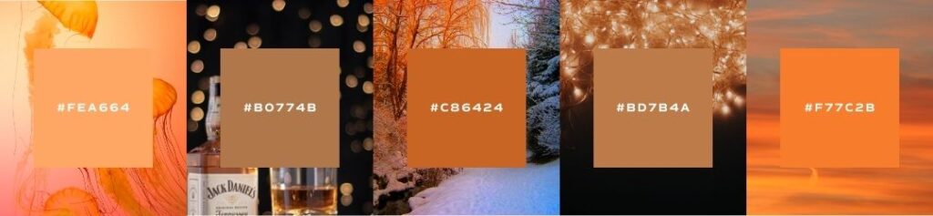
Winter
dramatic, minimal, extreme, cool
When using orange in your brand’s winter palette, it won’t be hard to add drama. This color is full of confidence and energy, so paired with neutral colors, you’ll easy have an extreme palette. When going with orange as a primary brand color, limit any supporting colors that may unintentionally put your palette in the spring or summer family. Keep it minimal and focus on picking just the right shade to show your personality.
Brand Examples

hermes
Hermes found its home in the orange family during World War 2. The brand started off using cream packaging, but due to wartime shortages, the brand had to move to a mustard yellow before eventually shifting to the last paperboard option available – orange. But, it was during these trying circumstances that the brand evolved and eventually adopted the orange as its signature color. Hermes orange is a “warm, dynamic, and joyful color – a symbol of luxury and good taste.”
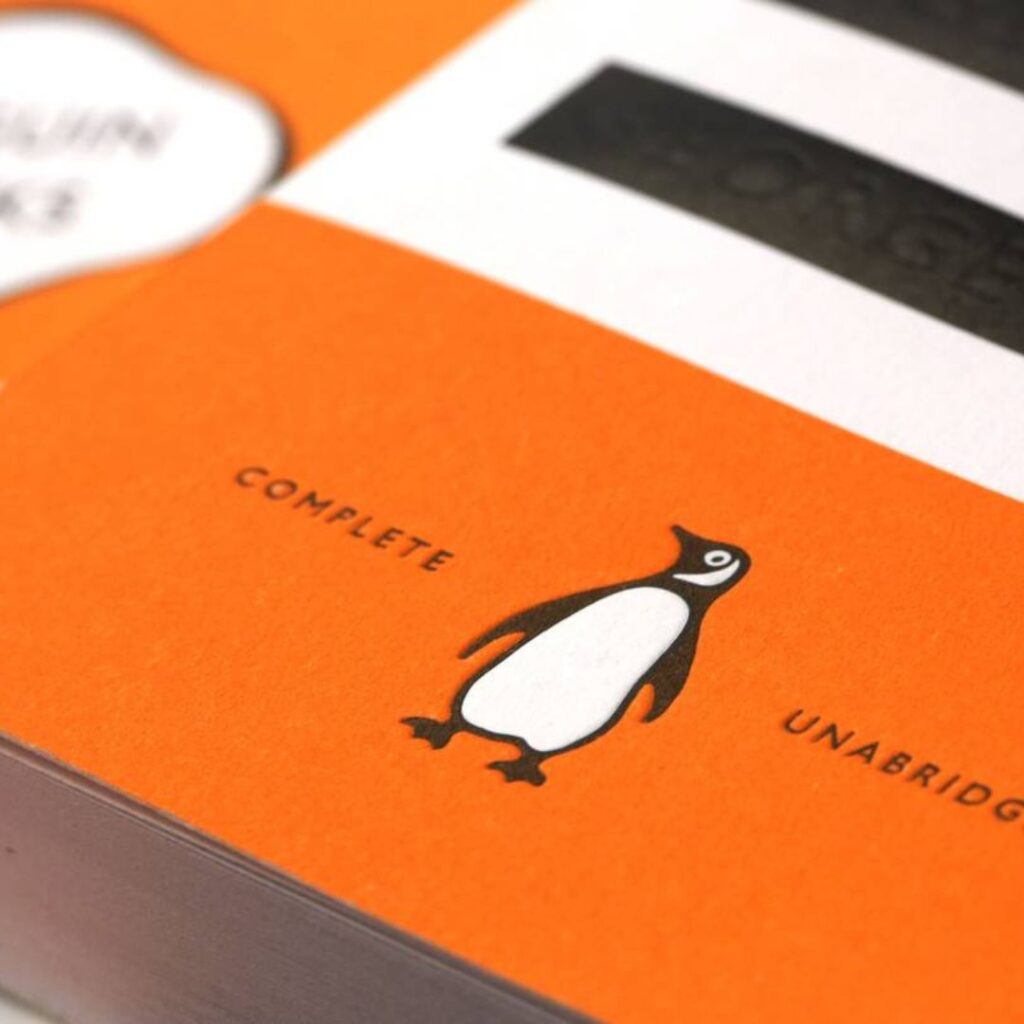
penguin publishing house
Penguin Publishing is an iconic British publishing house known for their orange oval. The Penguin logo has evolved over time, but the brand color with the iconic bird speaks to the energy and youthful enthusiasm of the brand. Penguin’s classic books collection is known as the Penguin Orange Collection – a limited run of the most influential books across time and across the globe. The signature Penguin trademark stands out on a shelf and gives a confident seal of approval to readers looking for their next great find.
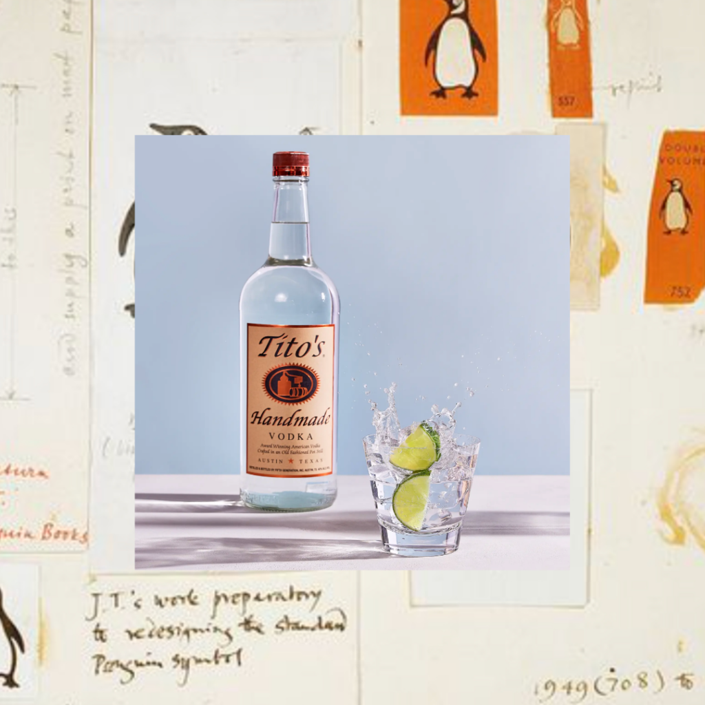
titos
The Tito’s vodka brand is built on grassroots energy and sheer drive. The brand has been built on the confidence and charisma of its founder, “Tito” Beveridge. Tito’s is the underdog in the vodka business, but has used optimism and high energy grassroots marketing to become a major player in the game. This brand’s earthy fall palette uses orange as a way to add energy to the brand without losing the handmade feeling of other neutral tones.
An Example from Our Agency

Flourish
Flourish by Caroline Potter embraces an earthy orange palette to reflect warmth, vitality, and a grounded sense of well-being—perfectly aligning with its mission of guiding women toward intentional, nourished lives. This sun-kissed hue evokes nourishment and energy, symbolizing both personal growth and the natural rhythms of life. Psychologically, earthy orange creates a feeling of warmth and connection, making the brand feel inviting, supportive, and deeply rooted in authenticity. It’s a color that inspires transformation while maintaining a sense of calm, mirroring the balance Caroline helps her clients achieve in their own lives.
Save for Later