


How to Use the Color Yellow in Your Brand’s Palette
It’s time for post number two of our new color series, and today we’ll be talking about yellow! Yellow is such a fun and bright color to work with in design. It’s the definition of being in the spotlight, and reminds me of sunny afternoons and the idea of a “bright future.” I’m excited to share more insight into this cheerful color, and explain how it can best be used in branding.
In this series, we will be heavily referencing Kassia St. Clair’s book The Secret Lives of Color. Her introductions to each color, and short stories on the most popular ones, are a beautiful history on how color names originated. I’ve only selected four of her famous tones to highlight, but the book is full of fascinated stories and tales from each hue, so be sure to pick up a copy!
In each post, you’ll learn…
The artistic history of the color
Four famous color tones and their stories
How that color is perceived by consumers
How to use the color in the four seasonal palettes
Notable brands recognized for using the color in their palette
As always, take this as a starting point for building your brand’s palette. There is not a formulaic system for choosing colors, but beginning with color exploration is a great place to start!
The History of Yellow
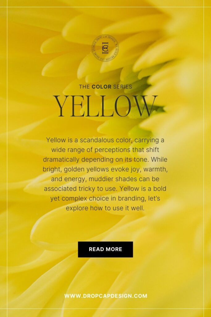
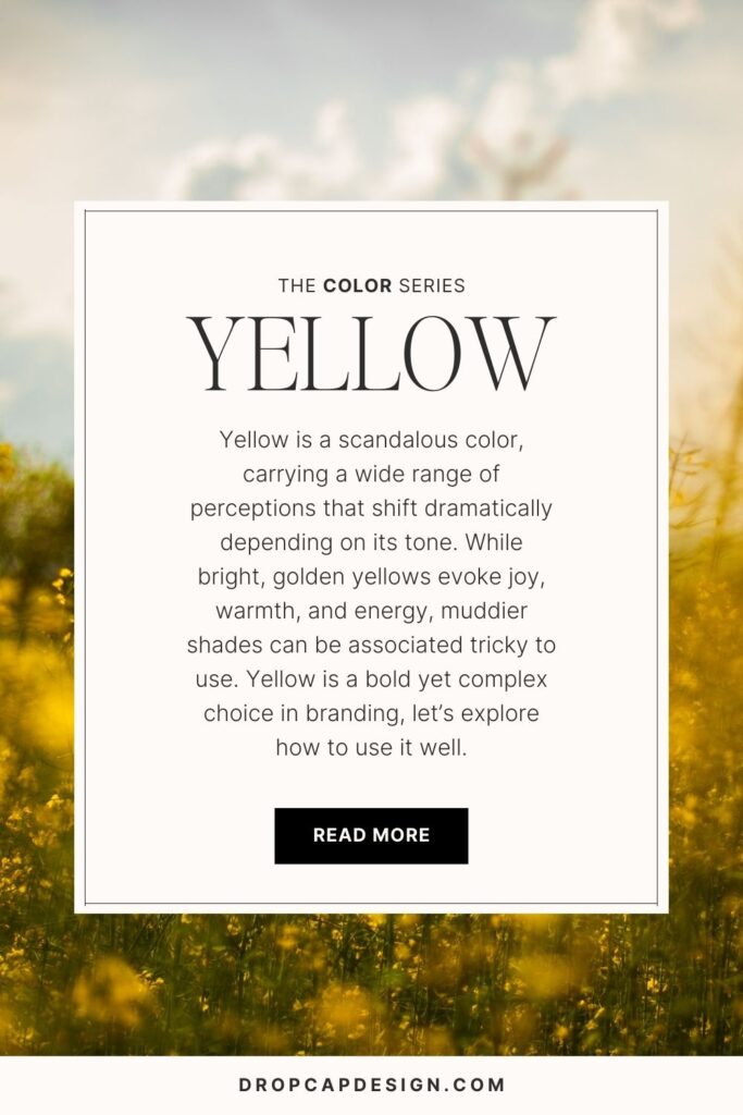
Yellow is a scandalous color.
Perceptions around the color yellow range from tone to tone. Most of the hue’s famous history comes from France in the 1800’s. At the time, yellow was linked to sensationalist literature and decadence. The pigment typically consisted of poisonous materials, and traditionalists were less-than-impressed with the rebellious connotations. But yellow became a key player in the Avant Garde movement and has been closely linked with innovation, progress, radical ideas, and opportunity.
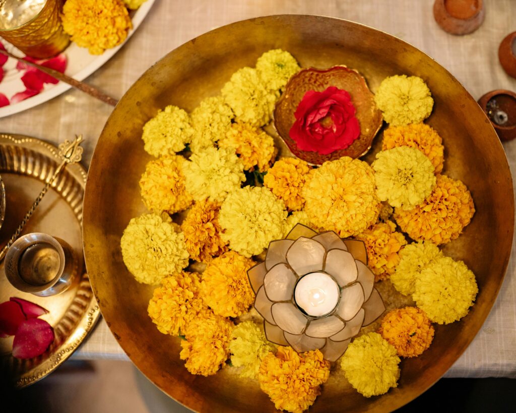
Yellow does have a dark past as a symbol of racial stigma and sensationalist journalism, however, blonde and gold tones of yellow are highly valued and seen as ideal. In India, yellow is a highly spiritual and transcendental hue, and yellow tones found in nature are symbolic of optimism, clarity, and light. In any case, using yellow in a brand palette grabs attention and makes a bold statement.
The Psychology of Yellow
Optimism, Warmth, Clarity, Energy, Attention
In marketing, yellow is a stimulating and energetic color. It’s grabs your attention, because our brains actually process yellow before any other color on the spectrum. Yellow is typically always a brilliant and vibrant, no matter what tone you use, so there’s a certain energy and enthusiasm that comes with it. Brands who use yellow are typically cheerful, warm, and friendly.
When thinking about using yellow in your brand’s palette, consider the personality you want your brand to have. If you’re a solopreneur, you may want your brand to imitate your own personality. If you own a small business with a team, brainstorm the kind of personality your brand has that rallies the entire team and communicates your mission.
Yellow makes such a bold statement that it’s important to strongly consider your brand’s mission before utilizing this hue as a primary color. A great starting point for learning about your own personality and how it might play into the personality of your brand, is to learn more about the Enneagram, which is the most powerful and effective personality tool I’ve come across.
Learning your Enneagram number sets you on a path of growth and self-awareness that can quickly illuminate the ways you can create a brand and business with purpose.
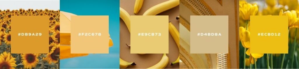
Famous Yellows
acid yellow
Acid yellow is most closely linked with emojis and the 1980’s party scene. This color was used on band album art from Talking Heads to Nirvana, and the name was derived from the drugs of choice laser light shows of nightclubs in rave culture.
In more current times, this shade of yellow is still linked to the digital social era, and is linked to modern communication and digital trends.
indian yellow
If you’re thinking there’s something interesting about this tone, you’re right. It’s most commonly believed to have originally been concentrated cow urine from a small town in India. The pigment reeked of ammonia and the powdery ball consisted of a “rotten mustard” exterior with a brilliant yellow core.
imperial yellow
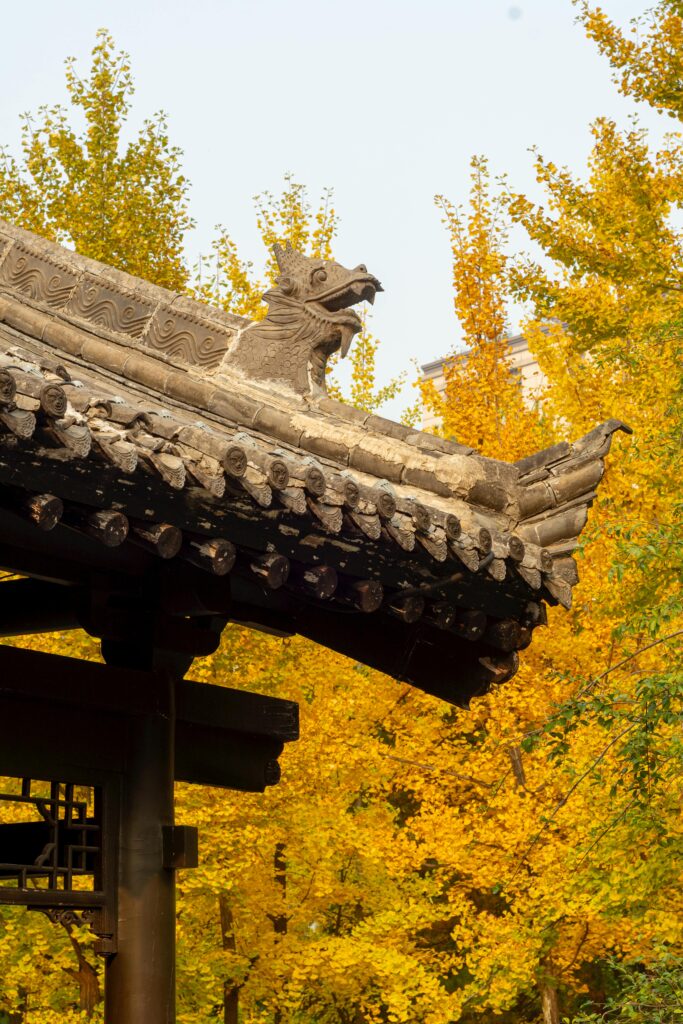
This tone has a special history in Eastern rule. Chinese belief indicated this color as spiritual and guarded color, reserved for power and prestige. Common people were forbidden from wearing the color, and royal palaces had gleaming yellow roofs to contrast the grey of the general population.
The process for dying the exclusive silk was labor-intensive and precise. While this tone no longer holds the significance of its former days, it still commands a particular elegance.
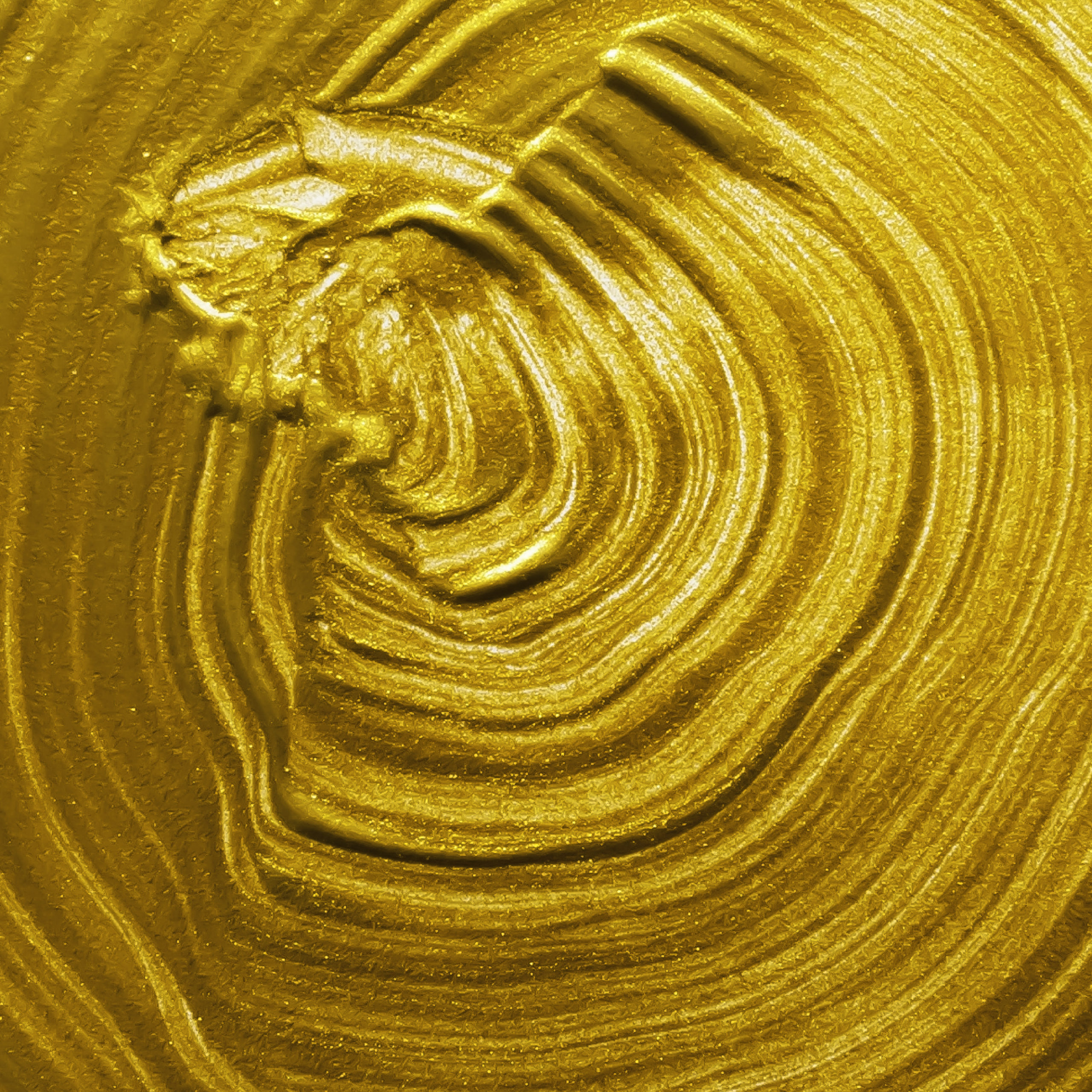
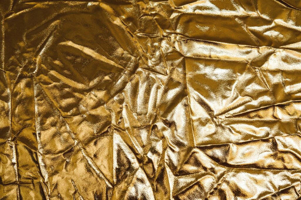
gold
Gold has always been a color of reverence and an object of desire. Because of its scarcity in the natural world and rushed extraction, the tone has always held a particular place of honor. In religious art, gold was used to inspire awe and reverence among a congregation – using the material was a form of worship to God and often communicated the wealth of the church.
Golden thread in clothing was used by the Romans and among European royalty. The electrons that make up the precious metal strongly reflect light, giving it the effect of “glowing from within.” It is the reflective quality of gold that makes it appear real – when the metal is converted to a flat color or leaf, it does not translate well because the light falls too evenly, whereas real gold interacts and bounces back and forth with the natural light.
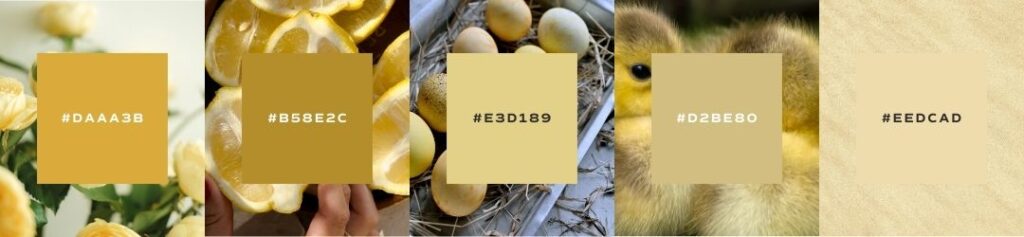
Seasons of Yellow
I want to show you the ways that yellow can be used in seasonal palettes. When we talk about a seasonal palette, it doesn’t mean that you’ll change your brand’s colors four times a year. Seasonal palettes are another way that we assign personality traits to palettes and organize visual cues into a cohesive story.
If you’ve never heard about seasonal color palettes, check out our introduction to color post to learn more!
Spring
crisp, clean, light, delicate
When using yellow in your brand’s sprint palette, remember to select shades that are crisp and bright, but not too vibrant. A buttery yellow or crisp citrus will compliment other light and delicate tones. Yellow can be a very bold and attention-grabbing color, so when using it in a spring palette, look for softer tones so that it does not dominate other delicate hues.
Summer
bold, elegant, strong, vibrant
When using yellow in your brand’s summer palette, go for the bold tones. This color will naturally feel bright and vibrant, so don’t be afraid to implement pure yellow tones. Just remember to mimic the temperature of your other colors – if you go warmer, select a bright mustard yellow. If your colors are cool, select an energetic acid yellow.
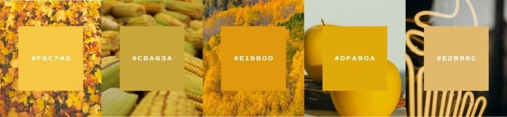
Autumn
organic, warm, muted, intense
When using yellow in your brand’s autumn palette, look for shades that are earthy and muted, with warm undertones. This is a great palette to use mustard and indian yellows, mimicking a setting sun rather than high noon. Remember to keep your yellow on the warmer side to compliment earthy autumn tones. Don’t be afraid to go more in the direction of warm brown.
Winter
dramatic, minimal, extreme, cool
When using yellow in your brand’s winter palette, look for shades that have high-contrast, with cool undertones. This is also a great palette to experiment with gold due to its luxurious nature. To build the dramatic contrast of a winter palette, you could use 1-2 neutrals on either end of the spectrum with a fluorescent highlighter yellow as an accent.
Brand Examples
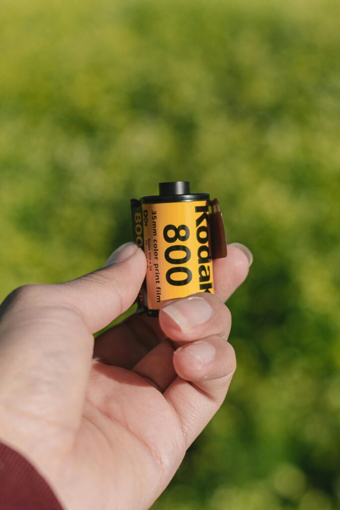
Kodak
Kodak’s use of yellow in its branding symbolizes warmth, creativity, and nostalgia—perfectly aligning with its mission of capturing life’s most cherished moments. Yellow is also an attention-grabbing color that evokes optimism and happiness, reinforcing Kodak’s message that photography is about preserving joy and storytelling. Psychologically, it creates a sense of familiarity and trust, making the brand feel approachable while standing out in a competitive market.
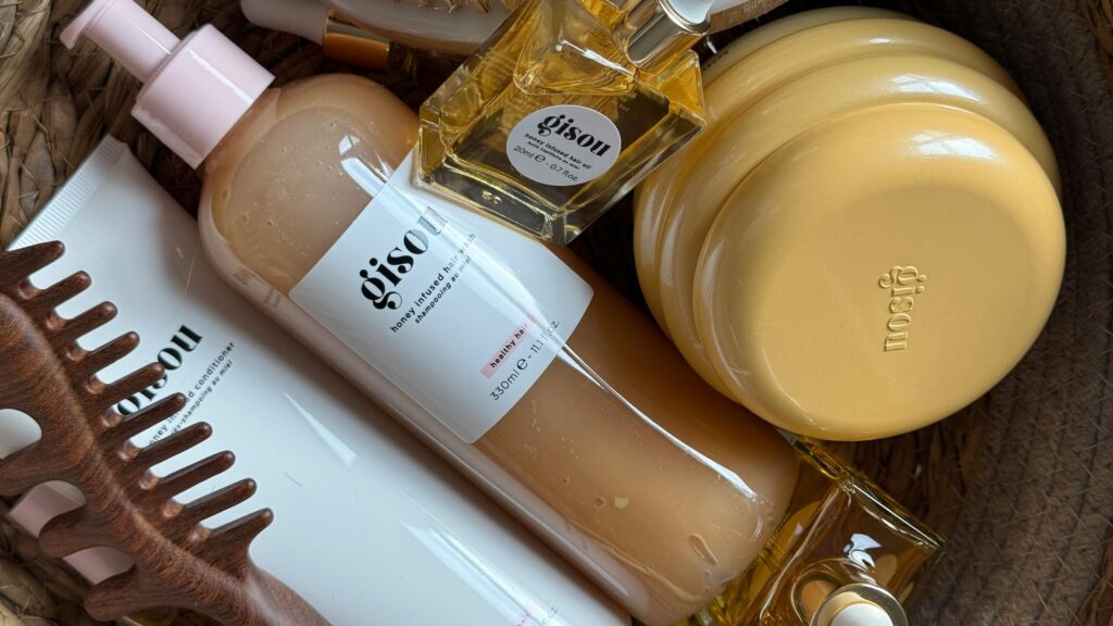
Gisou
Gisou uses yellow in its branding and packaging to reflect the warmth, richness, and natural essence of honey—the core ingredient in its haircare products. The golden hue evokes feelings of nourishment, luxury, and radiance, aligning with the brand’s promise of soft, healthy, and luminous hair. Psychologically, yellow also conveys optimism and energy, reinforcing Gisou’s connection to nature and the sun-kissed beauty that comes from using their products.
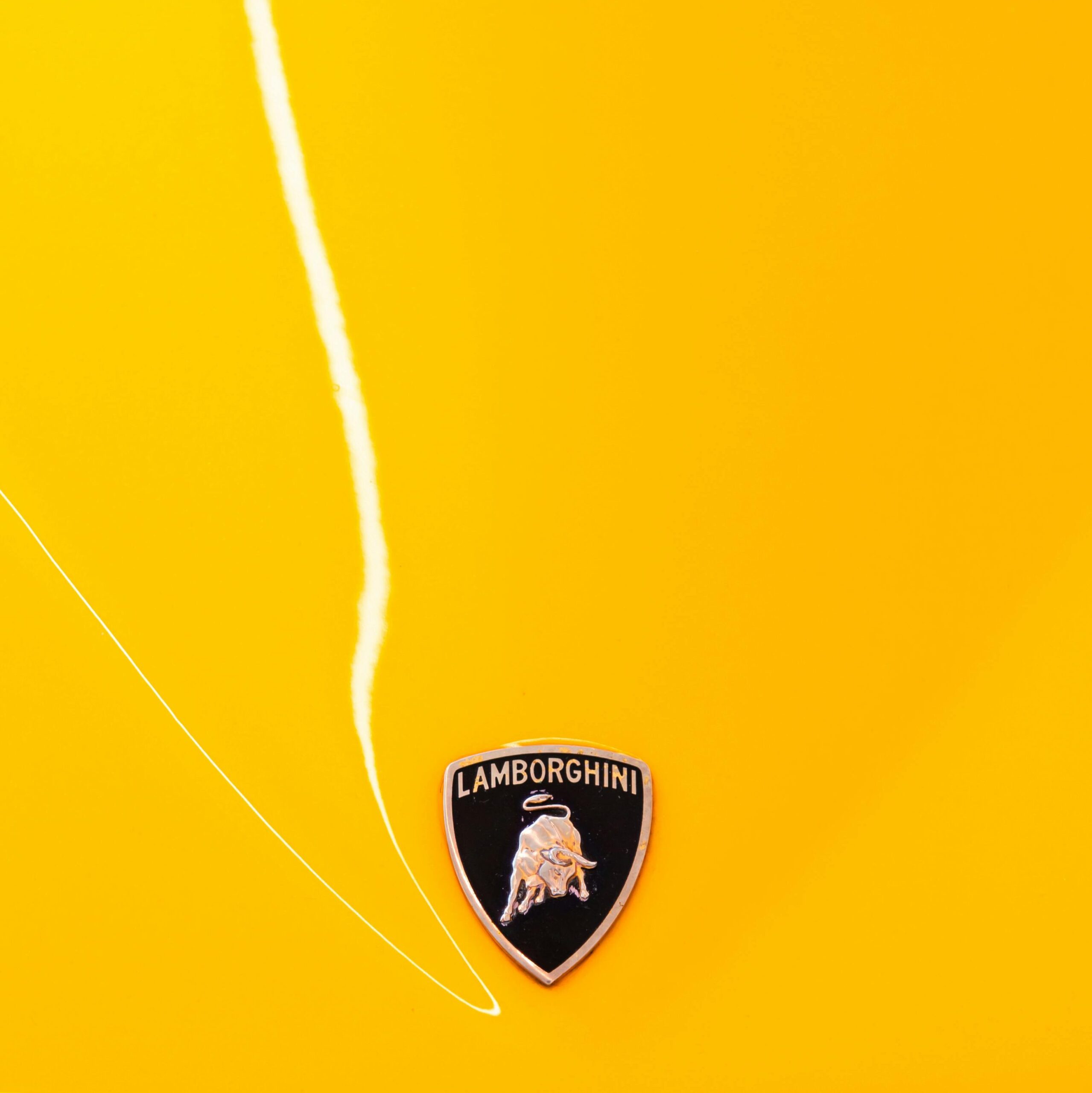
Lamborghini
Lamborghini’s iconic use of yellow, often referred to as “Giallo Midas,” has been a signature color for the brand, symbolizing energy, joy, and the thrill of driving. This vibrant hue not only captures attention but also reflects the brand’s commitment to luxury and excellence. In recent updates to their visual identity, Lamborghini has maintained yellow as an accent color, complementing the primary black and white palette, to preserve its heritage while embracing a modern, bold aesthetic.
bumble
Bumble is an app that changed the game for online dating, and has a mission to create a space for women to feel safe putting themselves out there online. After a rocky start with Tinder, the founder of Bumble wanted to do things differently. Her brand is also inspired by the bee community and the power of the Queen Bee. The bright and cheerful tone that is now synonymous with the digital empire shines a light on a bright and positive future for the online relational world.

An Example from Our Studio
pionera edu
Pionera Edu’s use of yellow in its branding reflects warmth, curiosity, and an inviting sense of discovery—perfect for an education platform designed to engage and inspire students. The vibrant hue is influenced by Spanish culture, adding a sense of adventure and global inclusivity while maintaining an academic yet playful feel. Psychologically, yellow sparks creativity and optimism, reinforcing Pionera Edu’s mission to revolutionize curriculum development with a fresh, modern, and engaging approach.
save for later

What a fantastic and interesting blog post! I love yellow and I loved reading through what you’ve collected here. Thanks for sharing. 😀
I’m so glad you enjoy this happy color! Yellow is such a fun color to work with in design 🙂