


Welcome to the first installment of The TONIC Review—a series where we will be taking a deep dive into all of the TONIC templates so that you can choose the best one for your business. My goal with this series is to inspire you to think outside the box and also recognize the flexibility of each design to help you begin styling it to suit your brand.
To read the full breakdown of why we love TONIC, and how Showit is revolutionizing the web design space, read our introduction post here.
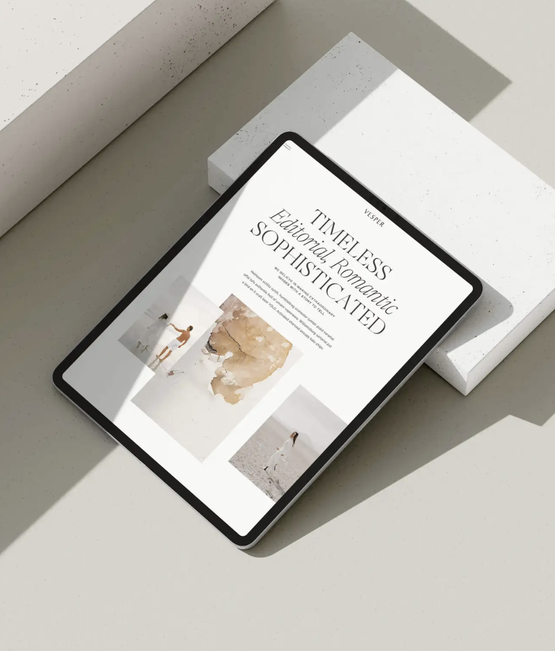
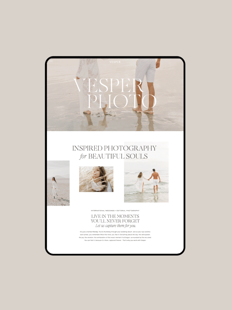
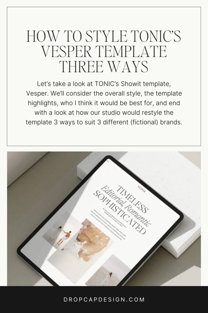
In this week’s installment, we’ll be taking a look at TONIC’s new template, Vesper. We’ll consider the overall style, the template highlights, who I think it would be best for, and end with a look at how our studio would restyle the template 3 ways to suit 3 different (fictional) brands.
So, without further ado, let’s dive in.
Vesper Template Overall Style
The overall style of the Vesper template is airy, editorial, soft, and clean. It utilizes thin lines to guide the eye and overlapping photos to add depth and movement. On its own, it really adheres to modern minimalist design trends, but I was eager to see how we might push the structure to fit different styles. With a timeless, elegant, and very well-organized foundation, we have so much room to play.
I fell in love with the hierarchy of type on this template, especially on the ‘about’ page. It immediately captures the eye and feels like a welcoming invitation to read the full story—a feature that’s ideal for anyone who has spent time (and money!) refining their copy for clarity.
In looking through each page’s layout, I will say that this template is focused on copy. It presents it in a way that’s visually appealing and bite-sized, but it’s still a design that emphasizes words eager to be read. Don’t be deterred by the copy-heavy design. If you’re wanting to focus on the copy of your website with done-with-you guidance, I highly recommend Copy Uncorked’s course The Copy House.
Template Highlights
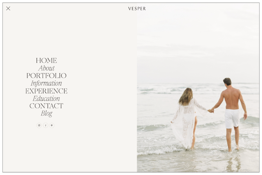
Full Window Navigation
Right off the bat, I really love the full menu that opens with the hamburger icon. I think this gives the site an editorial look while keeping the top of the site clean and uncluttered with links.
Editorial Information Page
The information page reads like a magazine article which really plays into that editorial vibe. I think this gives your FAQ details (which can often feel bland) a refreshed and engaging style.
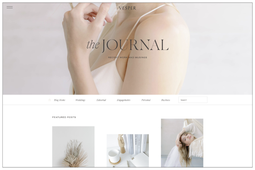
Clean Blog Design
The part that absolutely made my heart sing is the blog design. It feels classic and clean in a time when most of us feel overwhelmed by content. This is an ideal design for businesses that plan to utilize blogging to boost SEO and provide long-form content to their audience.
Vesper is Best For
I see this template working best for brands with a lot of copy – bloggers, wedding vendors, and copywriters. Its clever typography and content organization make it perfect for storytelling and long-form writing.
However, its beautiful use of photography and layered canvases could also make it a great fit for e-commerce retail and designers.
How to Customize the Vesper Template
While this template style is airy and editorial, in today’s post, I hope that you’ll realize that it doesn’t have to be. This design is so versatile and conducive to showcasing a variety of brands in a powerful and captivating way. Let me show you what I mean.
Let’s look at how I’ll be restyling the Vesper Template in three different ways for…
- Styled by Stella – a western lifestyle blogger who lives on a ranch, considers herself a glamorous cowgirl, and writes her posts with some dirt under her fingernails.
- Unearthed Pottery – an e-commerce kitchenware website with beautifully minimal and practical dishware for everyday use. This brand values quality and has a refined, edited-down style.
- The Transient Press – half copywriter and half travel writer- is the Anthony Bourdain of brand copywriters. With colorful photography, a no-nonsense style, and edgy details, this is a brand that is on the move and taking you with them.
Styled by Stella
This (fictional) brand is for a lifestyle blogger living on an Idaho ranch. Her brand is Western, gritty, ethereal, and holistic. She wants to use the Vesper template for its clean organization and stunning blog design. Here’s how I would customize the Vesper template design to match her style.
First off…
The Vision
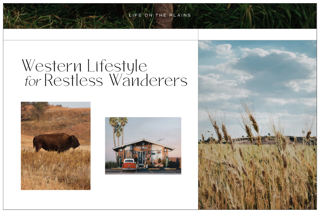
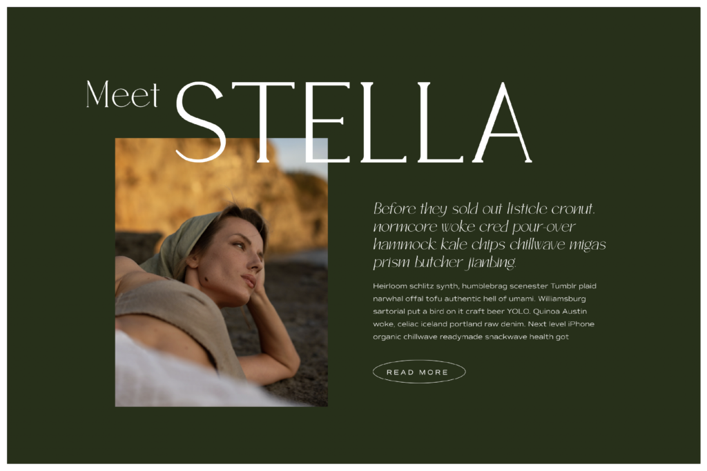
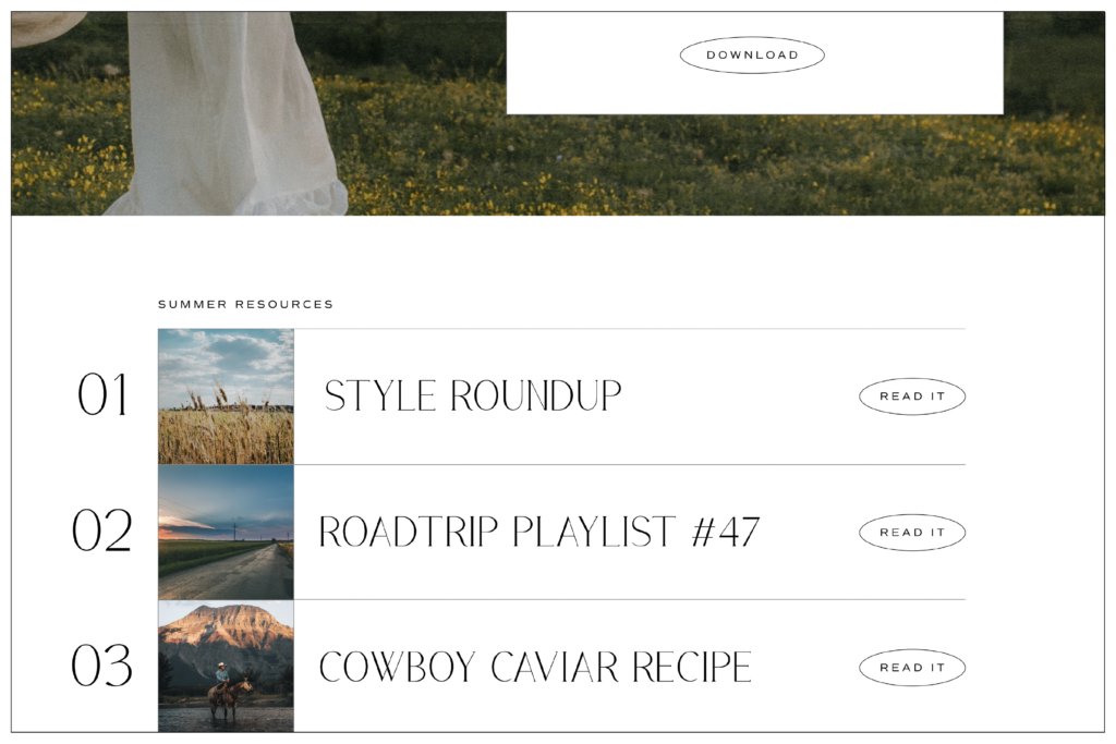
My vision for this style is to make it bold, earthy, tenacious, and tough but still have the elegant feminine touch of a women’s lifestyle blog that features style, beauty, and holistic health. Here’s a look at how I’ve redesigned the Vesper home page.
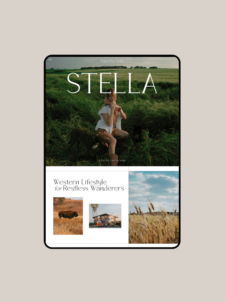
I want to share some of the design decisions I made when reimagining the Vesper home page to match the style of Stella.
Extending the Grid
Based on my inspiration for this site, I extended the lines I saw in the template design to further section off content and give the site an old-school travelog aesthetic. I wanted the lifestyle photography to really stand out, so the lines helped to create full bleed moments throughout the layout.
Use Dark Backgrounds
To counter the airy nature of the template, I mixed in some dark backgrounds so it didn’t feel as delicate. This also added a really stunning canvas that breaks up the home page Having contrast between the canvases disrupts the mindless scroll and compels a viewer to read whatever is being highlighted.
Playful CTA Buttons
I decided to add circles for the CTA to give a touch more personality to the design and change up the expected aspects of the site design for a little extra customization. I also felt like the circle design made the site feel more personable and tactile – matching the organic earthiness of the brand.
Unearthed Ceramics
This (fictional) brand is for a ceramic artist with a simple, modern, neutral, and organic aesthetic. The existing airy design already suits the product, but there are a few ways we can push it even further to match the brand’s style and help it stand out online.
The Vision
My vision for this style is to keep the elegant simplicity but add more organic nature by layering photos and softening some shapes into circles. Here’s a look at how I’ve redesigned the Vesper home page.
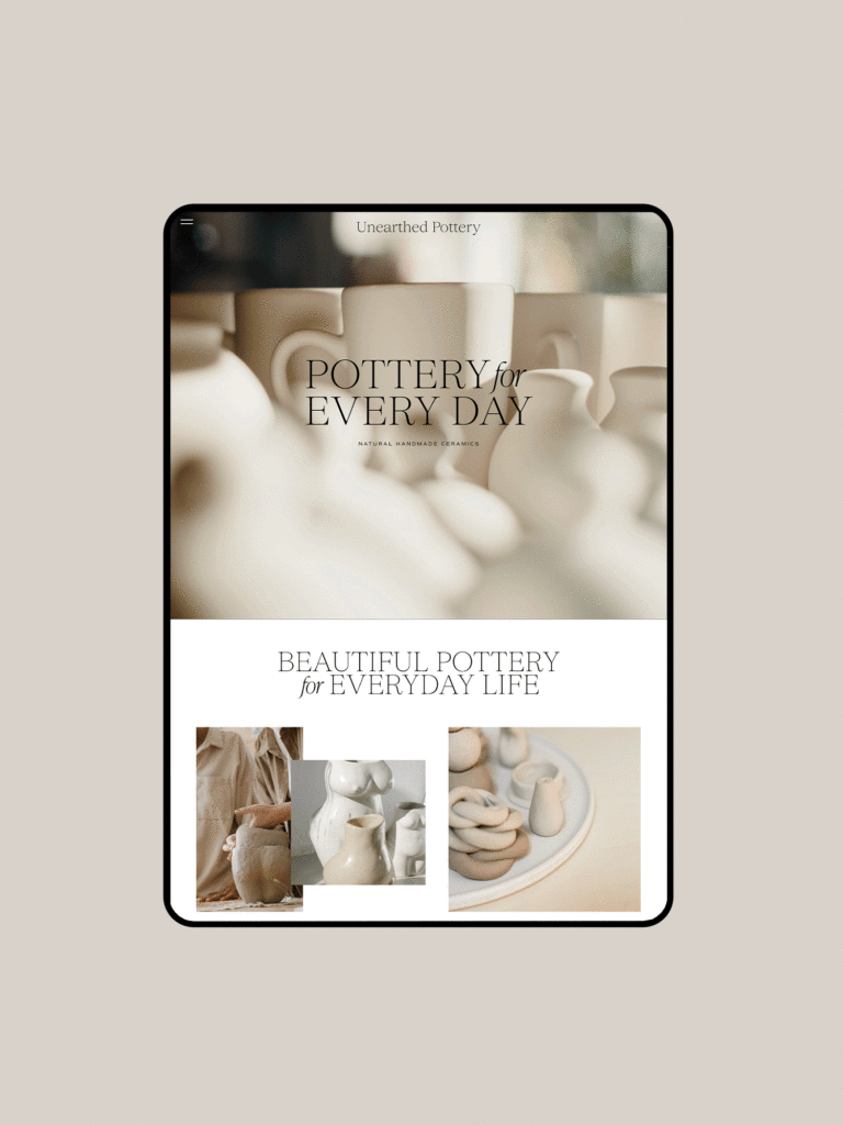
I want to share some of the design decisions I made when reimagining the Vesper home page to match the style of Unearthed Pottery.
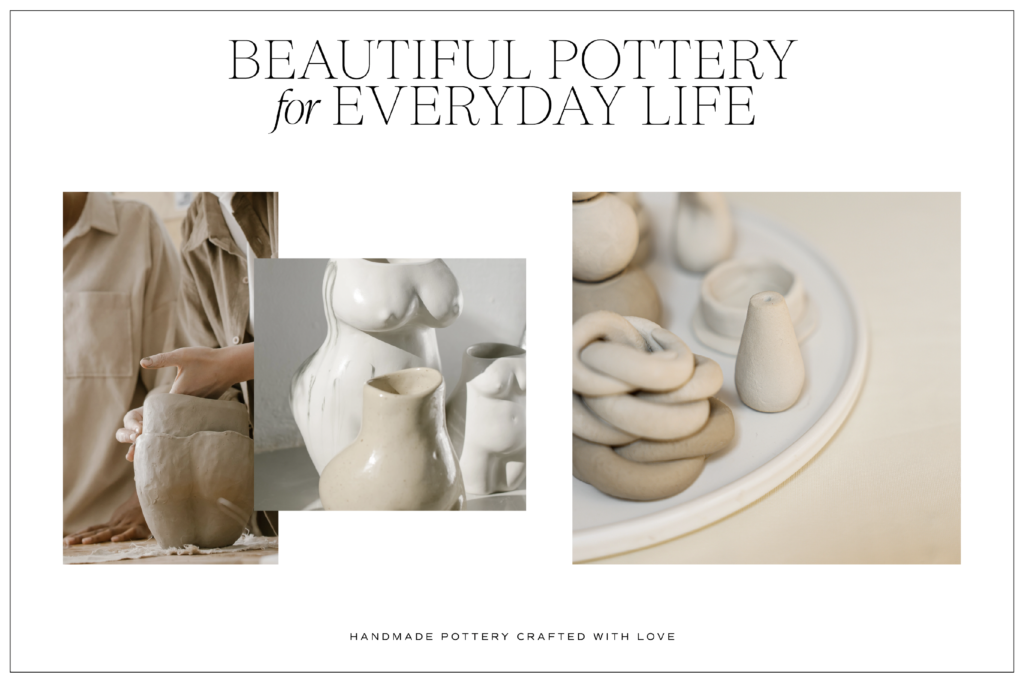
Layered Photos
To add more fluidity and organic detailing to the template, I layered photos so they felt like they were collaged together right inside the studio—nothing too perfect or digital. I wanted the site’s design to have a tactile quality.
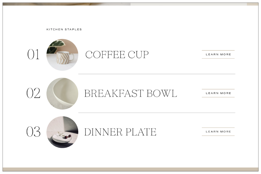
Changing Recent Blog Posts to Product Highlights
I changed the square images from the blog highlights to become circular product features. I didn’t see a blog design as appropriate for this brand, so using this canvas to promote featured products instead was a great way to keep the design but make it work for the site’s goals.
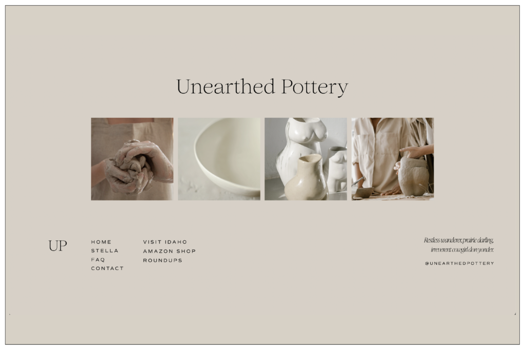
Centered Footer
I simplified (and centered) the footer so it felt more minimal and balanced. The limited Instagram feed allowed for more space.
The Transient Press
This (fictional) brand is for a traveling copywriter who moves all over the world in search of stories and helps brands position themselves within the context of an international marketplace. Because the Vesper template is so airy and minimal, this was my biggest challenge to push the design as far as I could take it to work for an edgy, worldly, and serious brand.
The Vision
My vision is to see just how far I can push the style standards of the Vesper template to work for a brand that doesn’t seem like an initial good fit for the design. However, I think we can do it because this brand is copy-focused, and this template handles copy extremely well. Here’s a look at how I’ve redesigned the Vesper home page for The Transient Press.
I want to share some of the design decisions I made when reimagining the Vesper home page to match the style of The Transient Press.
Playful Banners
I wanted the first impression to be completely unique, and because of the Vesper template’s clean navigation, I had an entire window to play with text and make a statement with the headline. This style gives me a Wes Anderson feel and honestly… I kinda love it.
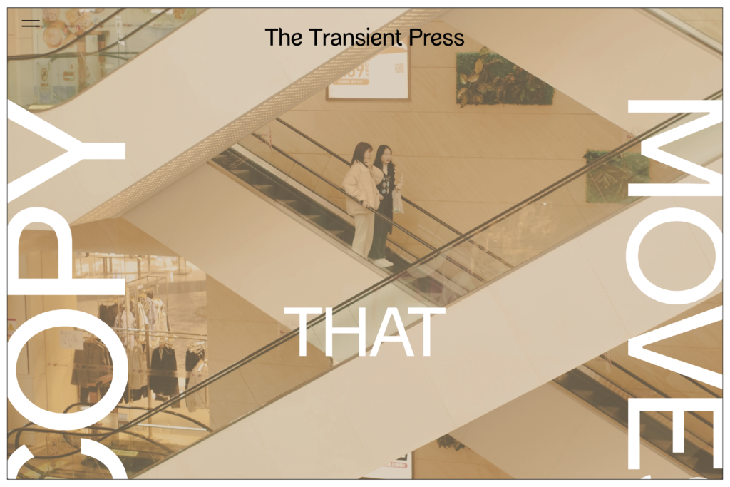
Extended CTA Lines
I worked a lot on placing different elements in this template redesign. Then, I moved the subheadings to the left and right and changed the color. Finally, I rotated the lines for CTA buttons to lead the eye to the next canvas. Creating movement with these elements helped break the template’s elegance and give it an edgier aesthetic.

Accordion Photo Collages
My favorite part of this home page redesign is the bio canvas. I created an accordion collage, which is the little strip of photo on the far left. This adds a lot of mystery and is a fun way to add texture to your site with stock photography.
SAVE FOR LATER
Next Steps
Ok, so now you know how we’d restyle this template in 3 ways. Is it making you think about your website a bit differently? Want our team to take a stab at making this template work for you?
First, download our Website Content Organizer. This will give you a sense of what your site needs to do and what you already have to work with.
Then, check out our Web Intensive. We can help you choose your template, design your digital space, and launch your site in—yep—2 weeks.