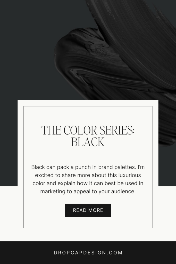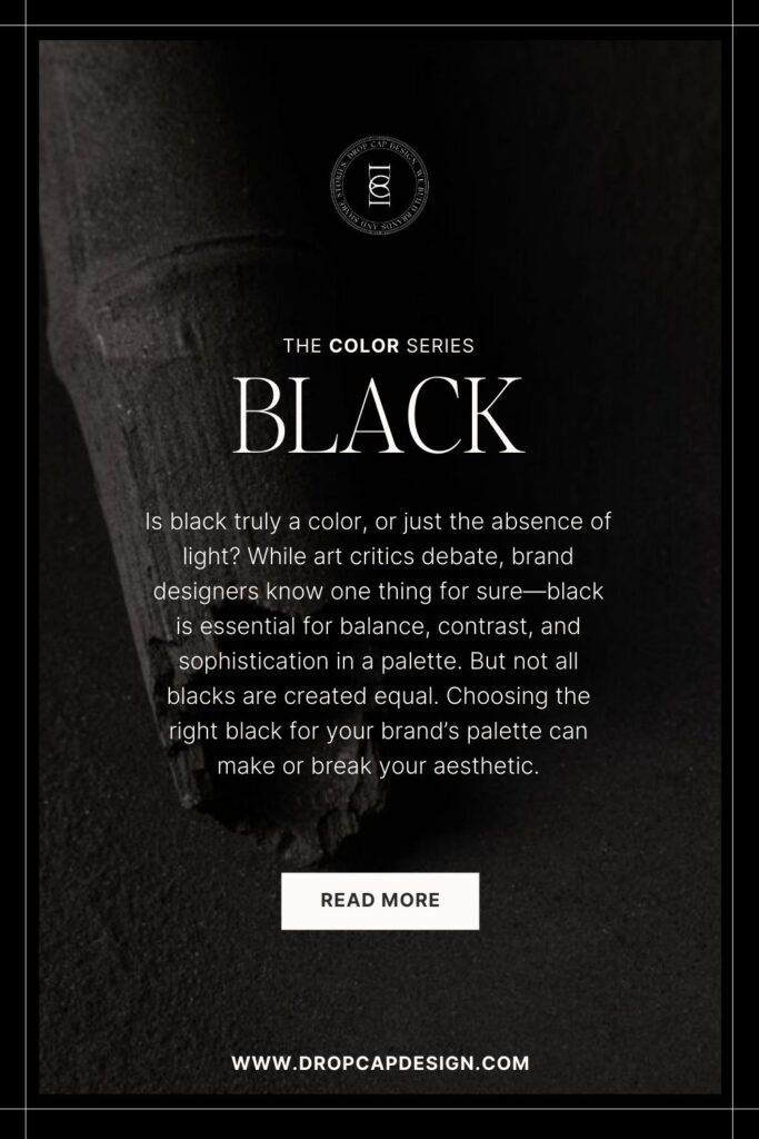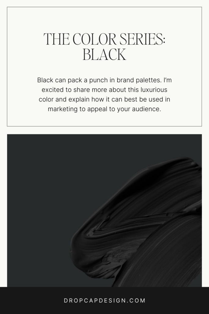


How to Use the Color Black in Your Brand’s Palette
Welcome to post number nine of our color series! Today we’ll be talking about the color black. Black is neutral color that can pack a punch in a brand palettes. I’m excited to share more insight into this luxurious and dark color and explain how it can best be used in marketing to appeal to your audience.
In this series, we will be heavily referencing Kassia St. Clair’s book The Secret Lives of Color. Her introductions to each color, and short stories on the most popular ones, are a beautiful history on how color names originated. I’ve only selected four of her famous tones to highlight, but the book is full of fascinated stories and tales from each hue, so be sure to pick up a copy!
In each post, you’ll learn…
The artistic history of the color
Four famous color tones and their stories
How that color is perceived by consumers
How to use the color in the four seasonal palettes
Notable brands recognized for using the color in their palette
As always, take this as a starting point for building your brand’s palette. There is not a formulaic system for choosing colors, but beginning with color exploration is a great place to start!

The History of Black
Black is a mysterious color.
Throughout art history, critics have debated whether or not black can be called a true color, since its definition is the absense of light and color wavelengths. However, it is nearly impossible to create a true black. Vantablack is the closest technology to create true black, and blocks out 99.965% of the spectrum. It is so black, that it confuses the eyes and brain, taking away the viewer’s ability to perceive depth and texture.
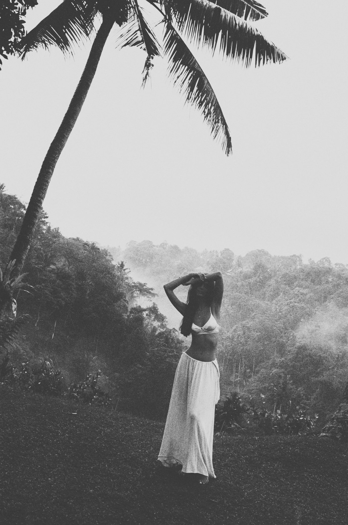
Black has been a fashionable color since the 1300s. Originally due to widespread death and mourning, new processes arose to create truly black dyes that made clothing more luxurious and less muddy. Since then, black has risen in popularity, at one point making up 29 to 44 percent of the average person’s wardrobe, and revered for its sophistication by the fashion industry. It has been deemed the most pleasing color in clothing.
The Psychology of Black
power, elegance, mystery, strength, prestige
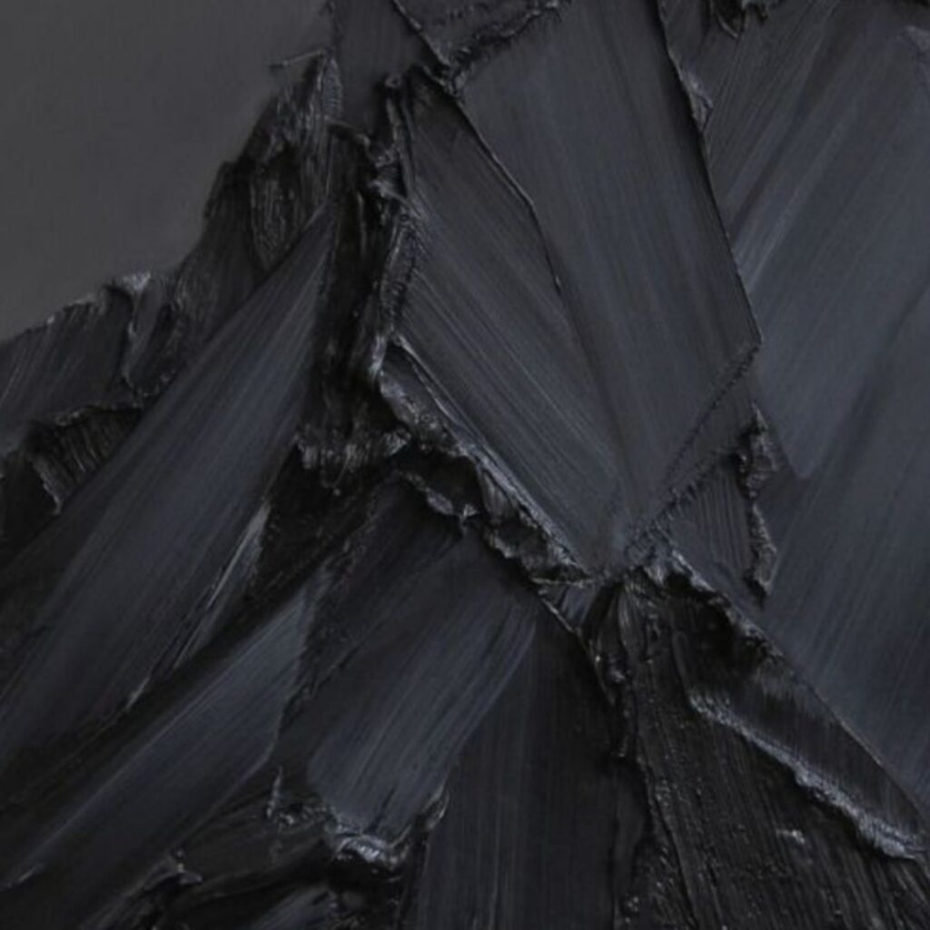
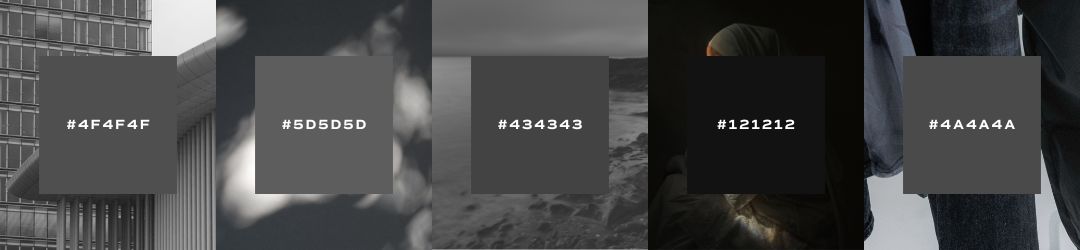
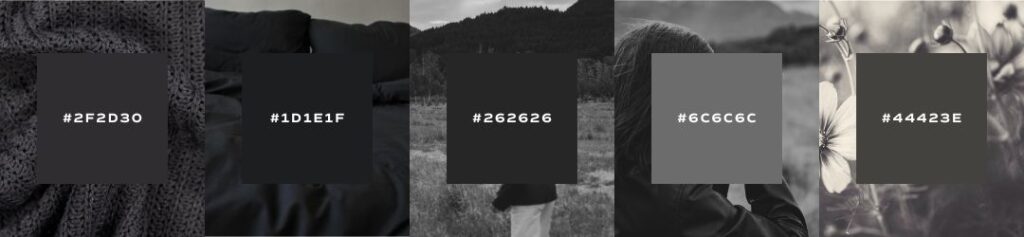
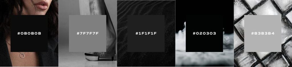
Black is a very common color to include in a brand’s palette to balance both light and dark hues. However, many don’t realize that there are many different versions of black available! Because true black is so difficult to recreate, the color tends to have varieties that range the entire grey scale. Black is a very dignified and sophisticated color to use in marketing materials.
When using black in your brand’s palette, remember that less is more. Black can be an overwhelming color to consumers, so it’s best to be intentional about how and when it’s used in your marketing collateral. Black is also a great way to make a dramatic point or eliminate distracting elements.
As an entrepreneur, consider your own personality among your friends and how you are perceived by friends. How might purple support or contrast your natural demeanor? If you’re not sure how to put words to your unique personality or communicate what makes you tick, you may want to do some work to develop a greater level of self-awareness before going through the branding process. I suggest starting with the Enneagram, which is the most powerful personality tool I’ve found to date!

Famous Blacks
kohl
In ancient Egyptian times, every person “from pharaohs to peasants, male and female, rimmed their eyes with thick black lines.” Why? Because kohl was thought to have magical properties and accentuate the whites of eyes, making a person more attractive. Later studies showed that ancient Egyptian kohl actually contained two man-made chemicals that reduced the risk of eye infections, a very real protective magic for the Egyptian culture.
ink
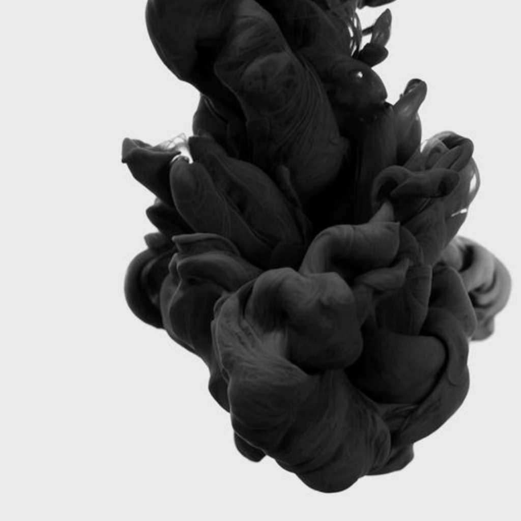
Traditional writing ink has Chinese roots, produced by scraping soot off of rows of lamps using feathers. Ink has grown in popularity among authors and scribes for its legibility, permanency, and consistency. Many early ink users would perfume the ink with cloves and honey, leaving an aromatic experience for the reader and fulfilling a spiritual process for scribes.
charcoal
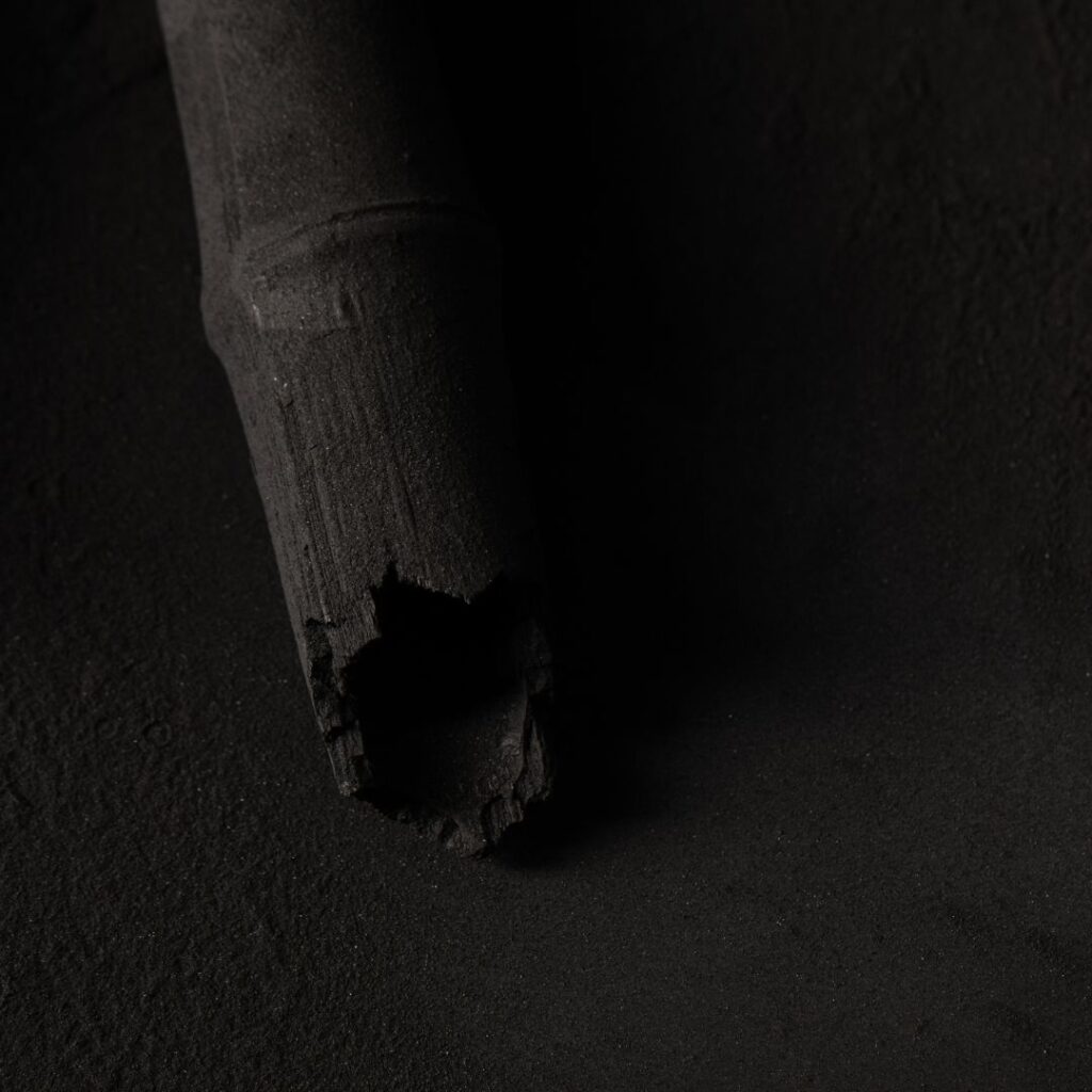
The very first known human attempt to record and recreate scenes from nature happened on the walls of caves using remnants of charred wood from camp fires. In Paleolithic paintings, scenes of bison and lions, horses and women tell the story of mankind from around 14,000 B.C. Because of the consistent temperature and humidity of caves, the walls became a perfect canvas for creating and preserving stories for generations to come.
jet
Original “jet black” came from pressurized wood that was able to be carved and polished to a glasslike sheen. Romans imported the material from England in droves, using it to build figurines and structures in their glorious empire. Jet black jewelry became a popular accessory for mourning in the Victorian era.

Seasons of Black
I want to show you the ways that black can be used in seasonal palettes. When we talk about a seasonal palette, it doesn’t mean that you’ll change your brand’s colors four times a year. Seasonal palettes are another way that we assign personality traits to palettes and organize visual cues into a cohesive story.
If you’ve never heard about seasonal color palettes, check out our introduction to color post to learn more!
Spring
crisp, clean, light, delicate
When using black in your spring palette, consider a softer grey-black or a crisp jet black to compliment your other light and clean colors. You don’t want to overwhelm a delicate palette with a harsh black, so pay attention to how this darker hue balances the rest of your palette. If it’s too harsh, go for a dark and saturated version of another color, like a dark navy or hunter green.

Summer
bold, elegant, strong, vibrant
When using black in your summer palette, also consider a grey-black that won’t try to compete with your bolder color tones. If your summer palette has blue, look for a dark black that leans on the cooler side.
Autumn
organic, warm, muted, intense
When using black in your autumn palette, find richer and earthier blacks that have a hint of brown and warmth in them, like charcoal. These dark tones will compliment the rest of your earthy palette and add depth without disrupting the balance of the other hues.
Winter
dramatic, minimal, extreme, cool
Black is the color of winter, and a great addition to a winter palette. Consider adding both a dark and dramatic pure black as well as a secondary grey-black color to add drama and luxury to your color range, especially if you’re leaning on a primarily neutral palette.
Brand Examples
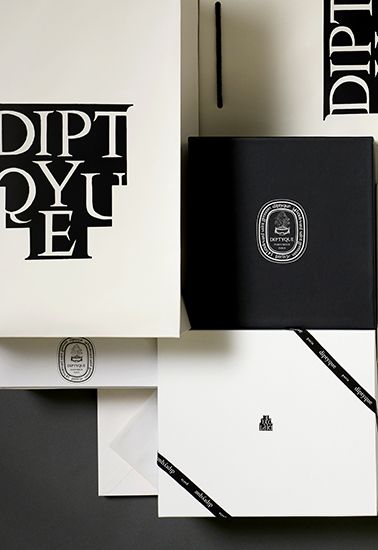
diptyque
Desmond Knox-Leet had all labels and illustrations for diptyque’s candles, eaux de toilette, and soaps printed in black India ink on a white background until 1993. The brand’s chromatic identity has evolved into a dialogue between black and white and, surprisingly, the myriad interpretations of this stark duet are by no means colorless. With each new creation, a spirit of collection takes shape with ever more definitive character.
ouai
Celebrity hairstylist Jen Atkin wanted to disrupt the haircare market with a chic AF brand for the girl who buys Zara but wears it like Celine.
With a brand that set the stage for trends and looked like the perfect accessory on bathroom counters across the world, the luxurious grey-scale palette added a sophistication and elegance that allowed their customer to shine

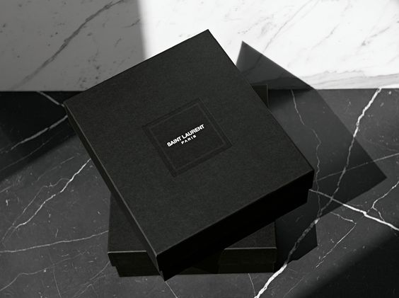
ysl
With a longstanding reputation in high fashion, Yves Saint Laurent uses the sophistication and luxury of black to attract their high-end customer. Many established fashion brands use black as the backdrop to their seasonal inspirations and couture creations.
An Example from Our Agency

carson nyquist
Carson Nyquist is a director based out of Atlanta, GA who creates content for brands like Facebook, Audi, Spotify, Twitter, Powerade, and ESPN. With such a wide roster of client work, a neutral palette allowed Carson’s brand to compliment his client’s branding and showcase his partnership with every film he creates.
Save for Later