How to Use the Color Brown in Your Brand’s Palette
I’m excited to share more insight into this natural and peaceful color and explain how it can best be used in marketing to appeal to your audience.
In this series, we will be heavily referencing Kassia St. Clair’s book The Secret Lives of Color. Her introductions to each color, and short stories on the most popular ones, are a beautiful history on how color names originated. I’ve only selected four of her famous tones to highlight, but the book is full of fascinating stories and tales from each hue, so be sure to pick up a copy!
In this post, you’ll learn…
The artistic history of the color
Four famous color tones and their stories
How that color is perceived by consumers
How to use the color in the four seasonal palettes
Notable brands recognized for using the color in their palette
As always, take this as a starting point for building your brand’s palette. There is not a formulaic system for choosing colors, but beginning with color exploration is a great place to start!
The Color Series: Brown
The History of Brown
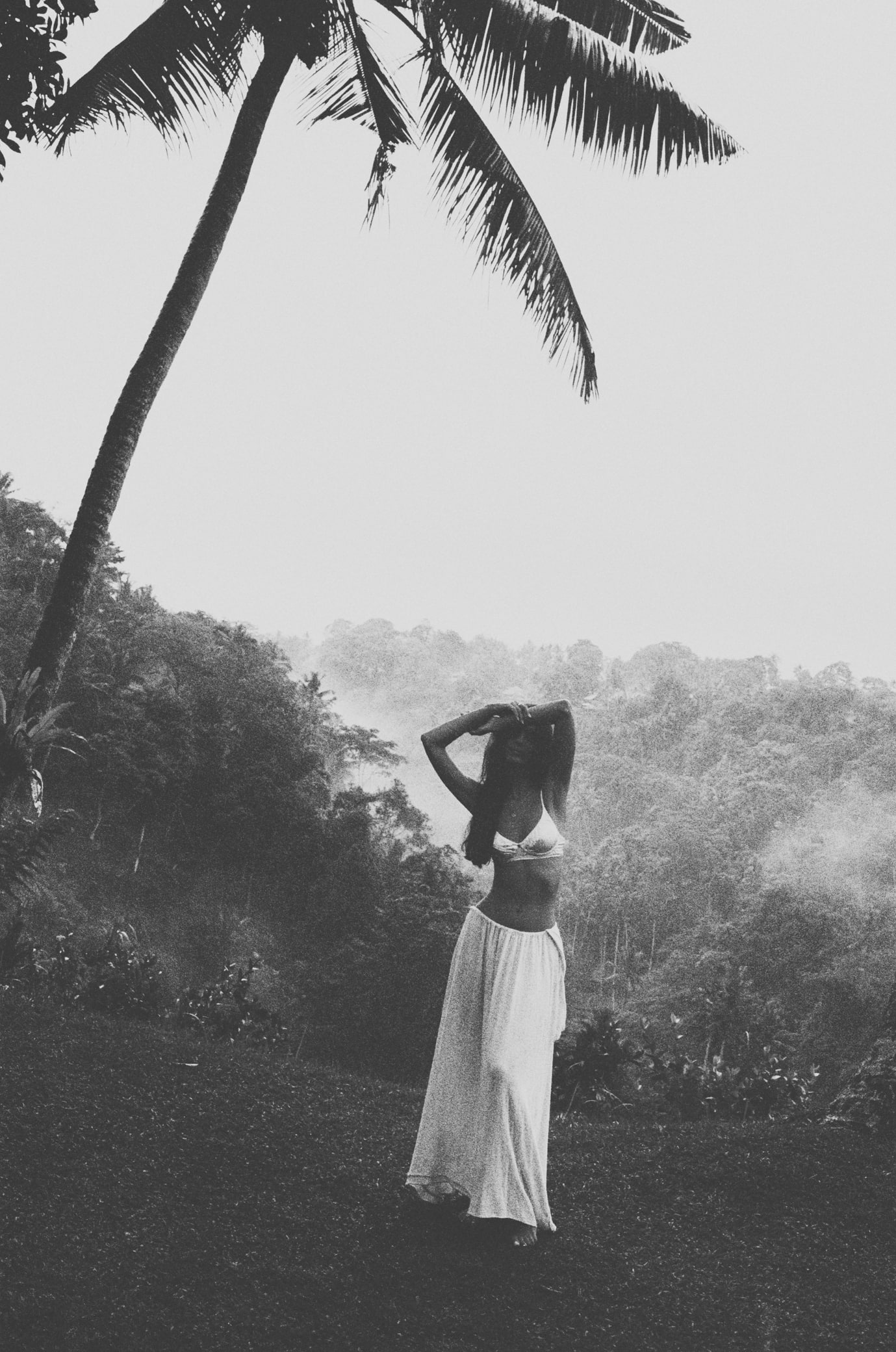
Brown is a grounding color.
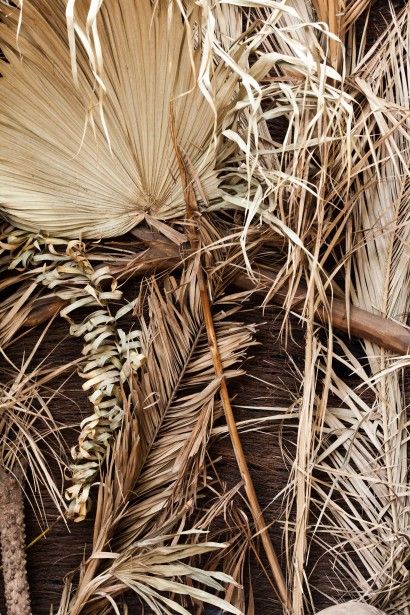
Interestingly, brown is not really a hue, but actually a shade. It is not found in a rainbow, but created by darkening and muting other colors, like yellow and orange. Historically, brown has been a popular pigment for artists to sketch out their ideas. When art was ripped away from ruined walls, the sepia tinted drawings remained.
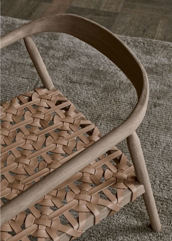
Brown has been considered a humble and reliable color – used to cheaply dye clothing and outfit a military uniform. Today, brown is considered a very versatile neutral that pairs well with bold colors like emerald green and sapphire blue.
The Psychology of Brown
friendly, grounded, dependable, conservative
Brown is considered the least popular color when it comes to marketing, but many established brands were actually built on this stable and dependable color! It it believed that brown’s wholesome earthiness helps customers to feel a sense of safety and belonging. Something that may help build trust and loyalty with new customers.
When using brown in your brand’s palette, consider replacing black with a darker brown to create a softer palette, or a light tan as a neutral to offset other colors. Brown can be a very versatile color that can both neutralize and balance a brand palette.
As an entrepreneur, consider your own personality among your friends and how you are perceived by friends. How might purple support or contrast your natural demeanor? If you’re not sure how to put words to your unique personality or communicate what makes you tick, you may want to do some work to develop a greater level of self-awareness before going through the branding process. I suggest starting with the Enneagram, which is the most powerful personality tool I’ve found to date!
Famous Browns
khaki
The color khaki was made for, and will forever be synonymous, with soldiers. In the late 1800’s, Sir Harry Lumsden ordered yards of white cotton and dyed the bright white cloth using tea, coffee, and mud so that soldiers would blend in with the dusty desert. This was the first time that European armies showed up to battle looking less like a parade and more like hunters.
buff
Today, “buff” is associated with shades of exposed skin, but actually originated as a shorthand word for “buffalo.” In the American Revolutionary War, Washington specifically requested “blue and buff” uniforms for his army, which caused the color to later become a symbol of liberty.

sepia
Sepia actually derives from the cuttlefish’s proper name Sepia officinalis and refers to the inky dark liquid that the fish extracts when startled. Originally, extracted ink from these fish produced the pigment used for writers and artists to compose poems and sketch drafts of masterpieces.
taupe
In the 1930’s the British Color Council set out to create a Dictionary of Color. One hue that gave researchers the run-around was taupe. Taupe is a french word meaning “mole,” but the actual pigment ranged in history from grey to brown. Today, taupe continues to be a very versatile color from context to context, a range of pastel brown-grays.
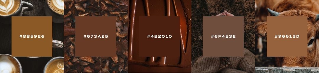
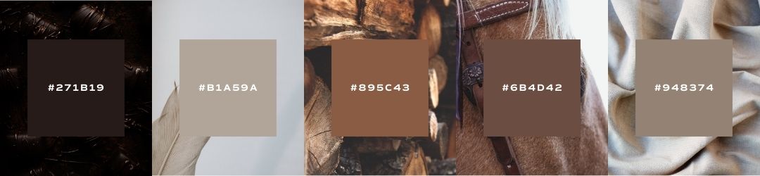
Seasons of Brown
I want to show you the ways that brown can be used in seasonal palettes. When we talk about a seasonal palette, it doesn’t mean that you’ll change your brand’s colors four times a year. Seasonal palettes are another way that we assign personality traits to palettes and organize visual cues into a cohesive story.
If you’ve never heard about seasonal color palettes, check out our introduction to color post to learn more!
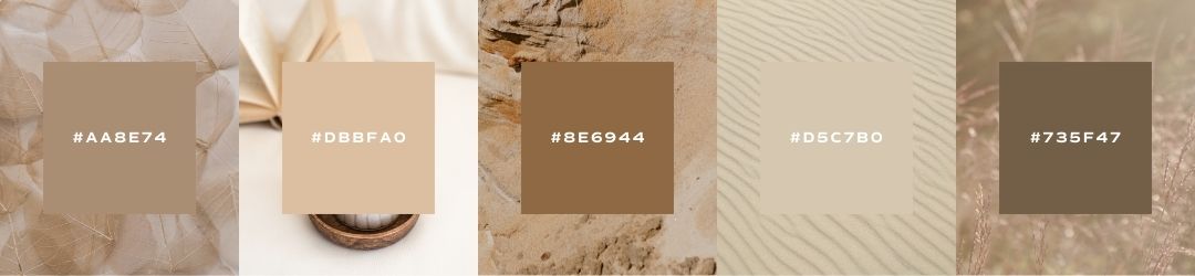
Spring
crisp, clean, light, delicate
When using brown in your spring palette, go for muted chocolate browns or bright buff colors that will highlight the delicacy of the other colors in your palette.
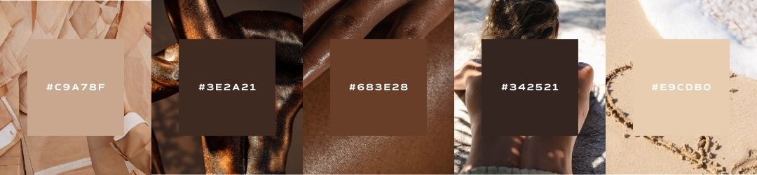
Summer
bold, elegant, strong, vibrant
When using brown in a summer palette, go for rich and warm chocolate browns that will accentuate your vibrant color scheme, or a muted tan to add balance and dependability if your palette seems too bold.
Autumn
organic, warm, muted, intense
Brown is a great color to add to a fall palette, because it will reinforce the rest of your earthy hues. Consider using both a light tan and dark brown to add a range of neutral tones.
Winter
dramatic, minimal, extreme, cool
When using brown in a winter palette, look for extremes – inky dark browns can replace blacks and grey-brown buff tones can replace, or compliment, whites for a dramatic and neutral color range that still offers versatility and depth.
Brown Brand Examples
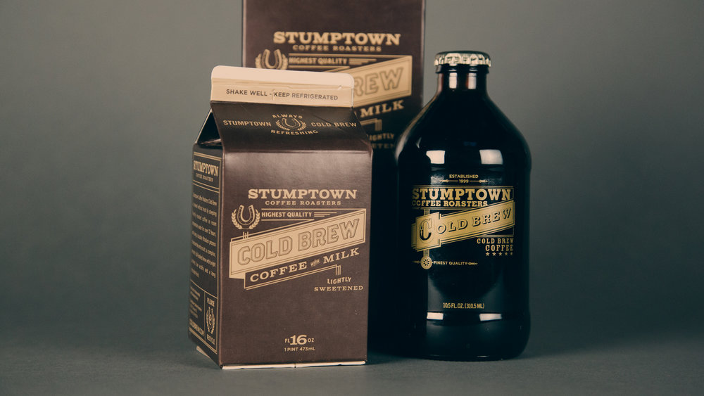
stumptown coffee
It is no surprise that a coffee roaster with as much credibility as Stumptown Coffee would use brown as the primary color in their brand’s palette. For a roaster, brown finds its way into the very process that creates their product – going from a green coffee bean to various shades of brown drinkable coffee grounds.
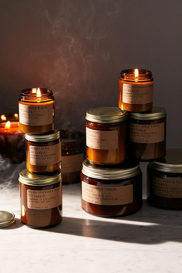
PF Candle Co.
For PF Candle Co, golden brown alludes to the warming flame that rises above each of their candles. Using brown in their packaging gives the candles themselves an amber glow that extends the experience of lighting a candle – making it look like it’s glowing from within.
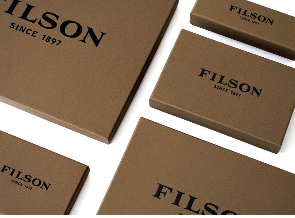
Filson
Filson is an outdoor clothing and accessories brand, with the tagline “unfailing goods.” As someone with experience using their products, they really stand the test of time and are travel proof for wear and tear. For this brand, brown ties back into their commitment to durability.
An Example from Our Agency
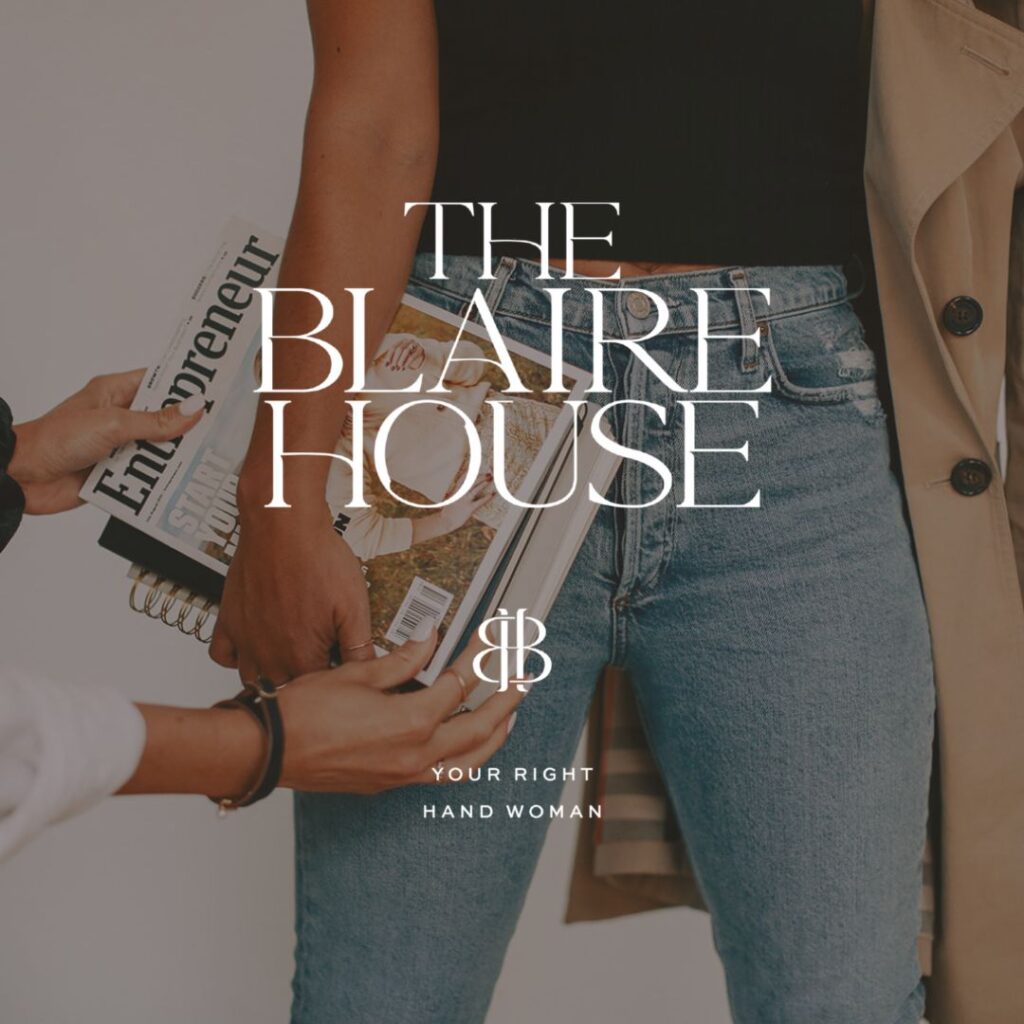
The Blaire House
The Blaire House is a systems and automation agency run by Brooke Sager. She is the right hand woman for online entrepreneurs and business owners looking to scale their business with cleaner systems and operations. The brown in the palette spoke to Brooke’s down-to-earth personality, grounding presence in high-stress situations, and reliability. Ultimately, it helped her brand build trust.
Save for Later