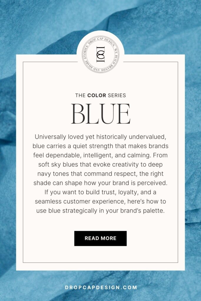
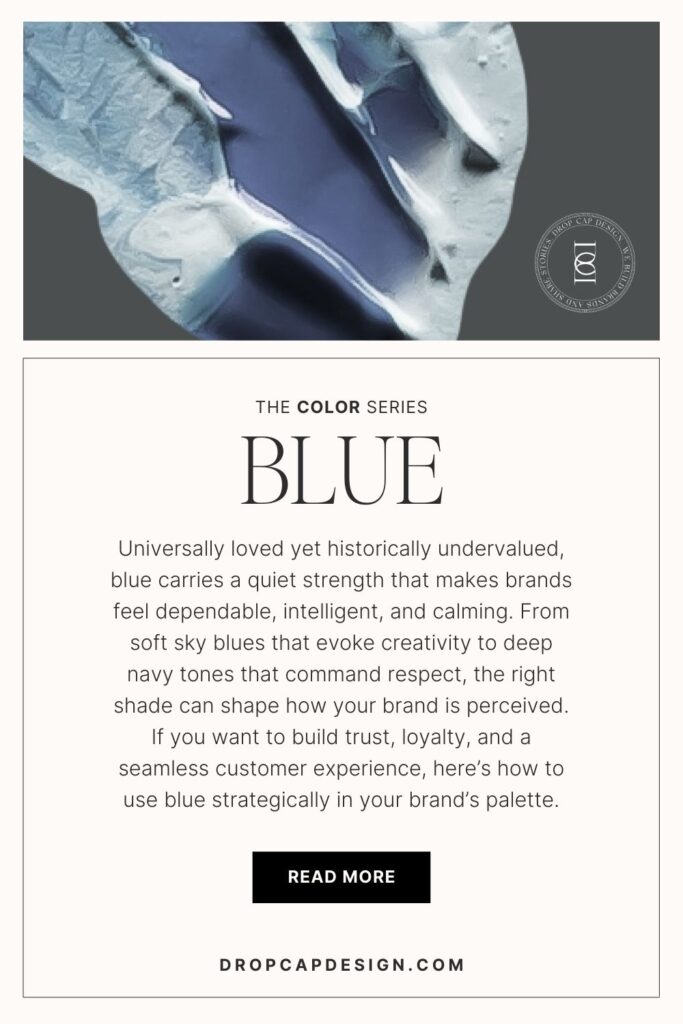
Welcome to post number seven of our color series! Today we’ll be talking about the color blue. Blue is a calming and universally loved color. Blue reminds us of the sky and the water. Its hues range from the dramatic royal to the timeless navy. I’m excited to share more insight into this natural and peaceful color and explain how it can best be used in marketing to appeal to your audience.
In this series, we will be heavily referencing Kassia St. Clair’s book The Secret Lives of Color. Her introductions to each color, and short stories on the most popular ones, are a beautiful history on how color names originated. I’ve only selected four of her famous tones to highlight, but the book is full of fascinated stories and tales from each hue, so be sure to pick up a copy!
In each post, you’ll learn…
The artistic history of the color
Four famous color tones and their stories
How that color is perceived by consumers
How to use the color in the four seasonal palettes
Notable brands recognized for using the color in their palette
As always, take this as a starting point for building your brand’s palette. There is not a formulaic system for choosing colors, but beginning with color exploration is a great place to start!
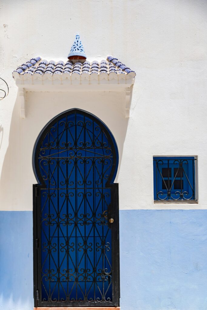
The History of Blue
Blue is a popular color.
While universally loved, it has been historically undervalued. Without the fame and glory of colors like red and purple, blue was widely overlooked until the twelfth century. This is when the French designed their gold on azure fleur-de-lis and other European coat of arms followed suit.
Interestingly, blue’s association with trust came from its common use in military uniform. Specifically with the navy (hence the name navy blue). But it was only used in those uniforms because the color was the most resistant to harsh elements, like sun and the sea.
The Psychology of Blue
trust, strength, RELAXATION, self-sufficiency, purpose
Blue is the most universally loved color by consumers. Brands with blue are often thought to have better customer service, experience more loyalty from clients, and have a more relaxing sales experiences. Blue is also considered a productive and no-nonsense color. Which is why you’ll also find it in many start-ups that want to build trust.
When using blue in your brand’s palette, remember that lighter blue tones are often associated with creativity. Muted sky and sea tones have a calming effect, and dark blue gives an air of intelligence and purpose. Soft blues can make a customer feel safe and serene, while dark and rich blues make a client feel supported and strengthened. There is an unmistakable power in the color blue.
As an entrepreneur, consider your own personality among your friends and how you are perceived by friends. How might purple support or contrast your natural demeanor? If you’re not sure how to put words to your unique personality or communicate what makes you tick, you may want to do some work to develop a greater level of self-awareness before going through the branding process. I suggest starting with the Enneagram, which is the most powerful personality tool I’ve found to date!
Famous Blues
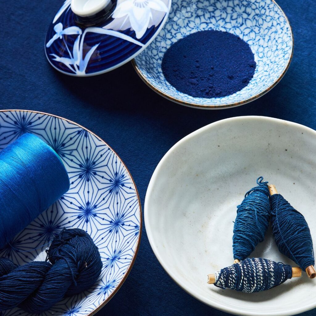
indigo
It seems that the process for dying wool cloth a dark blue started in 600 B.C. with the Babylonians. Today, indigo is used to dye denim and every fiber from silk to linen. The reason this color has become such a staple is due to its durability, its beautiful aging process, and its phenomenon of outlasting other colors it’s combined with.
cobalt
This color has a fascinating story. After World War 2, a Dutch painter was accused of collaborating with the Nazi party and making a fortune from selling Vermeer paintings. If found guilty, he would face the death penalty. However, the painter swore that the pieces were not real and that his only crime was forgery. Museum and art critics refused to believe him, but a shade of cobalt blue that would not have been available in Vermeer’s day gave it away. While the painter was only sentenced to a year in prison for forgery, he died only a month in from what many consider to be a broken heart.
egyptian blue
Before blue was truly valued in the west, Egyptians were enthralled by what they found to be a spiritually powerful color. Blue was thought to ward off evil and protect the dead on their journey into the afterlife. Because turquoise was hard to find and azurite was difficult to carve, the Egyptians created their own blue by firing and combining chalk, a copper mineral, and sand. The result was a blue that was so versatile and long lasting that balls of Egyptian blue pigment are still found in Roman excavations to this day.
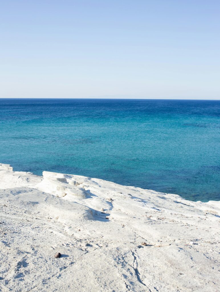
cerulean
This is known as the color of peace. Many Hindu gods have this sky-colored skin and the United Nations adopted a cerulean background as a sign of peace and tranquility. Pantone named a version of this color as the color of the new millennium, because they felt that consumers would be looking for inner peace and spiritual fulfillment. However, this color is also often associated with grief and loss, expressing deep and difficult matters of the human spirit.
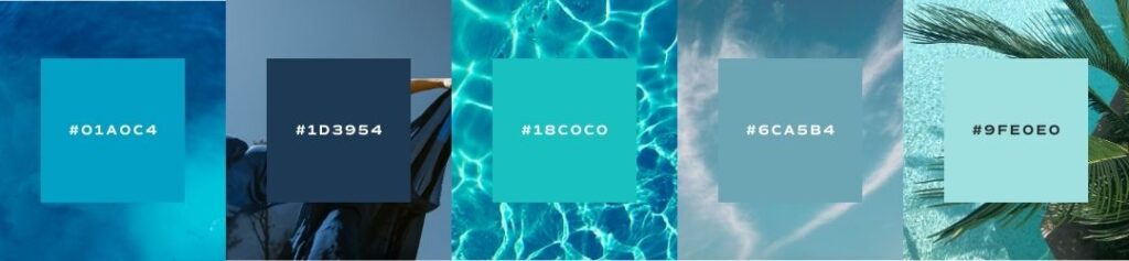
Seasons of Blue
I want to show you the ways that blue can be used in seasonal palettes. When we talk about a seasonal palette, it doesn’t mean that you’ll change your brand’s colors four times a year. Seasonal palettes are another way that we assign personality traits to palettes and organize visual cues into a cohesive story.
If you’ve never heard about seasonal color palettes, check out our introduction to color post to learn more!
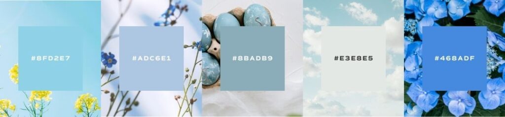
Spring
crisp, clean, light, delicate
When using blue in your spring palette, go for soft and light natural blue tones found in the sky and the ocean. These paler colors will compliment a pastel palette and keep your other hues looking light and fresh.
Summer
bold, elegant, strong, vibrant
When using blue in your summer palette, go for bold and bright tones. Also consider using a classic navy or royal blue that may compliment more classically nautical tones. It will also give support to other vibrant colors.
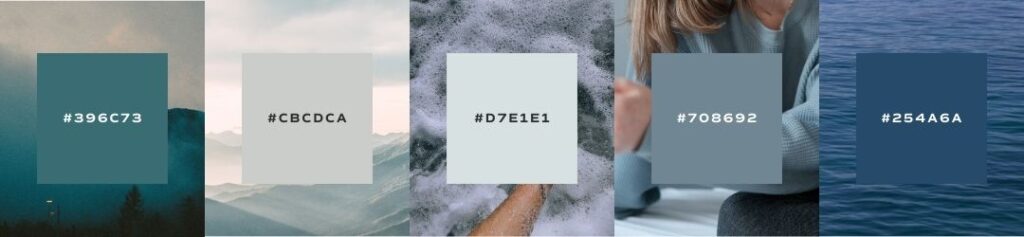
Autumn
organic, warm, muted, intense
When using blue in your autumn palette, look for grey, muted blue tones like indigo and slate. These colors will add an earthy neutrality to your other organic hues.
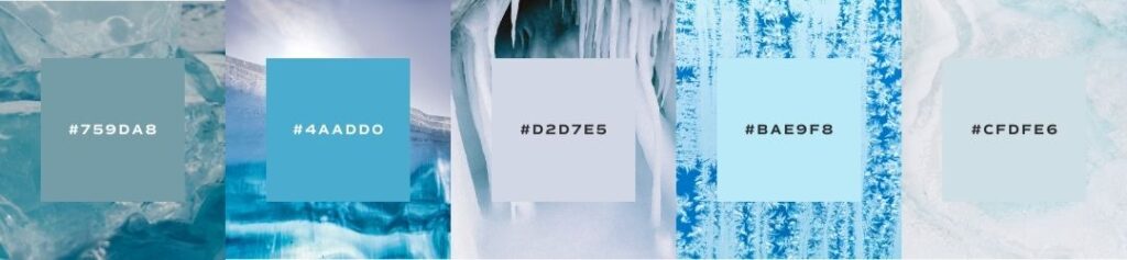
Winter
dramatic, minimal, extreme, cool
When using blue in your winter palette, consider using vibrant ice tones. You can find lots of inspiration from natural minerals, but be sure to keep the color temperature fairly cool to match your other tones.
Brand Examples
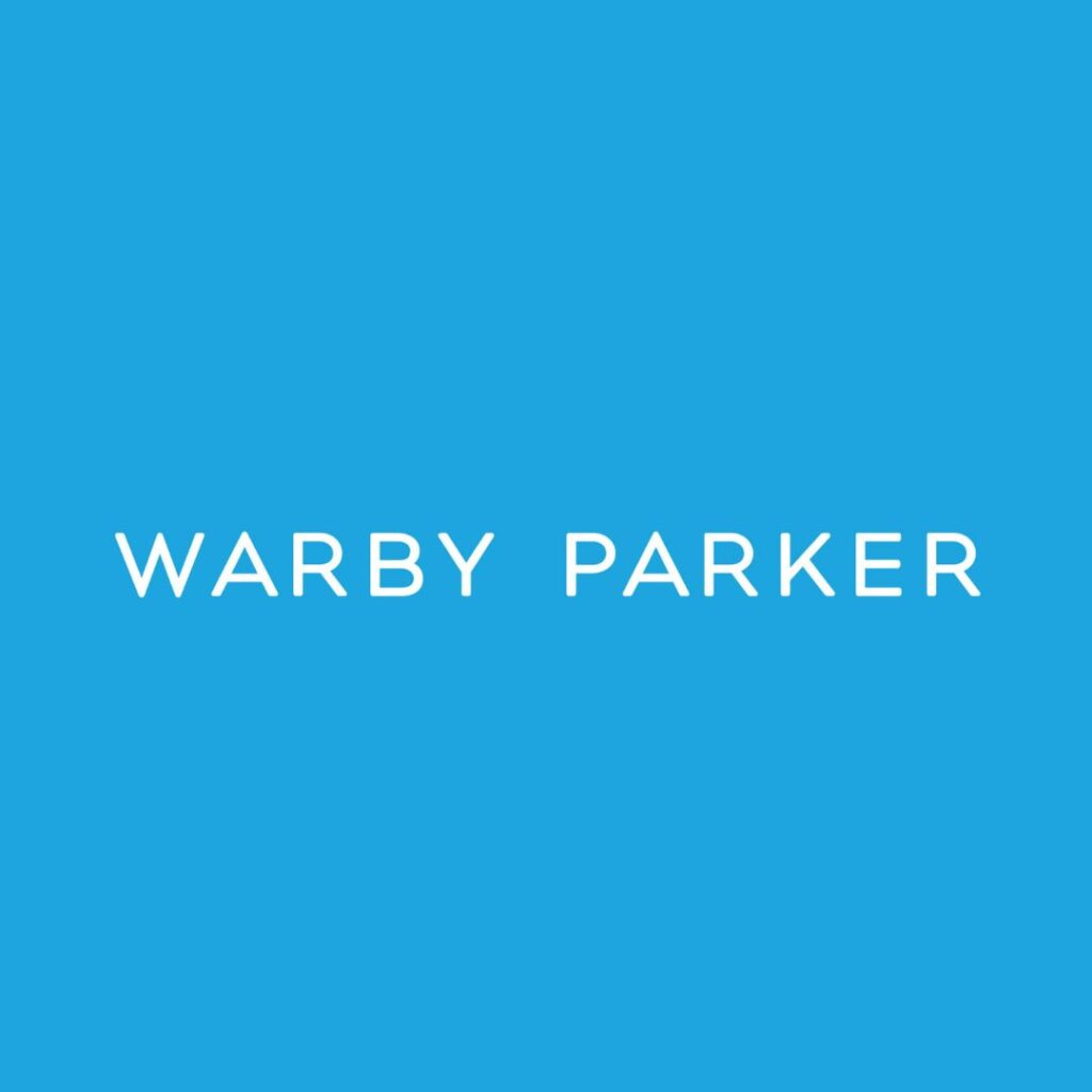
warby parker
Warby Parker shook the eyewear industry with their innovative digital platforms and direct-to-consumer business model. Because they were doing something new and risky in a long-established industry, blue was a great color for the brand to build trust. However, using a lighter blue gave the brand a more youthful and energetic personality that appealed to a younger market.
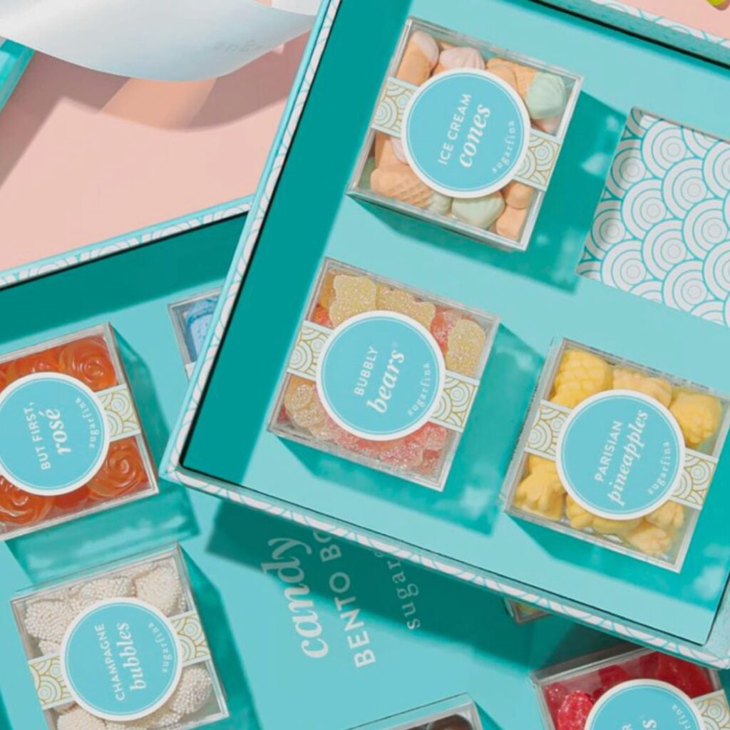
sugarfina
Sugarfina is the sweet treat boutique of luxurious Beverly Hills. With 24K gold marshmallows, champagne gummy bears, and real cocktails adorned with the sweetest of treats, this is not your average candy shop. Packaged in Tiffany-blue boxes, this brand adopts the cool icy tones of a blue winter palette, the perfect accent to add a bit of playful self-care in a luxurious atmosphere.

outdoor voices
Outdoor Voices is a brand that embraces the outdoors. Their soft muted blue tones and comfortable athleisure encourage a lifestyle of yoga, hiking, and outdoors exploration while relaxing and enjoying the feeling of being in nature. They have used a blue autumn palette to keep the brand earthy and organic while adding a tone of peace and serenity.
An Example from Our Agency
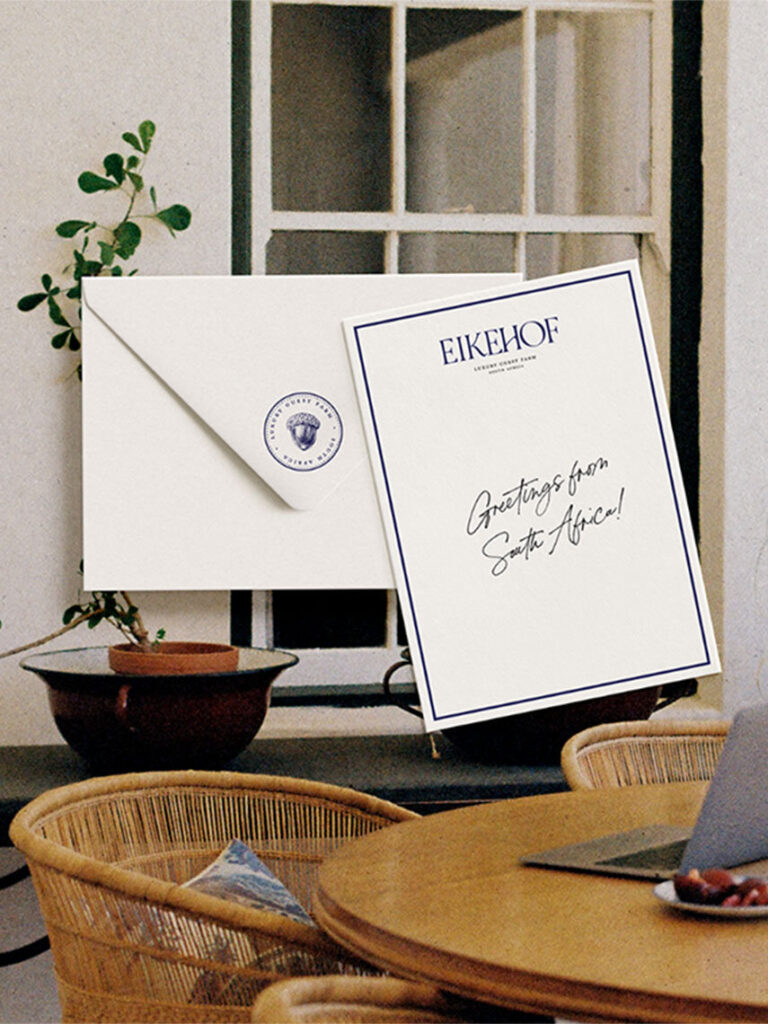
Eikehof Farm
Eikehof Farm is a guest luxury farm and wedding venue in South African right outside of Cape Town. This incredible property has been around since the Dutch East India Trading Company in 1791, so we wanted to pay homage to its Dutch roots and the original owners with a traditional Dutch blue palette. Blue is also an established color and brings a level of authority and sophistication, which was the perfect option for this brand as we designed and planned for their next, elevated chapter.
Save for Later