


How to Use the Color Purple in Your Brand’s Palette
Welcome to post number six of our color series! Today we’ll be talking about the color purple. Purple is a spiritually rich and striking color with a long history in royal families. This hue was once considered the forbidden color, and while it’s now accessible to anyone, it maintains a bit of its former mystery. I’m excited to share more insight into this luxe and imaginative color and explain how it can best be used in marketing to appeal to your audience.
In this series, we will be heavily referencing Kassia St. Clair’s book The Secret Lives of Color. Her introductions to each color, and short stories on the most popular ones, are a beautiful history on how color names originated. I’ve only selected four of her famous tones to highlight, but the book is full of fascinated stories and tales from each hue, so be sure to pick up a copy!
In each post, you’ll learn…
The artistic history of the color
Four famous color tones and their stories
How that color is perceived by consumers
How to use the color in the four seasonal palettes
Notable brands recognized for using the color in their palette
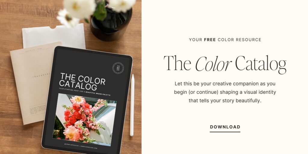
As always, take this as a starting point for building your brand’s palette. There is not a formulaic system for choosing colors, but beginning with color exploration is a great place to start!
The History of Purple
Purple is a sacred color.
“To be born into purple is to be born into royalty.”
Purple has a long history of being associated with powerful rulers and aristocratic royalty. It’s a widespread, international belief that purple is set apart and signifies power in a way that no other color can convey. In fact, purple is not actually part of the traditional color spectrum (violet is the shortest wavelength humans can see!)
Purple has also historically been associated with God’s glory and generosity. In many religions, purple is symbolic of virtue and faith. Within the Buddhist faith, an amethyst purple stone is considered sacred. In the Christian faith, purple is used during the Advent and Lent seasons. In the US Army, a Purple Heart award is given to soldiers who exemplify outstanding bravery and courage in combat.
The Psychology of Purple
SPIRITUALITY, INTUITION, MYSTERY, WEALTH, CREATIVITY
While purple has very positive connotations, it’s a difficult color to work with when it comes to marketing. Nestled between two strong and dominant colors (red and blue), purple takes on some of the aggression found in red and the calm found in blue, creating tension if not carefully considered.
When using purple in your brand’s palette, consider the temperature of your other colors. If your palette is on the warmer side, add more red to your purple hue. Purple is best used as a supporting color, because it doesn’t “pop” the way other colors do. This is mainly due to its short visual wavelength.
As an entrepreneur, consider your own personality among your friends and how you are perceived by friends. How might purple support or contrast your natural demeanor? If you’re not sure how to put words to your unique personality or communicate what makes you tick, you may want to do some work to develop a greater level of self-awareness before going through the branding process. I suggest starting with the Enneagram, which is the most powerful personality tool I’ve found to date!
Famous Purples
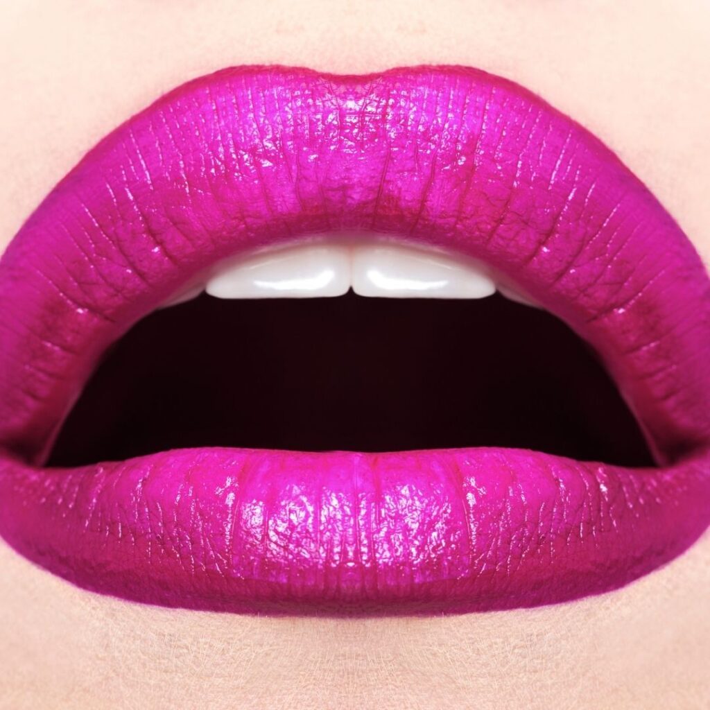
magenta
Ironically, this color was first used in European army clothing. Because a name like “fuschia” would not work to convey a majestic and assertive military, the hue was named “magenta” in honor of a small town in Milan where a French army won a battle against the Austrians. Similar to most shades of purple, its value declined as the color because more available to the public, but the name remained in use due to CMYK color printing (even though it is a decidedly more pink tone today!)
mauve
This pigment was discovered by an ambitious 18-year-old teenager who was experimenting with coal tar in an attempt to find a cure for malaria. Instead, he found a chemically-manufactured shade of purple that took Europe by storm and made him a very rich and well-respected man by the age of 21. However, as it ran its course through fashion and soon became out of fashion, it developed connotations with age. Oscar Wilde wrote, “Never trust a woman who wears mauve. It always means they have a history.” However, the experimentation with coal tar later led to the discovery and development of modern day chemotherapy.
heliotrope
In the Victorian era, heliotrope signified devotion and was an acceptable color to wear during “half-mourning” – for widows, a whole two years after full-mourning was complete. After a massive outbreak of influenza in the late 1800’s, the city was awash with black, grey, and heliotrope for the next year.
violet
Such a controversial color of the Impressionist movement, Monet and his peers were ridiculed for their over-use of violet in their landscape paintings. Many wondered if the sunlight had damaged their eyes, if they were truly mad, or if they had super-human abilities to see into the ultra-violet spectrum. Today, many believe that the use of violet came from Monet’s belief that shadows were never really black or gray. It was also the compliment on the color wear to a sun-soaked yellow.
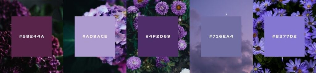
Seasons of Purple
I want to show you the ways that purple can be used in seasonal palettes. When we talk about a seasonal palette, it doesn’t mean that you’ll change your brand’s colors four times a year. Seasonal palettes are another way that we assign personality traits to palettes and organize visual cues into a cohesive story.
If you’ve never heard about seasonal color palettes, check out our introduction to color post to learn more!
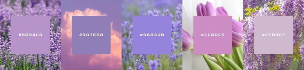
Spring
crisp, clean, light, delicate
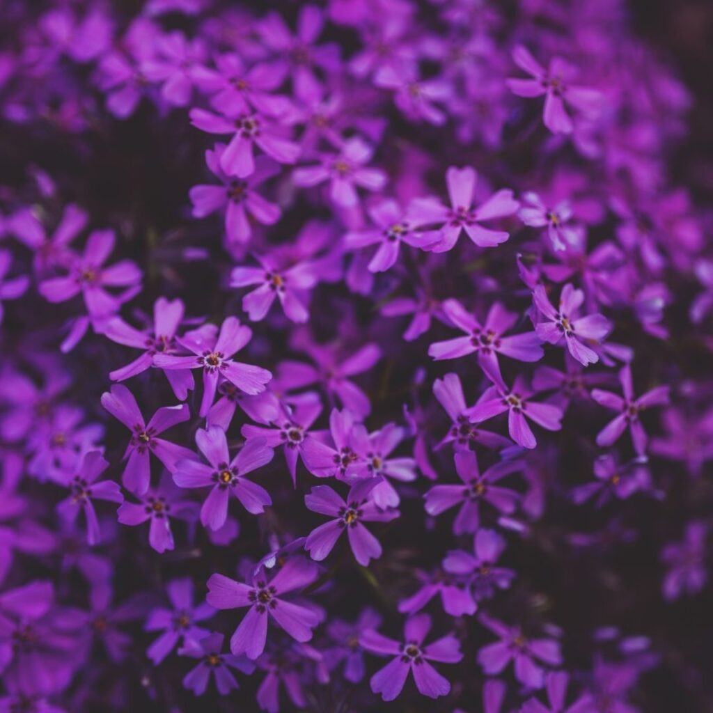
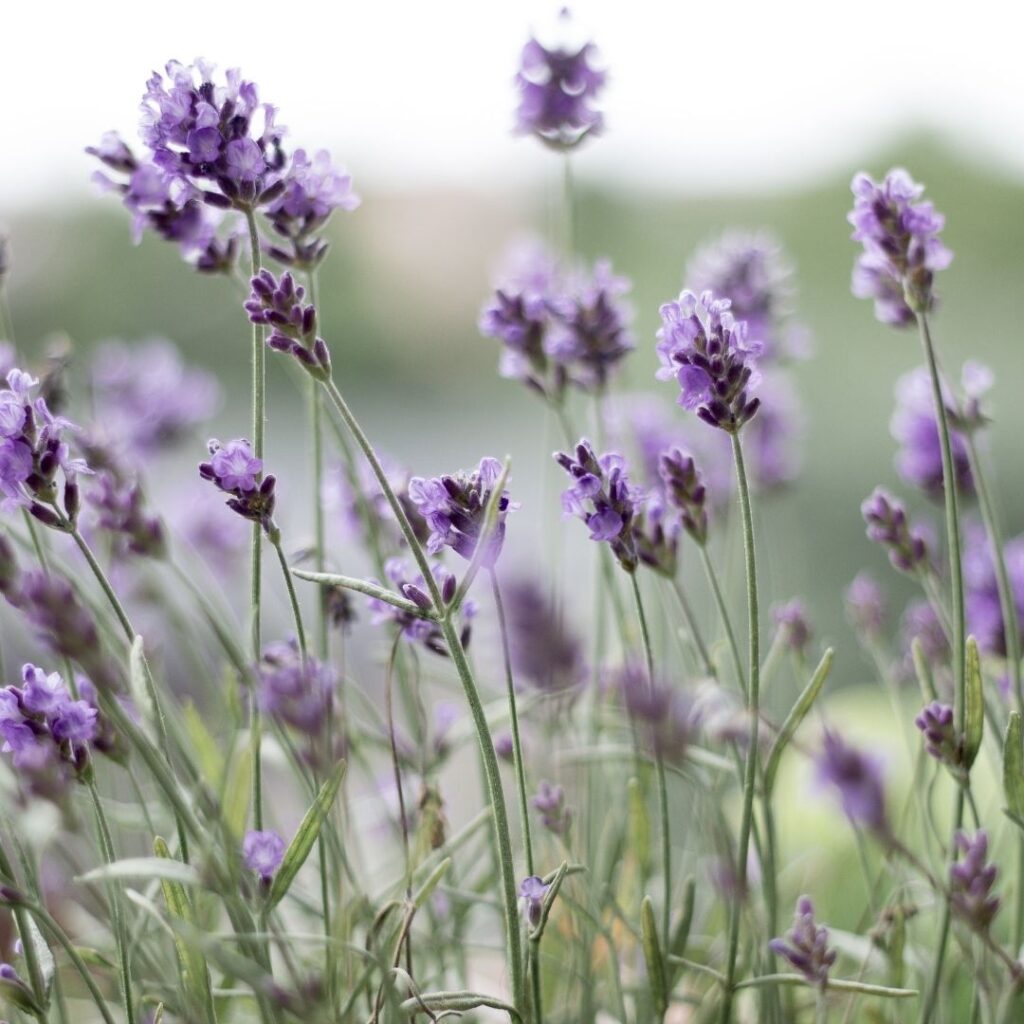
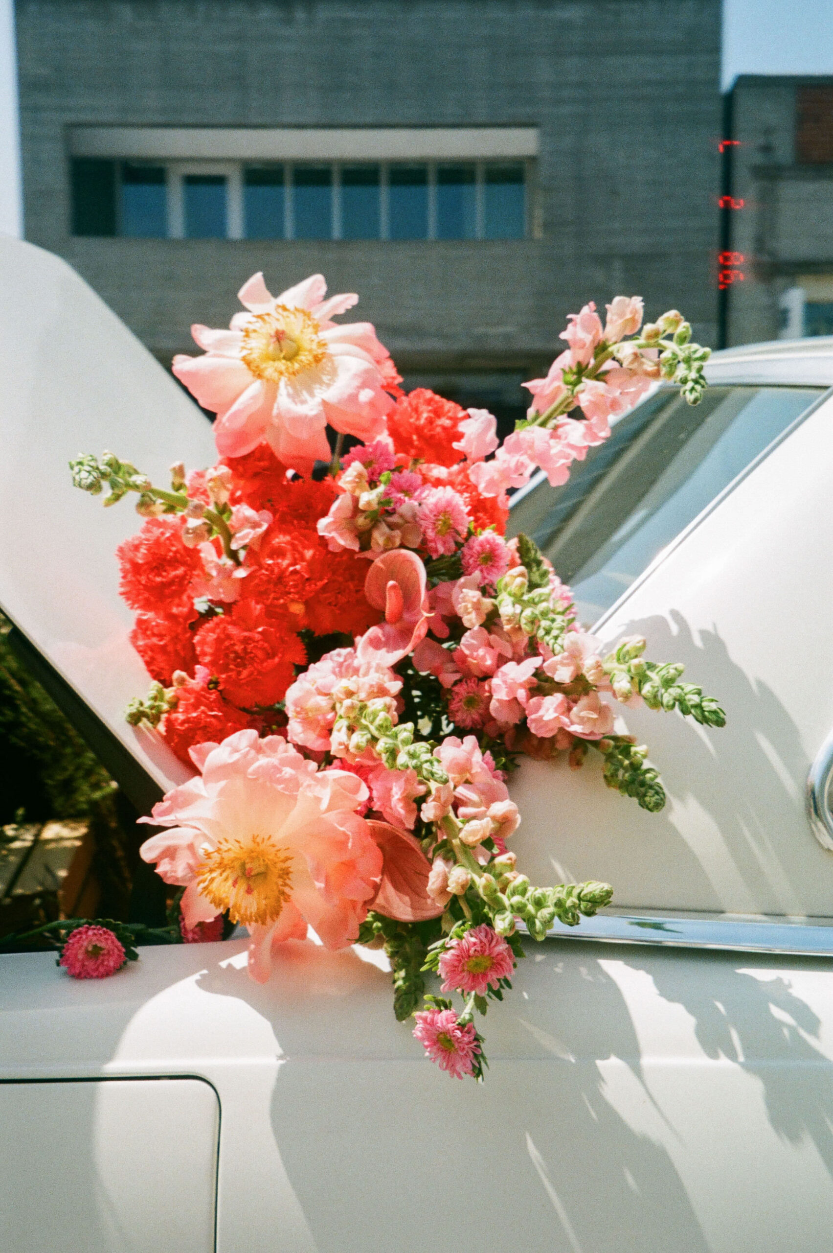
When using purple in your brand’s spring palette, try a soft pastel purple that won’t compete with your primary colors. Think about using floral purples, like violet, heliotrope, or lavender to signify the natural blossoms of the spring season.
Summer
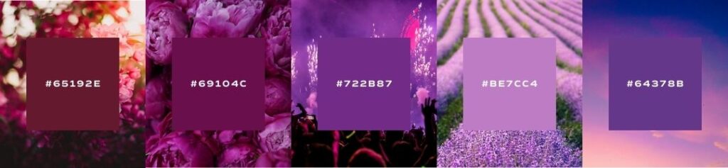
bold, elegant, strong, vibrant
When using purple in a summer palette, don’t be afraid to use the bolder purples available to you. A rich magenta or warm reddish-purple will compliment other bold and vibrant tones in your palette.
Autumn
organic, warm, muted, intense
When using purple in your autumn palette, look for darker, more muted hues. With an earthy palette, it can be hard to make purple look natural, so go for deeper burgundies and bluer purples to add a striking contrast to other earthy tones.
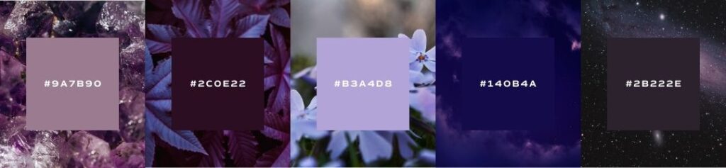
Winter
dramatic, minimal, extreme, cool
When using purple in your brand’s winter palette, look for crisp blue-purples that are cooler in temperature. Purple is such a striking color that it can be especially appropriate in a winter palette with other extreme and dramatic colors.
Brand Examples

Instagram uses a rainbow of color in their brand palette to exemplify inclusivity and the setting sun. However, their rich violet tone certainly stands out. A major reason for such a bold and eye-catching purple tone is its gender-equality and widespread acceptance as a brand color. Paired with its aggressively red and calming blue counterparts, violet rounds out the palette and communicates the social media powerhouses’ ambitiously innovative technology and inclusive digital community.
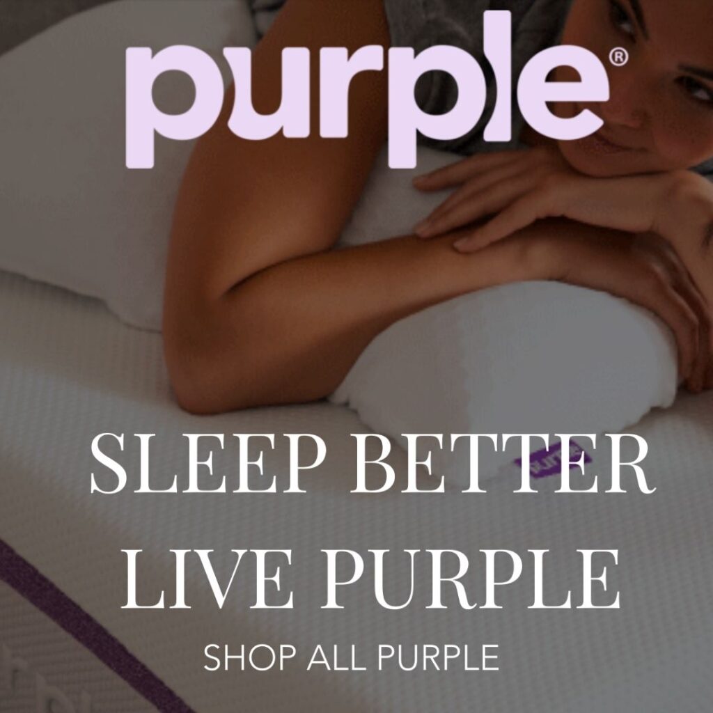
Purple
Purple strategically uses its namesake color to evoke a sense of luxury, innovation, and restfulness. As a blend of red’s energy and blue’s calm, purple symbolizes both rejuvenation and relaxation, reinforcing the idea that their mattresses provide both support and comfort. Psychologically, the color also conveys creativity and uniqueness, helping Purple stand out in a crowded market and positioning their technology as a revolutionary approach to better sleep.
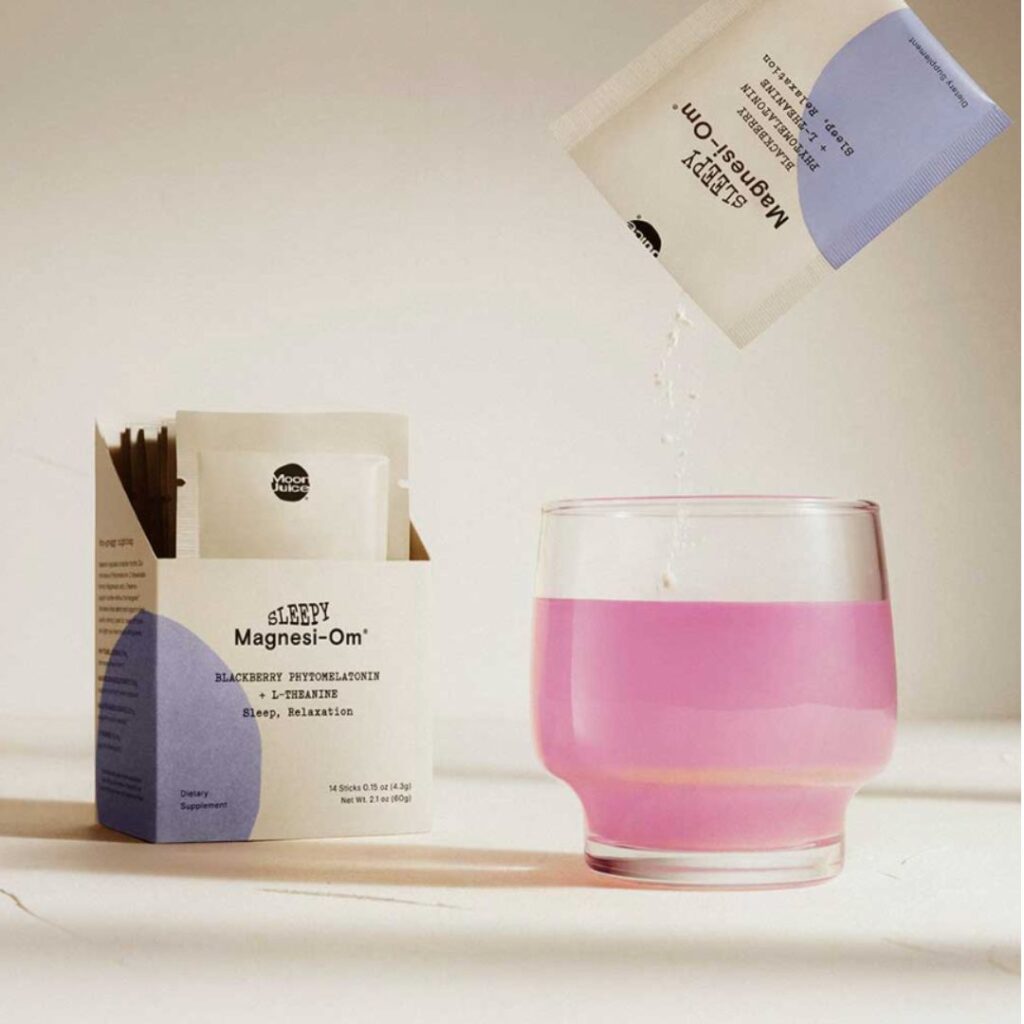
moon juice
Moon Juice’s brand purple is inspired by the spiritual and mystical powers of the amethyst stone. A wellness brand with a strong spiritual component, their crystalesque color tones give off the mystic and imaginative personality of their company and clientele.
An Example from Our Agency
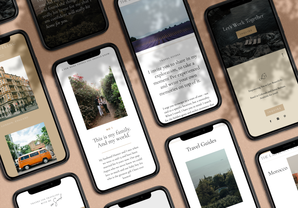
Sarah Lawrence
To be honest, I haven’t worked with the color purple very often in branding projects. It’s a difficult color to work with and usually doesn’t find its way into mood boards very often. However, when working with Sarah Lawrence, we were so inspired by her images of lavender and world travel that found their way into the brand palette and complimented the more earthy primary colors of the brand.
save for later


I love this series! Your post on purple could not have been more perfectly timing. We just wrapped up a brand that is painted purple! Purple was chosen for it’s strength, spirituality and association with royalty. Part of it’s royal and spiritual significance is that it is rarely found in nature, so it is considered holy or from a higher power!
Again, loving this!
Meredith
That’s amazing!! I rarely get the chance to work with purple on a branding project (it’s such a bold color!) but recently was able to and felt like it added a lot to the design process!