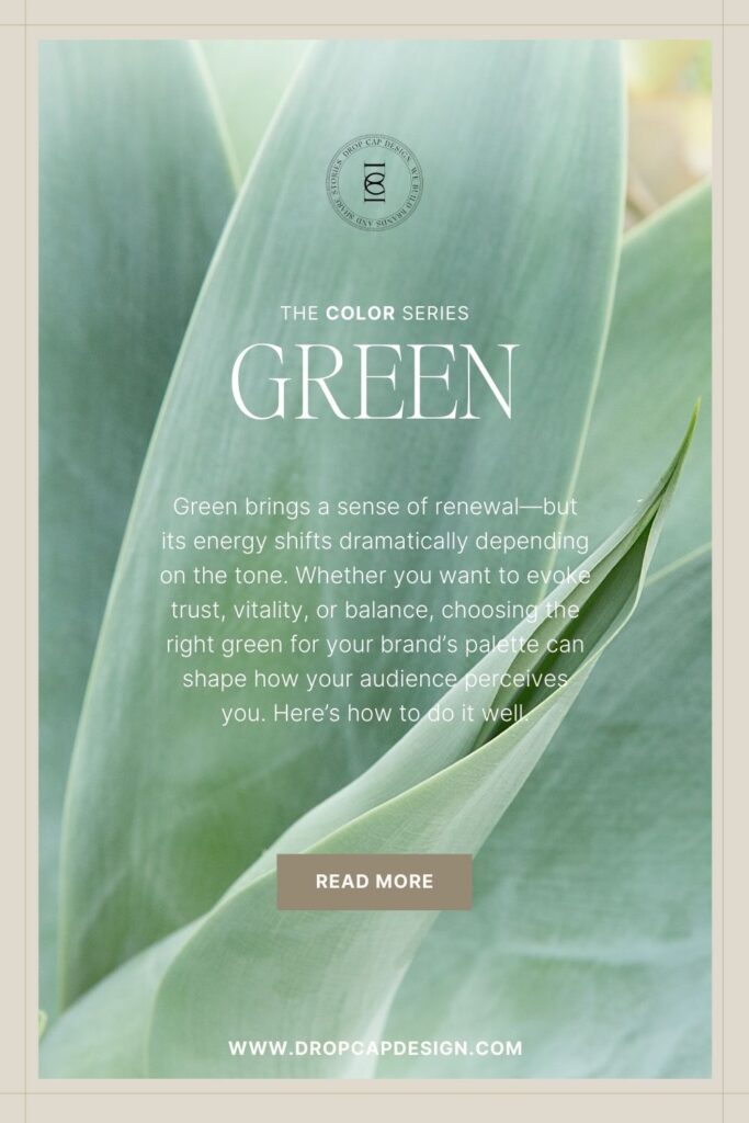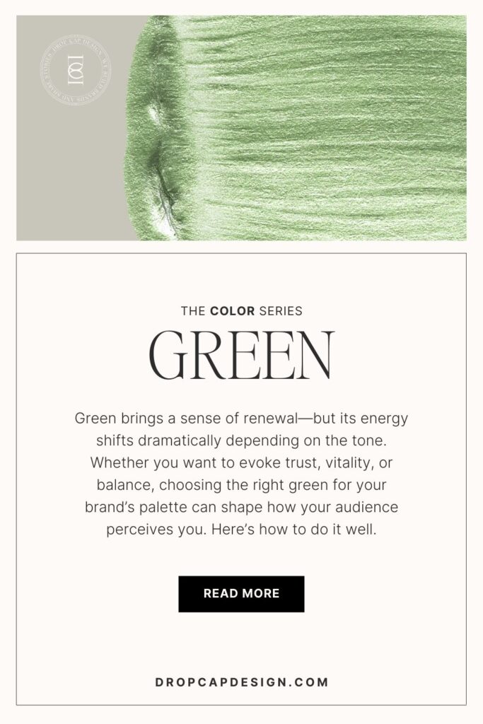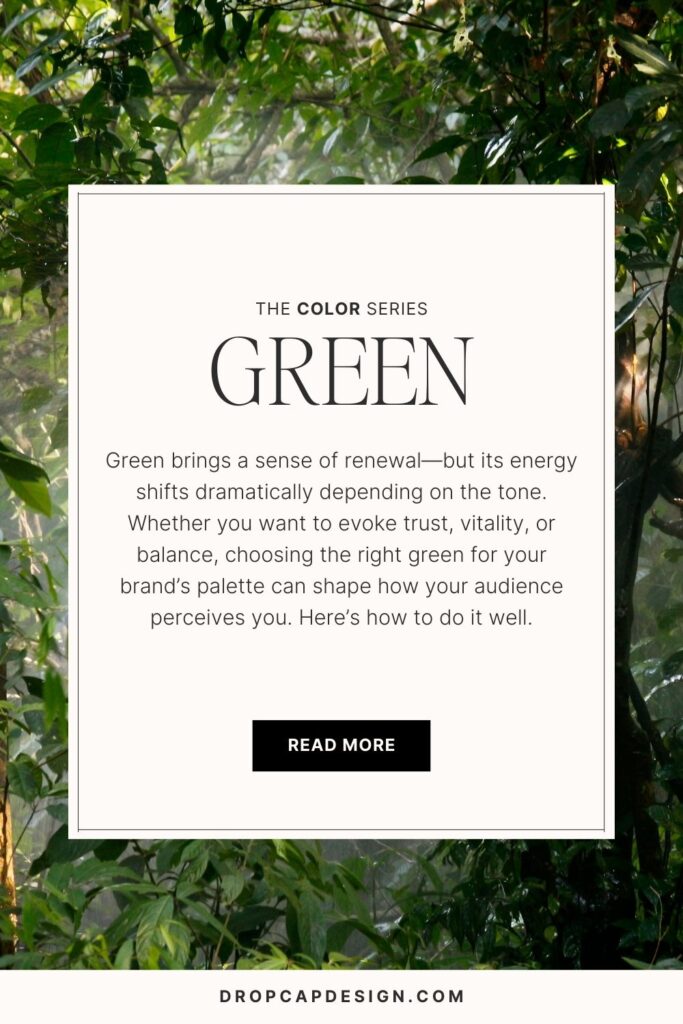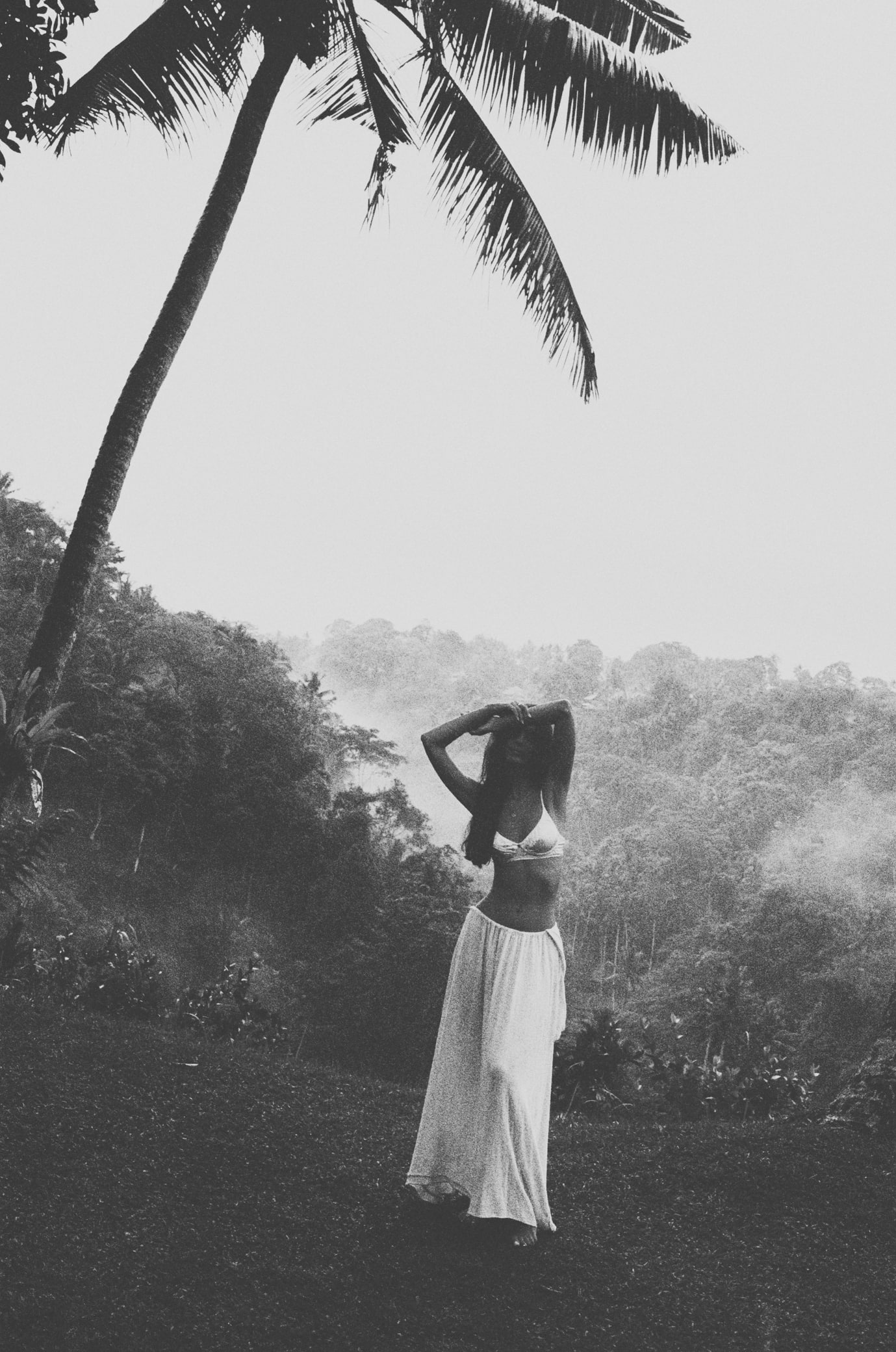


Welcome to post number eight of our color series! Today we’ll be talking about the color green. Full of life and abundance, green is a renewing and prosperous color that makes us feel rested and secure. I’m excited to share more insight into this refreshing color and explain how it can best be used in marketing to appeal to your audience.
In this series, we will be heavily referencing Kassia St. Clair’s book The Secret Lives of Color. Her introductions to each color, and short stories on the most popular ones, are a beautiful history on how color names originated. I’ve only selected four of her famous tones to highlight, but the book is full of fascinated stories and tales from each hue, so be sure to pick up a copy!
In each post, you’ll learn…
The artistic history of the color
Four famous color tones and their stories
How that color is perceived by consumers
How to use the color in the four seasonal palettes
Notable brands recognized for using the color in their palette
As always, take this as a starting point for building your brand’s palette. There is not a formulaic system for choosing colors, but beginning with color exploration is a great place to start!

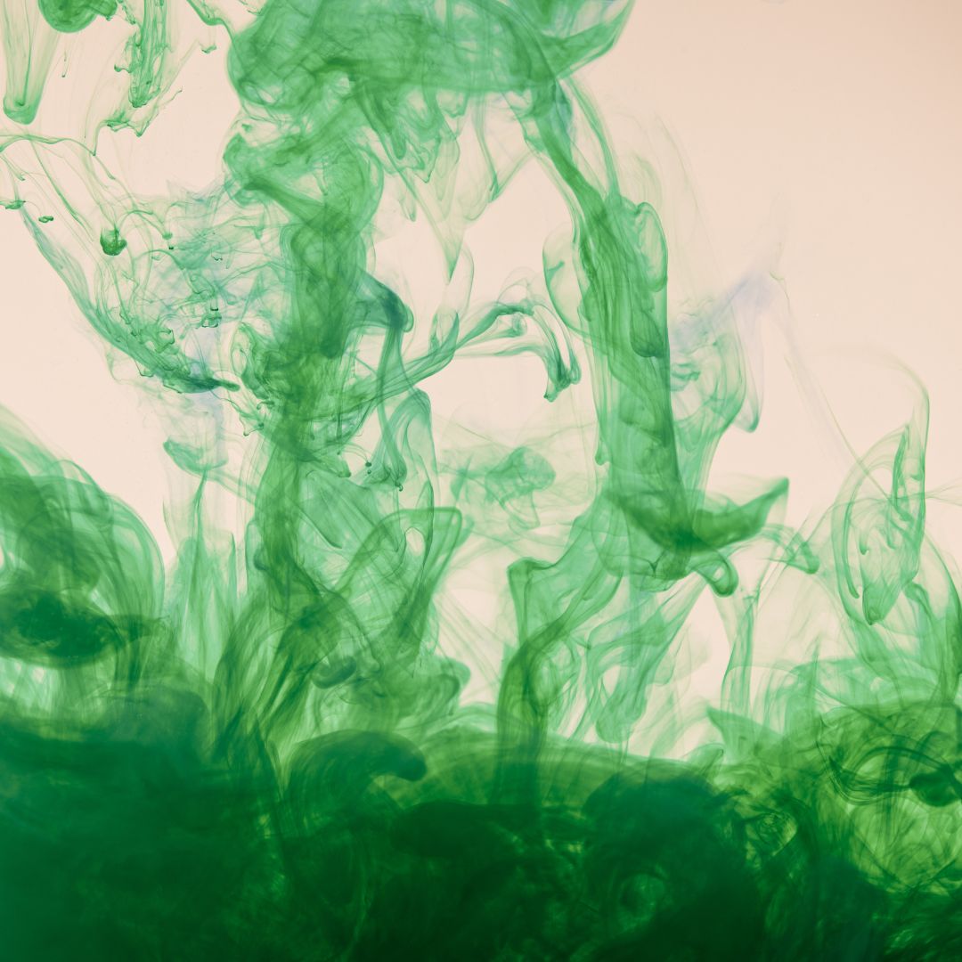
The History of Green
Green is a healing color.
In the east, green was a spiritual color that’s associated with the idea of “paradise”. As well as the natural growth and renewal of spring. The Latin word for green is “viridis” which relates to a large collection of words associated with growth, life, vigor, and strength. In the west, green had a similar association with the natural world and spring season. However, green did not show up as often in historic artwork. This was because of a weird connotation around mixing colors and a disagreement around which colors combined to form the green tone. Because of this, green was a rare color to find.
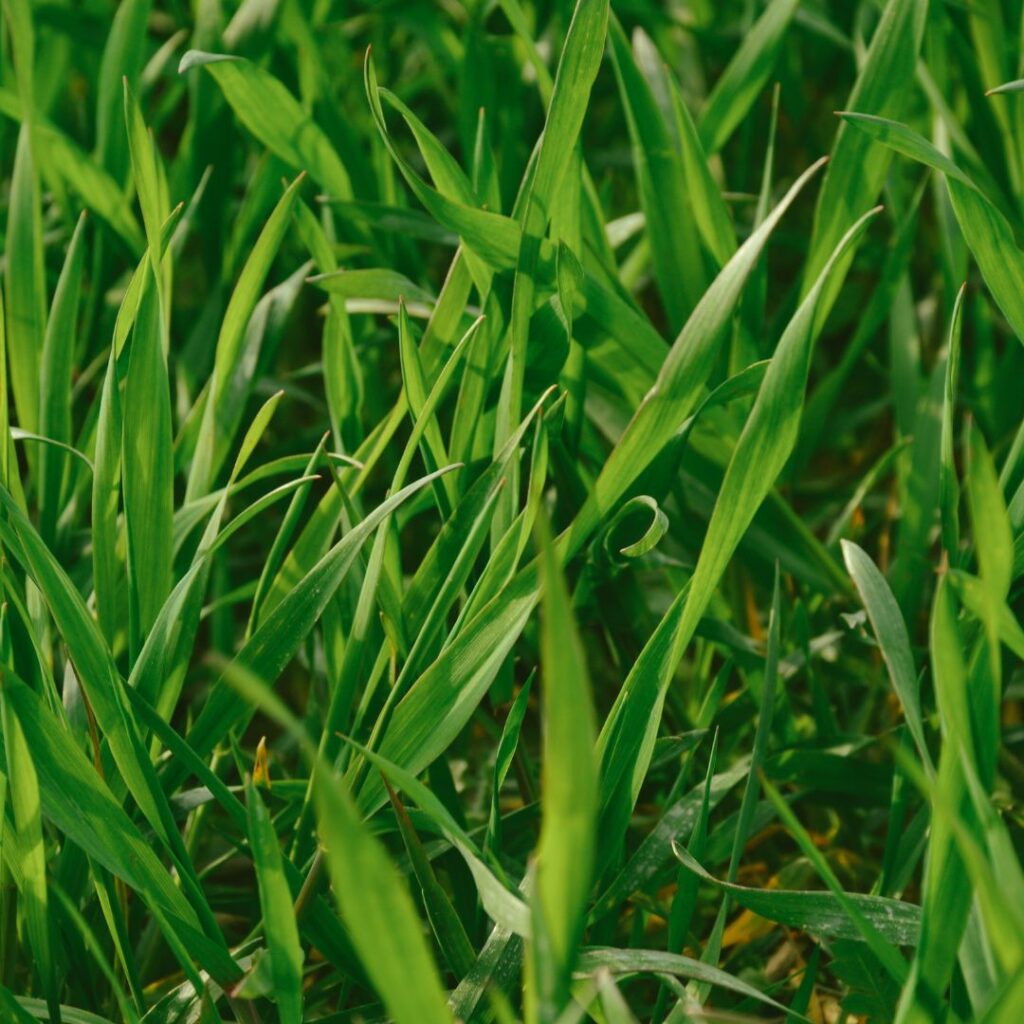
Today, green is still associated with the natural world, but also carries an environmentally-friendly message in politics. We have many modern sayings linked to the color, like “the grass is always greener on the other side” and “getting the green light.”
The Psychology of Green
growth, harmony, health, nature, abundance
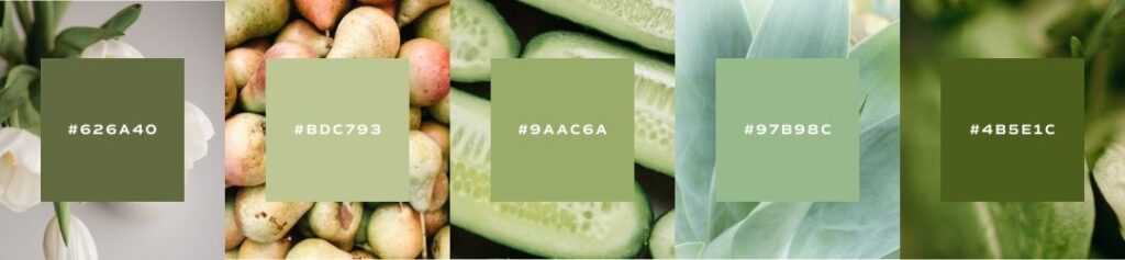
Green has a wide range of tones, and because of that, a very large range in energy levels. A dark hunter green is calming while a brilliant lime green is very high-energy. It also is a mix of blue (a cool color) and yellow (a warm color). Which gives it a balanced temperature that can lean either way in your brand’s palette.
When using blue in your brand’s palette, really consider your brand’s seasonal palette. Because of the large range in hues, green can express vastly different personality traits. So, you’ll want to make sure you choose the appropriate green tone for your brand.
As an entrepreneur, consider your own personality among your friends and how you are perceived by friends. How might purple support or contrast your natural demeanor? If you’re not sure how to put words to your unique personality or communicate what makes you tick, you may want to do some work to develop a greater level of self-awareness before going through the branding process. I suggest starting with the Enneagram, which is the most powerful personality tool I’ve found to date!

Famous Greens
absinthe
Initially developed as a form of insect repellent, more modern version of Absinthe were created as a medicinal cure for malaria. However, it quickly became a popular cocktail for dinner parties, especially in French culture. With a cheap price tag and popularity in the artistic crowd, demand for the electric liquid spread – whole districts in Paris were even rumored to have a faint herbal scent between 5 and 6 pm, which became known as the “green hour.” However, in the late 1800’s, medical studies began to circulate around the dangers of consuming absinthe. Patients showed signs of poisoning – with symptoms such as hallucinations and permanent insanity. The cultural fascination reached a peak in 1905 when a Swiss man killed his pregnant wife and two young daughters under the influence of the green drug, which became known as the “absinthe murder.” Quickly after the event, absinthe was banned completely in many European countries.
emerald
Romans believed that green was a restful color to the eyes, and had a practice of pulverizing emerald stones to make eye balms. Nero was even said to have watched gladiator battles through an emerald gem as an early form of sun protection to his eyes. In the classic novel The Wonderful Wizard of Oz, the Emerald City is a metaphor for magical fulfillment of dreams.

kelly
Irish pride spreads across the nation on March 17, where rivers run green and beer flows freely. The celebration of St. Patrick honors a man from the 5th century who arrived to Ireland as a slave – “My name is Patrick. I am a sinner, a simple country person, and the least of all believers.” Paired with the symbolic lesson of the shamrock and green’s association to revolution, Irish Catholics adopted the green hue as a symbol of their identity and independence.
avocado
In the 1960’s, Santa Barbara beaches were covered in spilled oil, sparking a natural crisis and international environmental awareness. As new environmental organizations popped up and public opinion on environmental policy increased, earthy colors became a popular design trend – including the muted avocado tone, which dominated advertising and product design during the 1970s. Today, avocado green has spread from environmentally-conscious consumerism to healthy living incentives.

Seasons of Green
I want to show you the ways that green can be used in seasonal palettes. When we talk about a seasonal palette, it doesn’t mean that you’ll change your brand’s colors four times a year. Seasonal palettes are another way that we assign personality traits to palettes and organize visual cues into a cohesive story.
If you’ve never heard about seasonal color palettes, check out our introduction to color post to learn more!
Spring
crisp, clean, light, delicate
When using green in your spring palette, go for cool, muted greens to compliment your more energetic color tones. These greens will be soft and fresh, but still have a natural and earthy vibe to them, indicative of the greens we find in the changing of the seasons and snow melts and new growth springs up from the ground.

Summer
bold, elegant, strong, vibrant
When using green in your summer palette, look for vibrant, warm greens. This season is all about strong hues and confident use of color. So, don’t be afraid to mix in a rich kelly green or electric lime. Especially if your palette needs to add a bit of energy.

Autumn
organic, warm, muted, intense
When using green in your autumn palette, look for muted, warm greens that have an earthy feel to them. Often safari or avocado green will have a bit of extra yellow in them, and compliment your other brown-based autumn colors.

Winter
dramatic, minimal, extreme, cool
When using green in your winter palette, look for dark forest greens or rich emeralds. Winter is both a luxurious and celebratory season, so incorporating darker, cooler greens into your palette will add depth and drama to your brand’s palette.
Brand Examples
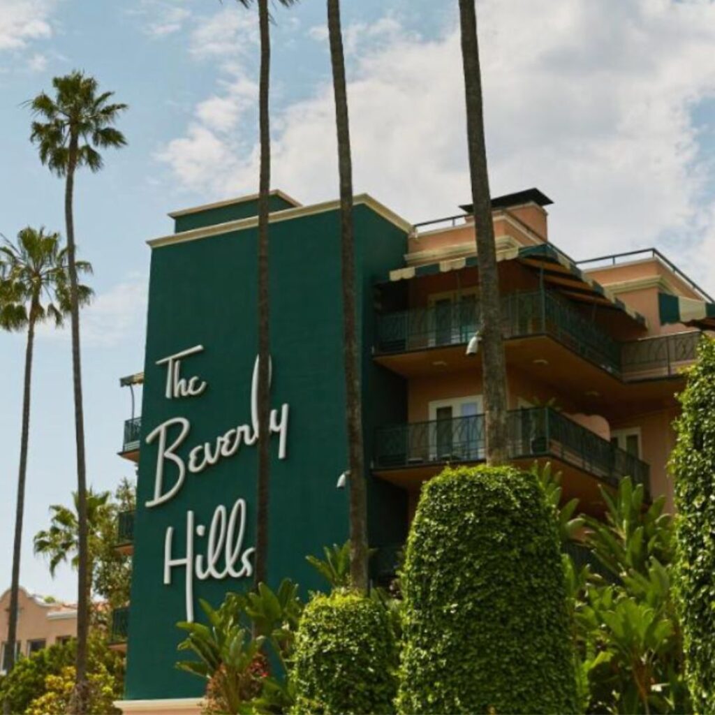
beverly hills hotel
The Beverly Hills Hotel, and their iconic green palette, are an iconic staple of Los Angeles. Mixing the luxurious emerald that represents the glamorous Hollywood crowd and the muted avocado that perfectly represents the culture of Southern California, and trends from the 1970’s, this hotel has utilized the positive perception around green and created a luxury escape for their environmentally and health-conscious high-end customer, with a playful tropical vibe.
la mer
La Mer, “the sea”, was established Dr. Max Huber and his fascination with the healing powers of the sea, specifically giant sea kelp. This brand utilizes the healing and restorative properties of green psychology to represent the holistic and natural ingredients found in their skin products.

An Example from Our Agency

Meshali
In 2017, Meshali began to restore an 1800’s ranch home in Texas; but in the process, she experienced a restoration of her heart. She has a gift for gathering, for bringing out the best in people. And we added a warm, earthy green to her brand palette to signify new growth and abundance in a warm and nurturing environment.
save for later