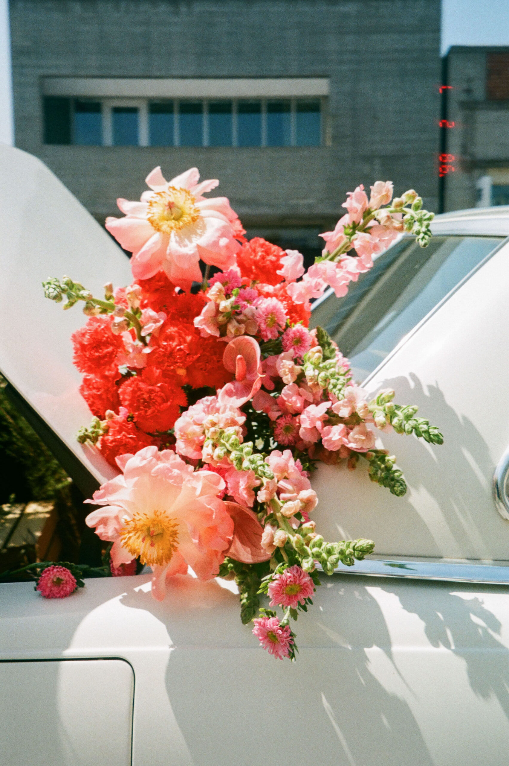
How to Use the Color Pink in Your Brand’s Palette
Welcome to post number four of our color series! Today we’ll be talking about pink! Pink is a playful and lighthearted color that has made major waves in the design world over the past few years. I’m excited to share more insight into this polarizing color and explain why it has appeared in so many recent trends. Helping you learn how it can best be used in branding.
In this series, we will be heavily referencing Kassia St. Clair’s book The Secret Lives of Color. Her introductions to each color, and short stories on the most popular ones, are a beautiful history on how color names originated. I’ve only selected four of her famous tones to highlight, but the book is full of fascinated stories and tales from each hue, so be sure to pick up a copy!
In each post, you’ll learn…
The artistic history of the color
Four famous color tones and their stories
How that color is perceived by consumers
How to use the color in the four seasonal palettes
Notable brands recognized for using the color in their palette
As always, take this as a starting point for building your brand’s palette. There is not a formulaic system for choosing colors, but beginning with color exploration is a great place to start!
The History of Pink
Pink is a complicated color.
Pink has always been linked to gender, but it was not always linked to girls. In fact, in the early 1900’s pink was actually considered a more appropriate hue for baby boys (since it was the slightly faded version of the more aggressive red). Leaving “calmer” colors like blues and greens for baby girls. Today, pink sits in the center of discussions on gender identity and feminism. As “millenial pink” remains a highly influential color in current trends and more neutral pink tones speak to the gender blur of today’s political culture.
In today’s climate, pink makes a statement about gender and identity, even as ownership shifts and changes.
The Psychology of Pink
Delicacy, Tenderness, Charm, Playful, Sweet, Feminine
Pink may be shifting in market perception, but it remains (at least for now) a relatively feminine color in brand palettes. Once deemed limiting and inferior to women in the 1960s, pink seems to have a more empowering effect today.
Pink is also a color associated with charm and optimism. Seeing life through “rose-colored glasses” and communicating a more tender and emotionally idealized version of romantic and familiar love.
When thinking about using pink in your brand’s palette, consider the personality you want your brand to have. If you’re a solopreneur, you may want your brand to imitate your own personality. If you own a small business with a team, brainstorm the kind of personality your brand has that rallies the entire team and communicates your mission.
Pink has the potential to make a strong statement about who your brand is serving. So, it’s important to consider your target audience before utilizing this hue as a primary color.
A great starting point for learning about your own personality and how it might play into the personality of your brand, is to learn more about the Enneagram. Which is the most powerful and effective personality tool I’ve come across. Learning your Enneagram number sets you on a path of growth and self-awareness. This can quickly illuminate the ways you can create a brand and business with purpose.

Famous Pinks
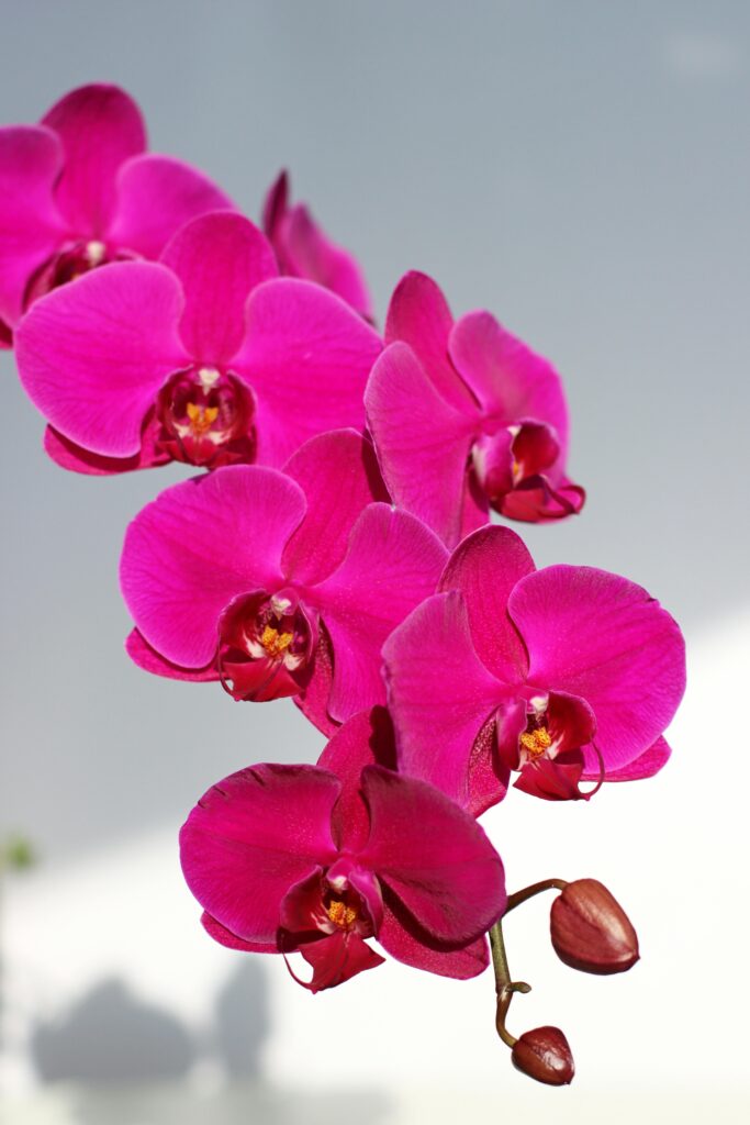
fuchsia
Yes, this color is derived from the flower. Discovered on the islands of the Caribbean, Père Charles Plumier named the flower with a brilliant blue-pink after his botanist idol Leonhard Fuchs, who wrote Notable Commentaries of the History of Plants and was responsible for naming imaginative plant names like purple fingers and foxgloves.
baker-miller pink
In 1979, it was discovered that a certain shade of Pepto-Bismol pink could make people less aggressive. Tested in a U.S. Naval Correctional Center, the shade of pink eliminated violence among inmates and appeared to actually make men physically weaker. This hue was named after the two officers who tested the theory of “cooperative pink.” So effective was this weakening pink that it became a universal trend to reduce crime and violence in the early 1980’s… until everyone became sick of the color.
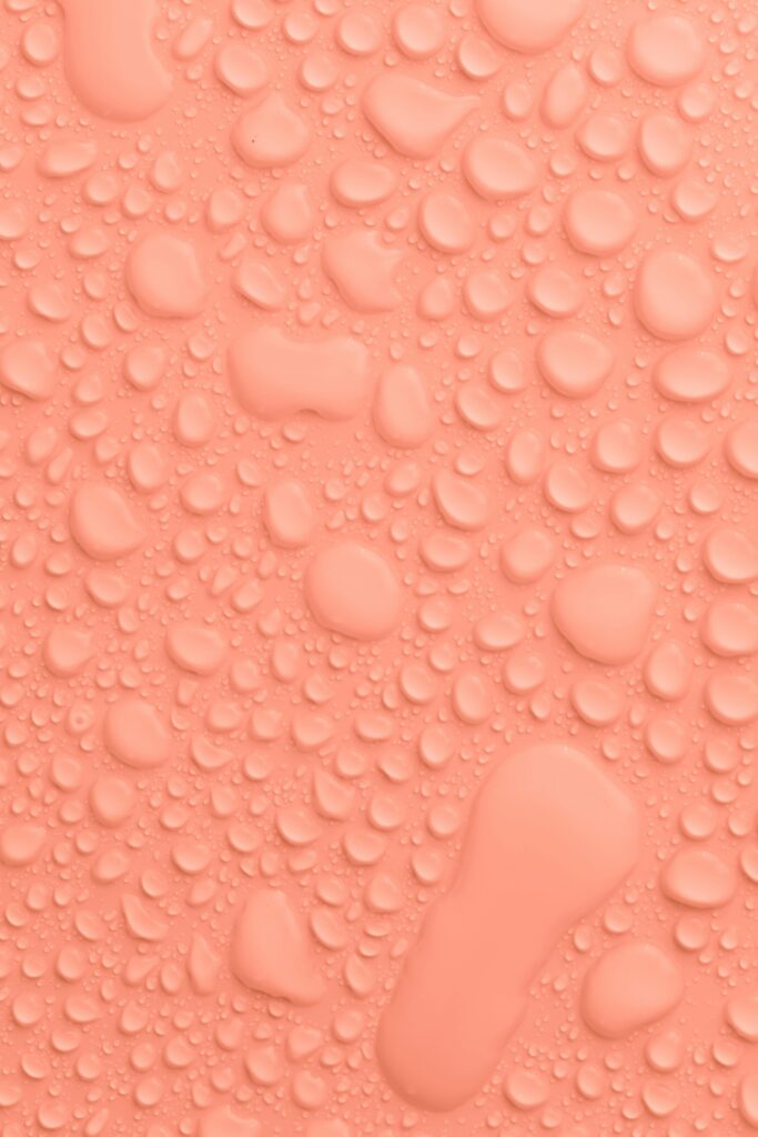
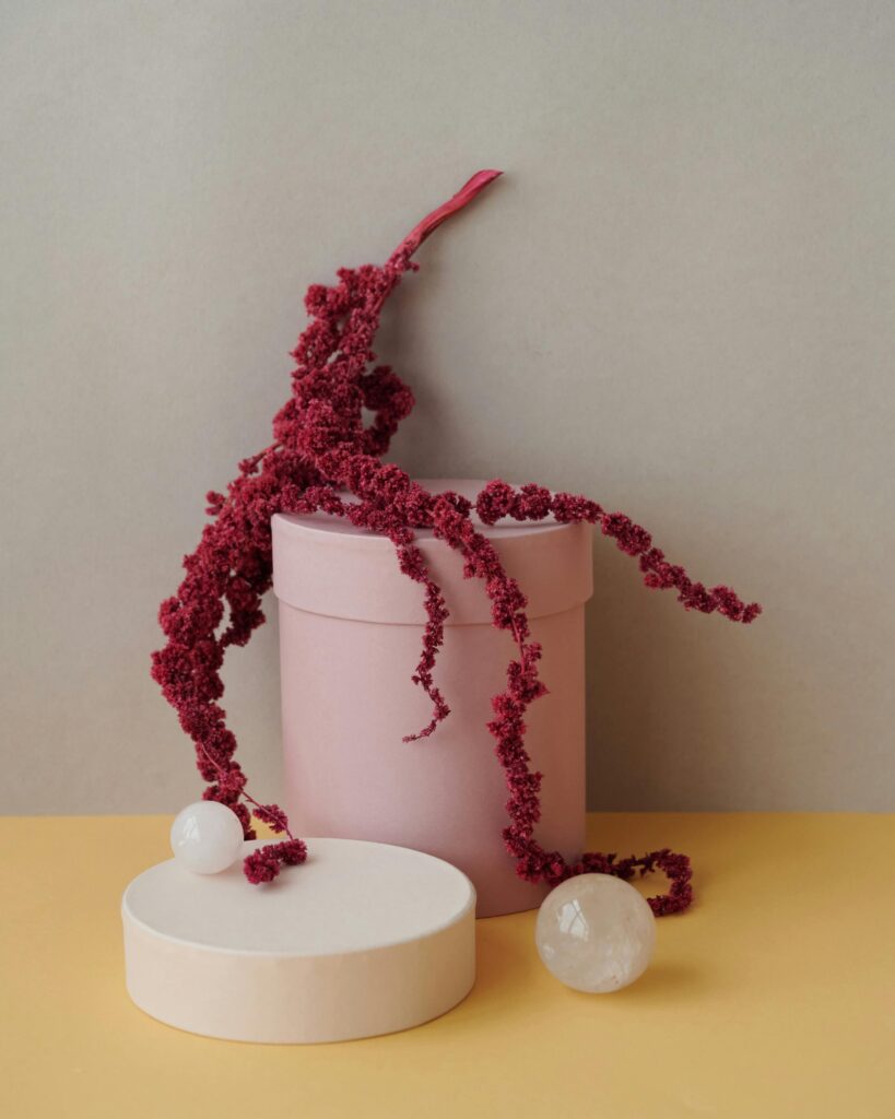
amaranth
This everlasting “weed” is synonymous with immortality and comes from the Aztecs. Edible and sacred, the plant was widely used in Aztec culture and was often mixed with blood in human sacrifices and baked into a cake to be eaten by the worshippers. This tough and prolific plant has found its way into Catholic rosaries and while the color is less commonly used today, still remains a part of Mexican culture.
flourescent pink
You knew that punk rock would find its way in this series somehow. Aggressively tense and artificial, fluorescent pink became a trend in the 1970s. True fluorescents are due to a chemical structure that transforms shortwave light that we can’t see into longer wavelengths that we can see, giving the hue a glowing effect. Most fluorescents we think of are really just highly-intense hues. Fluorescent dyes are used in highlighters to make text stand out and grab your attention – primarily sold in fluorescent yellow and pink.
Seasons of Pink
I want to show you the ways that pink can be used in seasonal palettes. When we talk about a seasonal palette, it doesn’t mean that you’ll change your brand’s colors four times a year. Seasonal palettes are another way that we assign personality traits to palettes and organize visual cues into a cohesive story.
If you’ve never heard about seasonal color palettes, check out our introduction to color post to learn more!

Spring
crisp, clean, light, delicate
When using pink in your brand’s spring palette, look for shades that are in the pastel family – soft, muted, and delicate. A baby girl pink and soft peachy tone will work to add flair to a crisp spring palette. When using a light pink in a spring palette, the brand’s personality takes on a more delicate and tender persona. Which can make an online brand (especially one that appeals to a female consumer base) feel more approachable.

Summer
bold, elegant, strong, vibrant
When using pink in your brand’s summer palette, go for bold, vibrant tones. This color can be empowering – grabbing the attention of your audience and communicating a strong message. Using magenta and fuchsia appropriately comes across and confident and elegant, but used flippantly can look aggressive and unappealing. Use summer pinks sparingly in your brand’s palette to add emphasis to your mission.

Autumn
organic, warm, muted, intense
When using pink in your brand’s autumn palette, look at the more neutral pink and almost lavender tones. Complimenting pink with an earthy palette can be difficult, so try using pinks that have a bit more brown in them, creating a dusty rose effect.

Winter
dramatic, minimal, extreme, cool
When using pink in your brand’s winter palette, add in some more blue to take it closer to purple. This color is full of confidence and clarity, creating a dramatic effect. You may even consider using a fluorescent or high-intensity pink to call attention and create an extreme palette. When going with pink as a primary brand color, limit any supporting colors that may unintentionally put your palette in the spring or summer family. Keep it minimal and focus on picking just the right shade to show your personality.
Brand Examples
acne
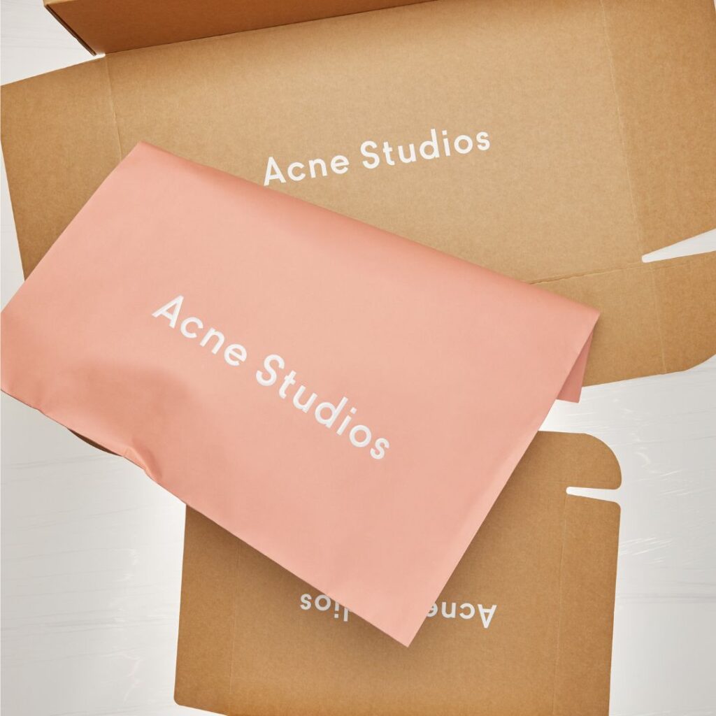
Acne has always wanted to make waves in unconventional and unexpected brand visuals. From the name to the stores to the iconic pink bags, Acne is constantly pushing the borders of expectations and conventional beauty as a fashion powerhouse.
cult gaia
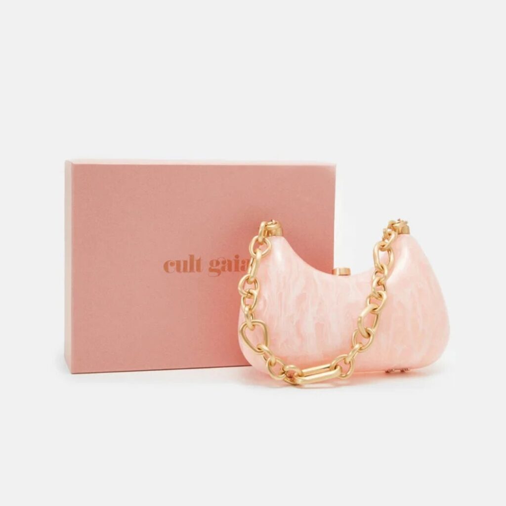
Cult Gaia is a brand that celebrates timeless femininity, and what better way to celebrate women than to use shades of pink as a a primary brand palette. Their peachy tones and soft pinks give an effortless “glow” to the brand that pairs with their effortlessly elegant ideal shopper.
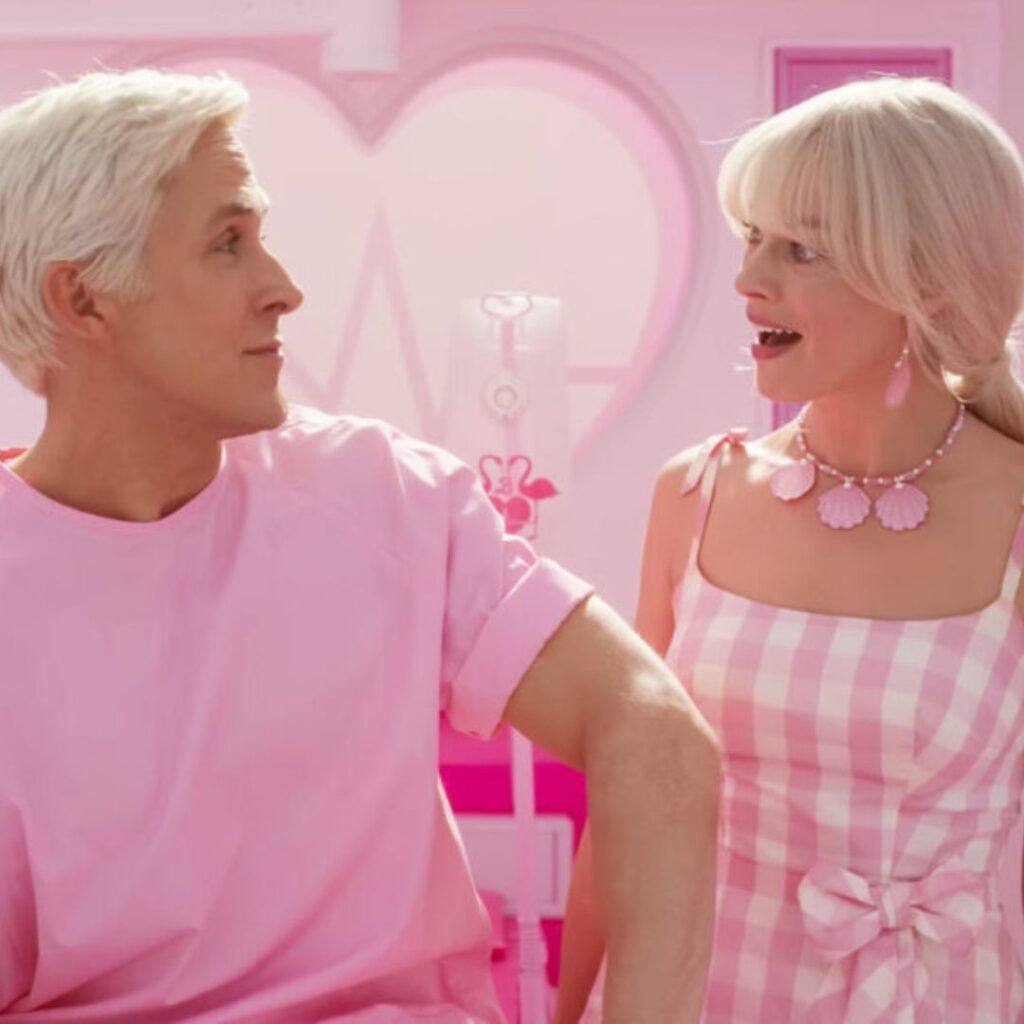
barbie
Barbie’s iconic use of pink embodies playfulness, femininity, and limitless imagination, making it instantly recognizable and emotionally resonant for generations of young girls. The color symbolizes fun, confidence, and self-expression, reinforcing the brand’s message that Barbie can be anything—a reflection of aspirational creativity and empowerment. Psychologically, pink creates a sense of warmth and joy, fostering a strong emotional connection that makes the brand feel inviting, inspiring, and endlessly fun.
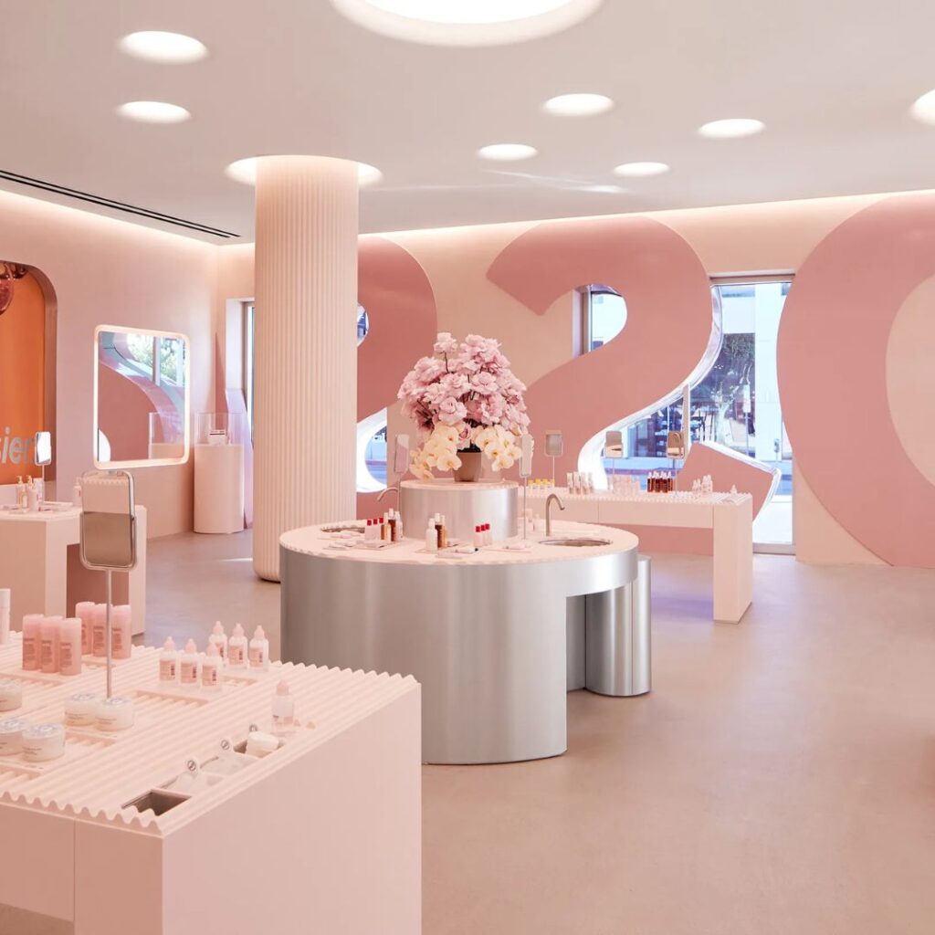
glossier
In Glossier’s pink moodboard explanation, the color came about quite organically. As the brand became a living, breathing thing, images circulating around the new Instagram-based beauty brand showed “examples that prove pink doesn’t have to be girly. It can be cool! And androgynous. It can be a color that suits everyone.”
An Example from Our Agency
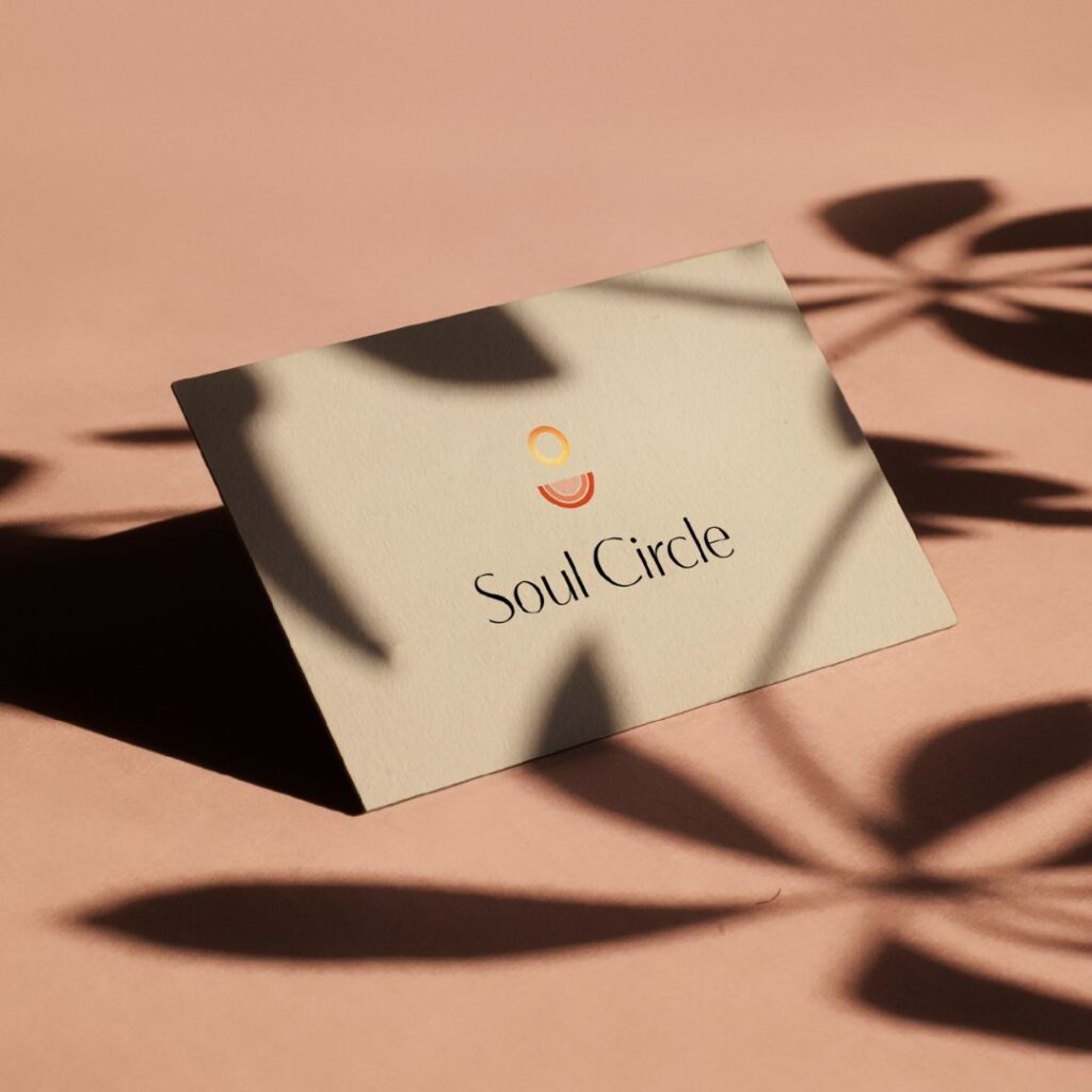
Soul Circle
Soul Circle’s use of pink reflects compassion, healing, and inner peace—key elements of a brand focused on women’s spiritual and mental well-being. Soft pink tones evoke warmth, support, and emotional safety, creating an inviting space for personal growth and self-discovery. Psychologically, pink fosters a sense of calm and connection, reinforcing the brand’s mission to nurture the soul and build a community rooted in love and understanding.
save for later
