


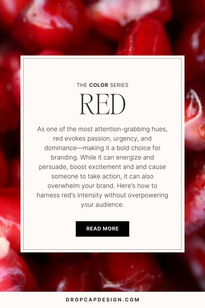
How to Use the Color Red in Your Brand’s Palette
Welcome to post number five of our color series! Today we’ll be talking about red! Red is a strong and dynamic color with a fascinating history in psychology. Whether red brings up memories of the Game of Thrones Red Wedding or The Handmaid’s Tale, it’s certainly a color with deep spiritual and sociological undertones. I’m excited to share more insight into this bold and aggressive color and explain how it can best be used in marketing to appeal to your audience.
In this series, we will be heavily referencing Kassia St. Clair’s book The Secret Lives of Color. Her introductions to each color, and short stories on the most popular ones, are a beautiful history on how color names originated. I’ve only selected four of her famous tones to highlight, but the book is full of fascinated stories and tales from each hue, so be sure to pick up a copy!
In each post, you’ll learn…
The artistic history of the color
Four famous color tones and their stories
How that color is perceived by consumers
How to use the color in the four seasonal palettes
Notable brands recognized for using the color in their palette
As always, take this as a starting point for building your brand’s palette. There is not a formulaic system for choosing colors, but beginning with color exploration is a great place to start!
The History of Red
Red is a passionate color.
As the color of blood, red has been linked to war, sacrifice, and power. In close association, red has strong associations with aggression and lust, and has a pretty rocky relationship with women throughout time. Because of historically aggressive accounts of this passionate color, it’s a difficult one to use appropriately in branding and marketing.
This color stops people in their tracks, and is the one color best able to communicate a strong message.
The Psychology of Red
Passion, Strength, Confidence, Excitement, Warmth
Physiologically, red increases the heart rate and energy of the user. Which is why it’s used pretty often in restaurant branding. Because of its association with power and dominance, red is also used frequently for schools and sports teams.
When using red in your brand’s palette, consider the historic and cultural connotations of the color and how they may affect the way your product or service is perceived. If you are making a bold claim, red may back up your message and make your customer pay attention. If your service is meant to assist or support your client, using red may seem too aggressive or dominant. Especially when trying to communicate your brand’s experience.
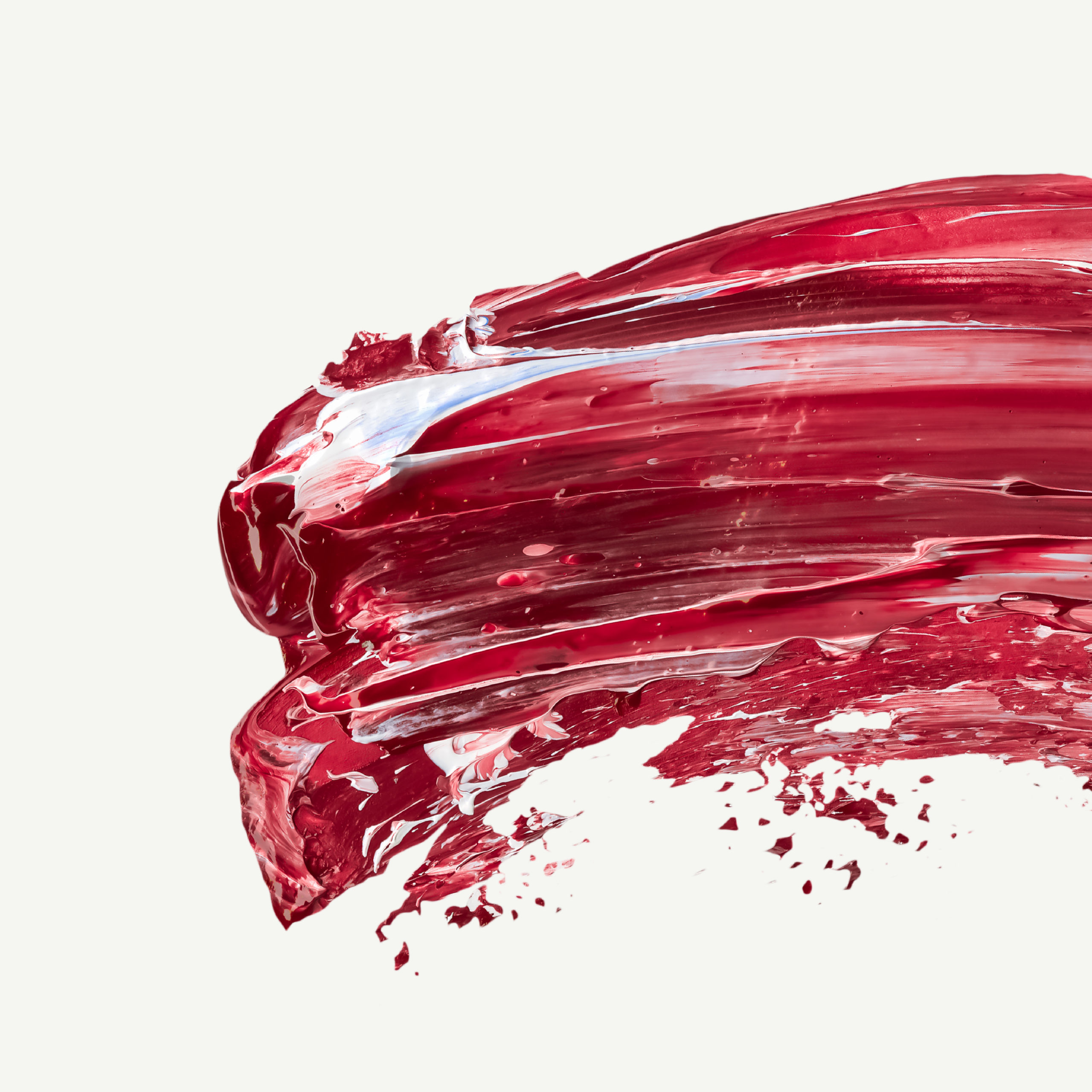
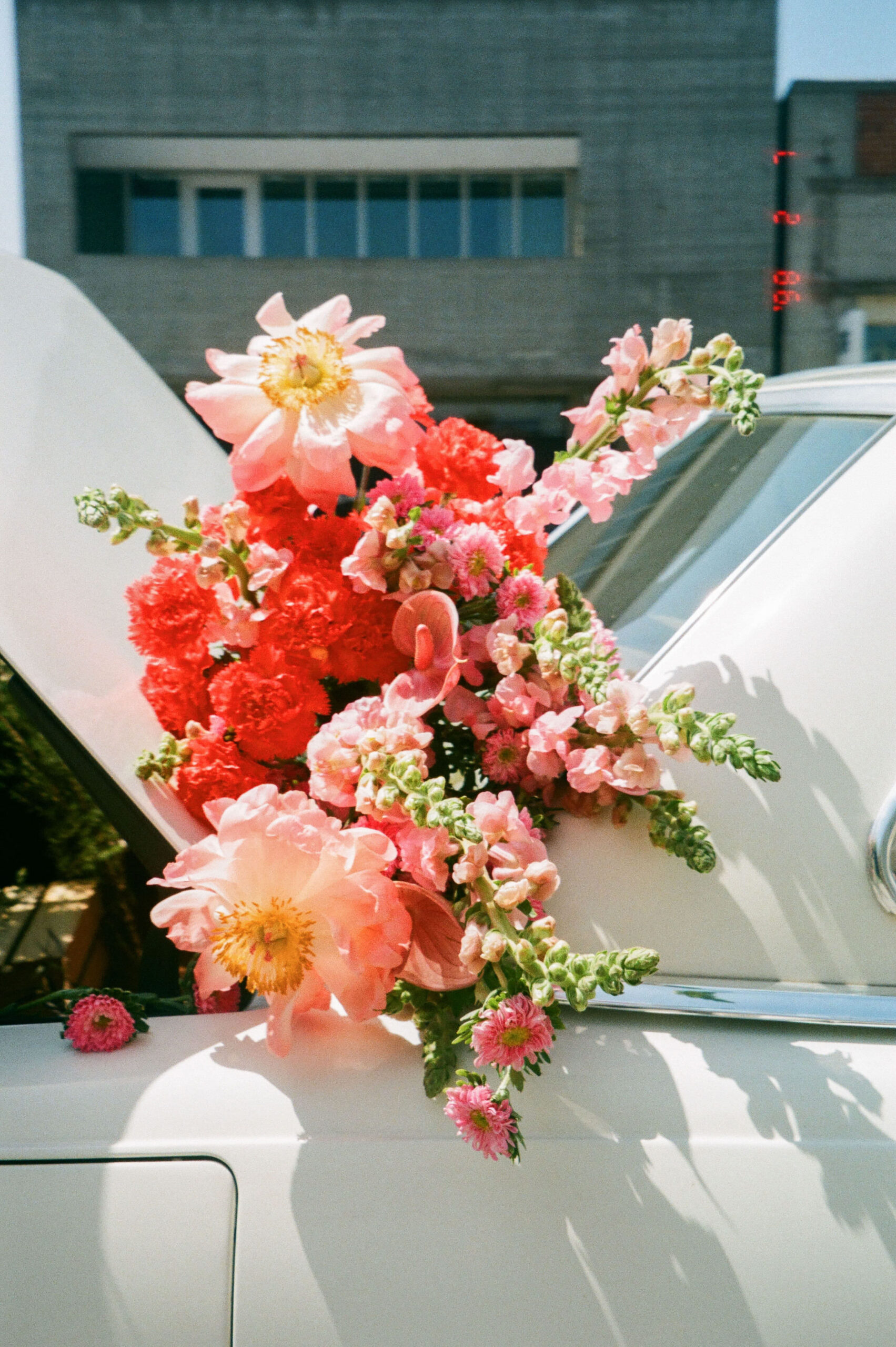
Red comes in so many different shades: dark to bright, burgundy to crimson, rose to poppy, and scarlet to maroon. If one application of red communicates the wrong message, try out a different shade!
As an entrepreneur, consider your own personality among your friends and how you are perceived by friends. How might red support or contrast your natural demeanor? If you’re not sure how to put words to your unique personality or communicate what makes you tick, you may want to do some work to develop a greater level of self-awareness before going through the branding process. I suggest starting with the Enneagram, which is the most powerful personality tool I’ve found to date!

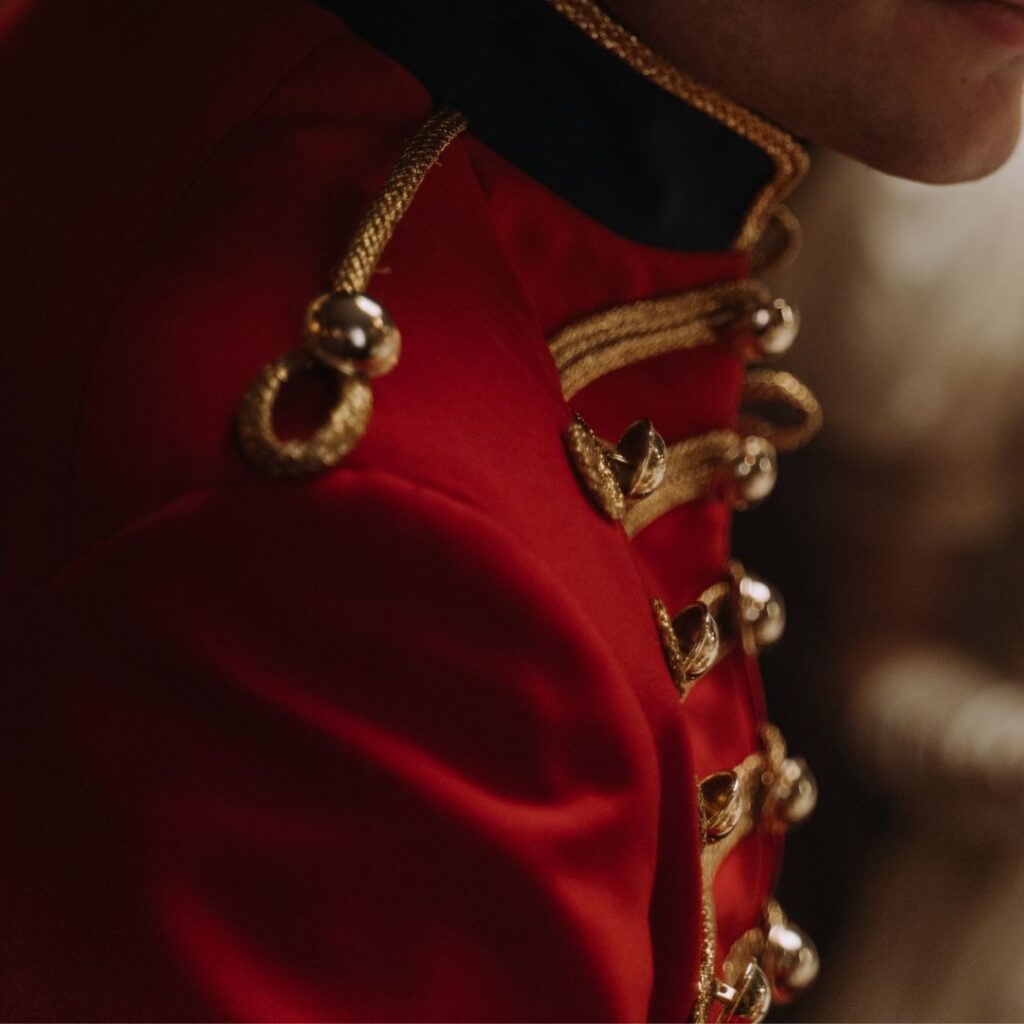
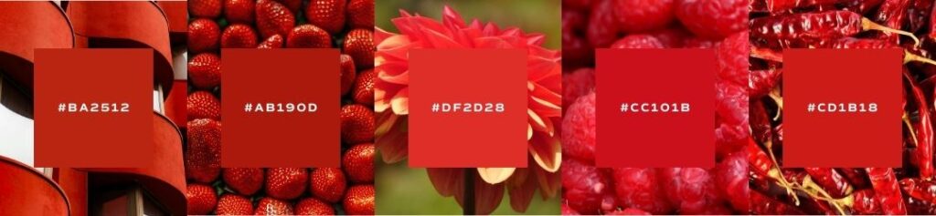
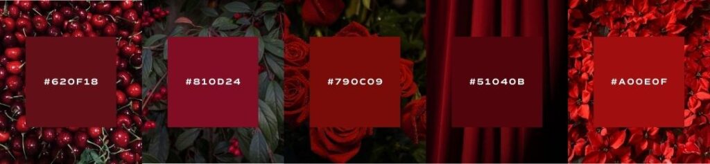
Famous Reds
scarlet
Such a controversial color. Most famously, it was the color of Mary Queen of Scots undergarments on the day of her execution, her last message to the people that she was a martyr. In 1464, the Pope declared that the official color of cardinal robes would be switched from purple to a scarlet red. Described as “flaming red, full of fire, dazzling the eye” the red has been linked with power, sacrifice, and purity. My favorite use of scarlet has been in the series The Handmaid’s Tale – where color is used brilliantly to tell underlying messages and divide characters throughout the story.
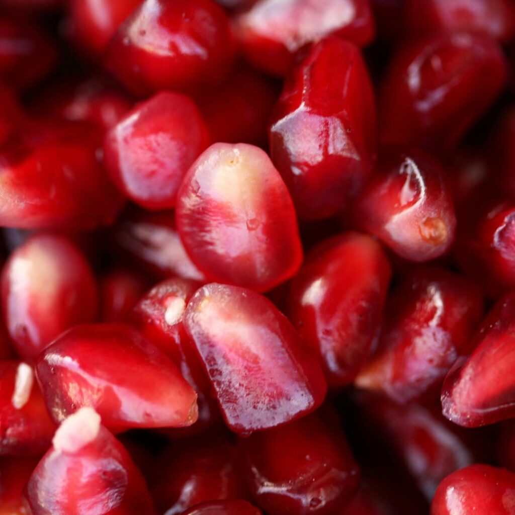
cochineal
This pigment is created by crushing dried Cocci insects found in Mexico and South America. Requiring nearly 70,000 bugs for one pound of raw pigment, the result is the most brilliant red found in the world, and one of the most effective dyes for fabric. For the Incas and Aztecs, cochineal red was a symbol of power. It’s also the dye that has been used to create the robes for Roman Catholic cardinals. Today, the practice of harvesting brilliant red from the beetles is the primary color source for cosmetic and food artificial dye (yes – your Cherry Coke and M&Ms contain crushed beetles!)
vermilion
The most famous use of Vermilion is in the Villa of Mysteries discovered in Pompeii in the early 1900’s. Vermilion was the most expensive and coveted pigment in A.D. 79, once as precious as gold. During an archeological dig, a perfectly preserved mural of vermilion red was discovered in a villa overlooking the sea, with large windows and elaborate detail. Its tone is striking and inspires awe, which is why the pigment can be seen in many works of religious art from that time. Today, this pigment gives a feeling of glowing sharpness, perfectly complimented and contrasted by the calming colors of the sea.
dragon’s blood
Rooted in myth and strange tales from Essex, Dragon’s blood was rumored to be the mixing of dragon and elephant blood when the latter killed the former and they died together, their blood mixing together to form this strange wound-colored pigment. However, that story is complete legend. The real pigment comes from a tree in the East called the Dracaena and while once popular with artists in the Enlightenment, quickly faded into obscurity due to its limitations. This color is mysterious and moody, and when used in the right context can add romantic fantasy tones to the palette of a wedding photographer or fashion brand (among others, of course!)
Seasons of Red
I want to show you the ways that red can be used in seasonal palettes. When we talk about a seasonal palette, it doesn’t mean that you’ll change your brand’s colors four times a year. Seasonal palettes are another way that we assign personality traits to palettes and organize visual cues into a cohesive story.
If you’ve never heard about seasonal color palettes, check out our introduction to color post to learn more!

Spring
crisp, clean, light, delicate
When using red in your brand’s spring palette, try a muted dark red. Which will make your other pastel tones pop. You can also think about adding in floral reds, like a poppy or rose, which will add a crisp and light spring floral scheme. Red is a great complimentary color to add balance and warmth to a delicate pastel palette.
Summer
bold, elegant, strong, vibrant
Summer reds are very pure and classic – think nautical and patriotic tones. Summer and winter reds tend to look similar. But the biggest difference is that a classic summer red will be more of an orangey-red. Which compliments vibrate blue and green sea tones.
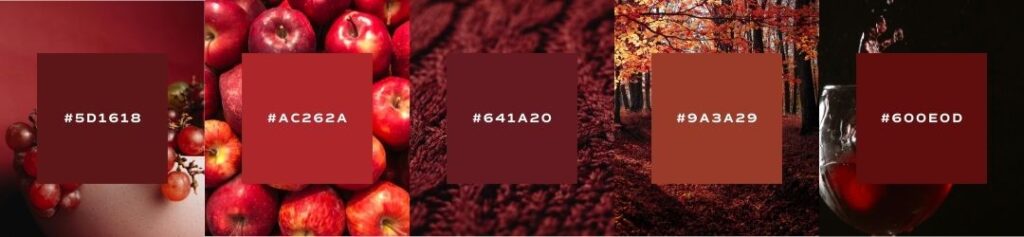
Autumn
organic, warm, muted, intense
When using red in your brand’s autumn palette, look for reds that have more blues and purples in them – like a rich burgundy that will complement an earthy palette, specifically brown. Autumn reds are more muted and act as accents to lighter earth tones.
Winter
dramatic, minimal, extreme, cool
When using red in your brand’s winter palette, you’ll notice that the tones are very similar to a summer red, but with a cooler undertone. Think Christmas and a high-contrast winter red that will compliment a grey scale. Winter reds tend to pair next to whites, blacks, and emerald greens. So having a cooler tone will maintain the temperature of the palette.
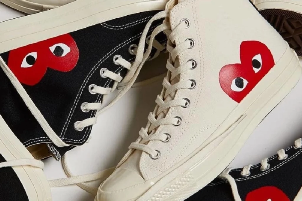
Brand Examples
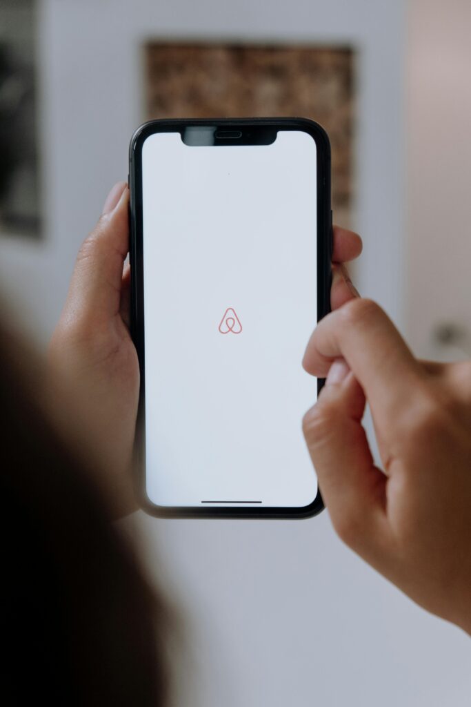
airbnb
Airbnb is typically considered the unicorn in the travel accommodations industry. Ironically, many industry unicorns all use red as their brand’s primary color. Why? Because red is disruptive and these brands are built on change and innovation. Innovative brands must have compelling marketing graphics that cause viewers to look twice and pay attention.
comme des garcon
Comme Des Garcon is a Japanese fashion label that became famous in the 1970s. Ever since making waves in Paris Fashion Week, the brand became known for using distressed fabrics and associating with the punk rock movement. In Japanese culture, using red in a logo indicates passion and impact (which is pretty standard internationally), but also happiness and the sun which is specific to Japan (in other cultures, yellow is typically associated with a sunny disposition!)
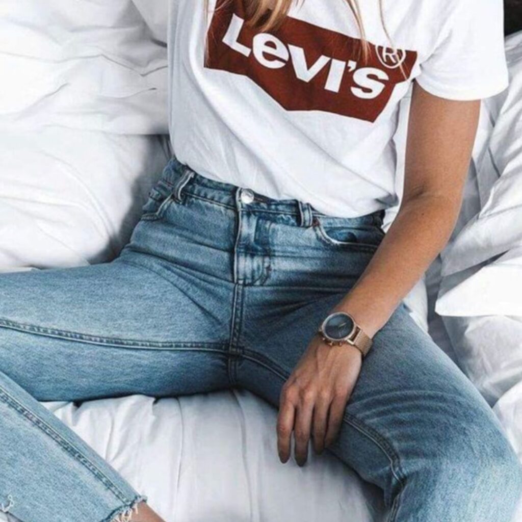
levis
Levi’s red tab is one of the most recognized clothing labels but was developed 63 years after the brand was created. “The red color in the Levi’s logo symbolizes energy, determination and passion, while highlighting the brand’s youthful attributes of power, explosiveness, rebellion and endurance.”
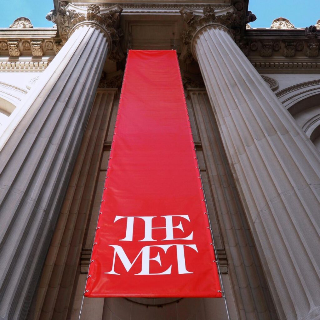
the met
In 2016, The Met underwent a highly controversial rebrand under Wolff Olins, who also rebranded the Tate. Among other distinctly new characteristics for the iconic museum, the new color palette was the most striking. While the official verdict was that red spoke to the international community about shared passion and vitality, critic Mark Kingsley points out a much more interesting story behind the vibrant tone.
“Dr. Elena Phipps is a specialist in the history of textiles and has been associated with the museum since 1977. She has written and spoken wonderfully about cochineal red, a color made from insects found in South America. After the Spanish conquest of the New World, cochineal red became the second most valuable export from the Americas after gold. Her chemical analysis of pieces in the museum’s collection helped prove the pigment’s global spread centuries before we even heard the word globalization. How perfectly appropriate for the Met.”
An Example from Our Agency
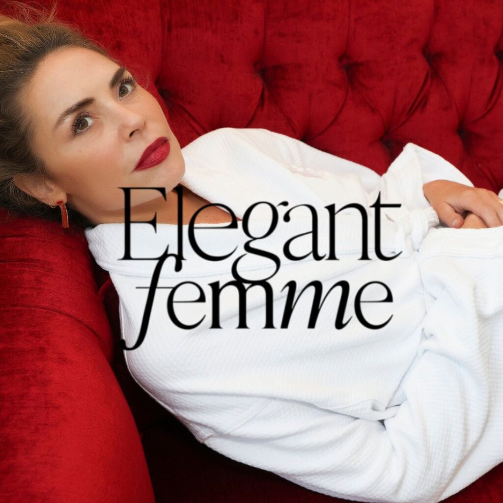
Elegant Femme
Elegant Femme’s use of red as its brand color reflects the bold, sensual, and passionate essence of French femininity, perfectly aligning with Tara Marina’s message of empowered, intentional living. Red symbolizes confidence and desire, inspiring women to embrace their full expression and step into a more elegant, self-assured version of themselves.
save for later


Wow! This blog looks just like my old one! It’s
on a entirely different subject but it has pretty much the same page layout and design. Superb choice of
colors!
Thank you Sebastian!