


When Molly first reached out, she was at a crossroads in her business.
Her vision and work were outpacing her brand’s ability to keep up. She realized that, eventually, she’d lose potential clients because her website didn’t fully reflect her style or the quality of her work.
This is the ideal place to be when going into a rebranding project. I have immense respect for clients who have spent years building their brand themselves and now have the data and inspiration to take it to the next level. They’re best positioned to get the most value out of the process.
Let’s take a look at how her brand evolved during our time working together.
(I’m so excited to share this one!!)
The Molly Murphy Photography Rebrand Inspiration
The Previous Brand
Molly’s original brand was simple, but it got the job done. One of the things that I really liked about the logo she designed herself is that it was a stylized type-driven style. This gave her photography a timeless feel and actually highlighted her portfolio instead of overwhelming her work with her branding.
A lot of times when working with a previous DIY brand, it’s a matter of editing out a lot of fluff. But in this case, we had a really simple foundation to build upon which made for an even bigger ‘WOW’ factor at the end!
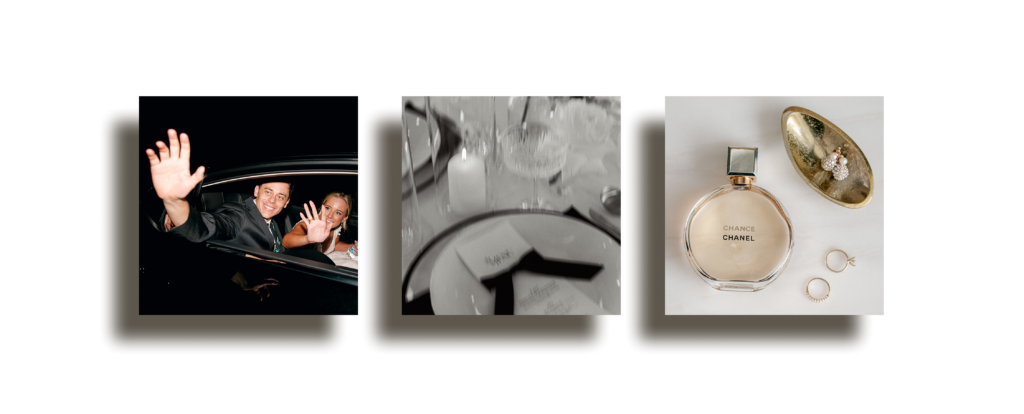
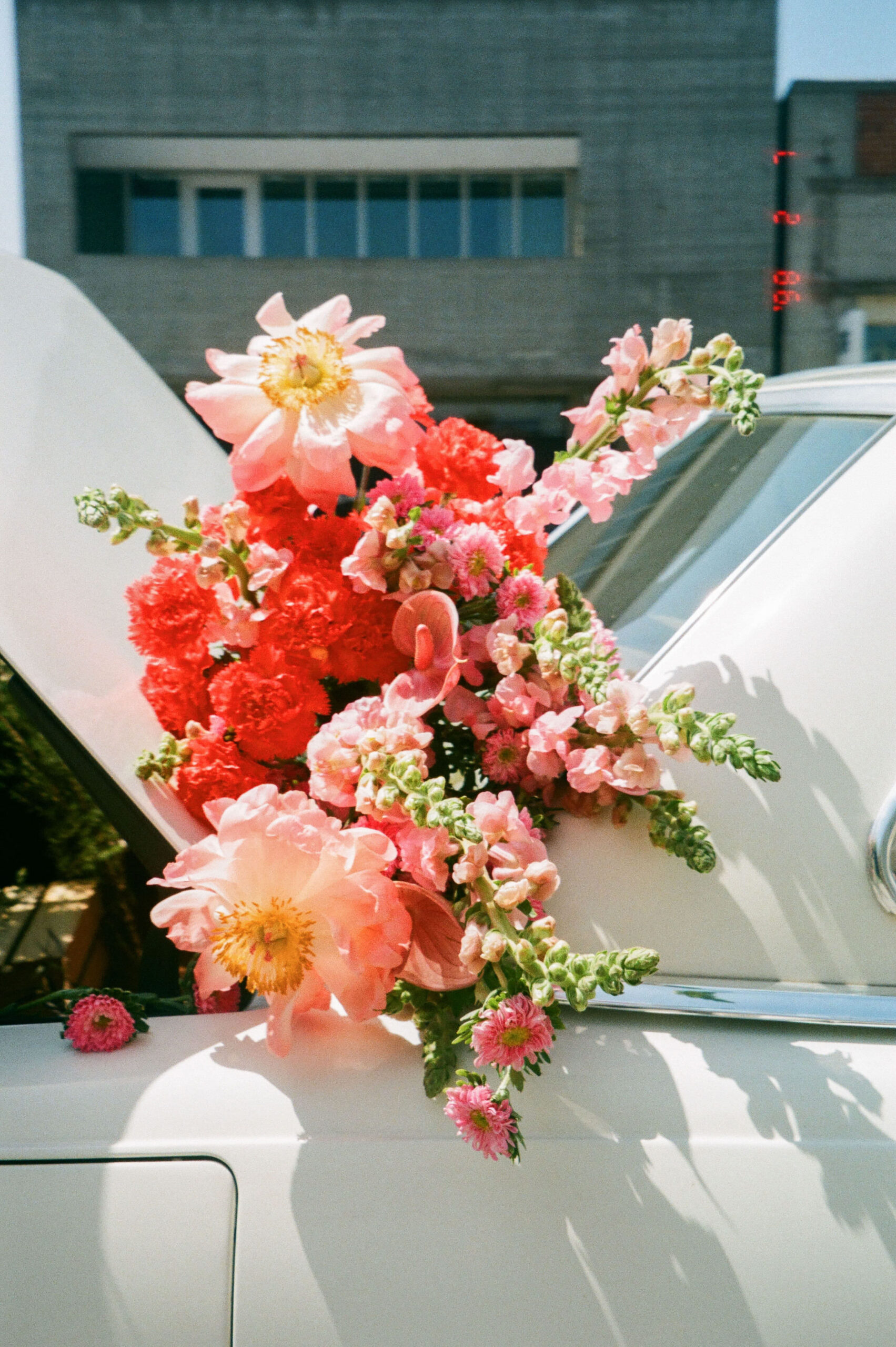
Urban Lifestyle
Molly has clients in the Dallas and surrounding metro area, and although many of her clients live outside of Dallas proper, we wanted the brand to have a sleek, urban feel. Because her photography extends beyond weddings to include portraiture, brand photography, and family sessions, she has the opportunity to establish a distinctive style and retain clients for a lifetime.
She already had a recognizable editing style that focused on natural colors, giving her work a timeless, effortless feel. Each wedding feels so tailored to the individual event, not a carbon copy of the others, which elevates her work. We wanted that to translate into the brand’s identity.
Clean Luxury
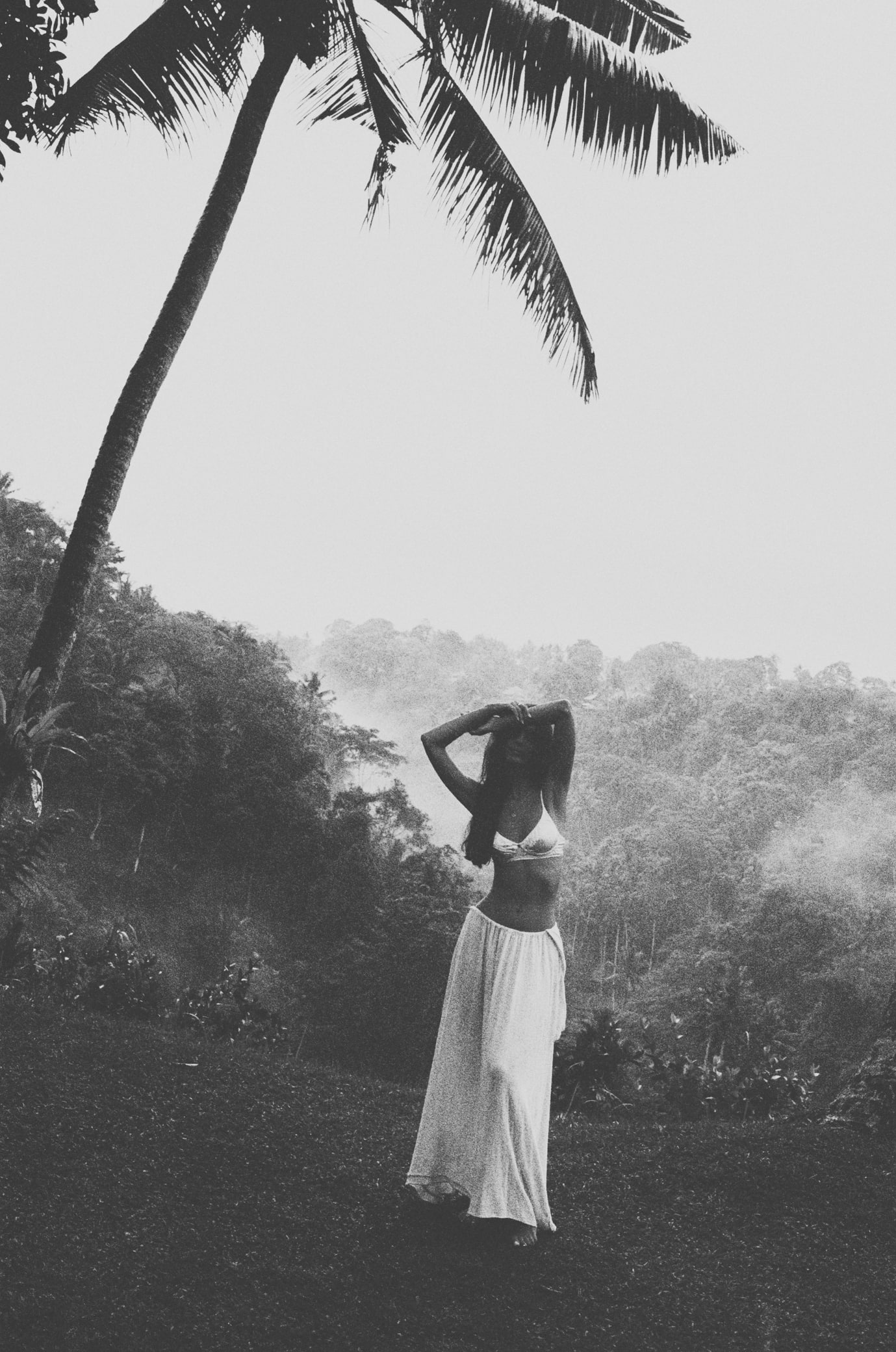
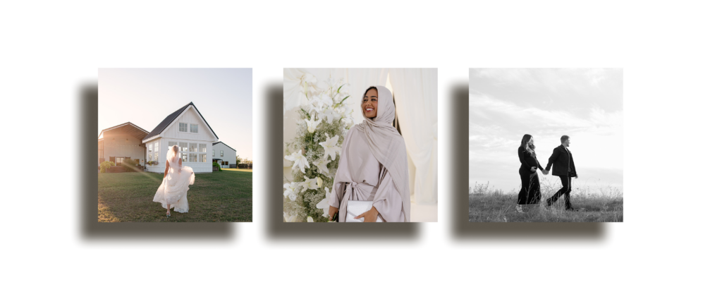
When browsing through her social media and researching ideas for her creative direction, I got the sense that her photography represented real luxury. Not overly edited or filtered, nor overly posed or forced. It’s Quiet Luxury with thoughtful details and timeless style.
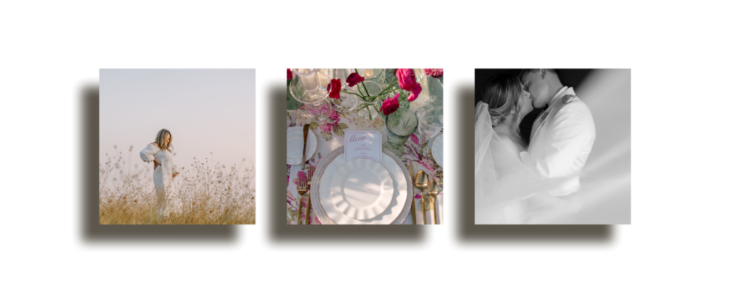
Cinematic Documentary
Another thing I quickly noticed about her work is a cinematic feel to her images. She has so many epic, timeless captures. Flowers in full bloom, authentic interactions between guests, capturing her clients in their best moments in their best light.
Her work feels like a camera roll of her client’s lives, and she finds a way to capture the emotion of every milestone.
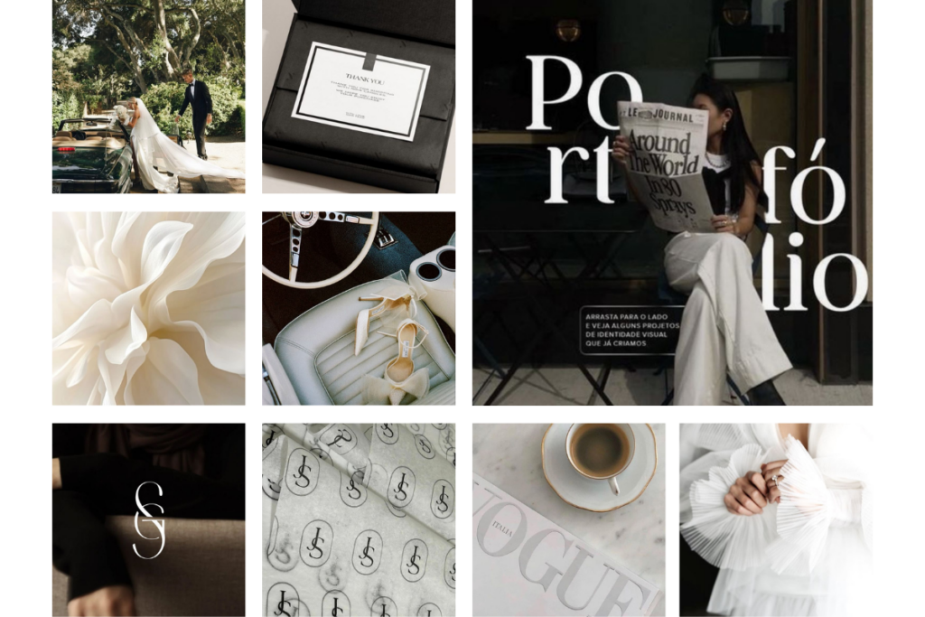
Molly Murphy Photography Rebrand
sleek editorial, classic elegance, high-touch experience
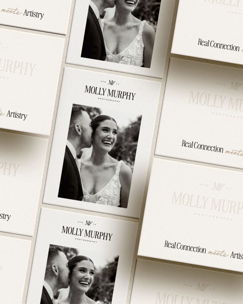
With the creative direction for the rebrand, we aimed for a sleek, editorial look and feel. We wanted classic elegance and the representation of a high-touch client experience. We wanted everything to mirror the quality of her work, just elevated by the brand.
Logo Concept 1
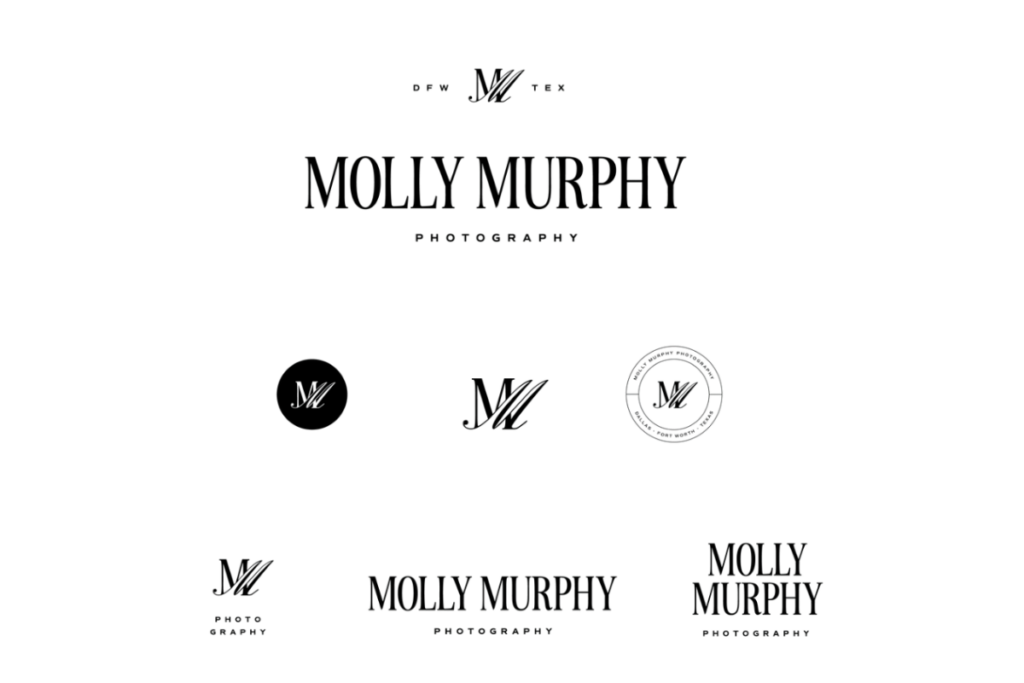


With this first concept, we experimented with an interlocking M. Incorporating the idea of shadows that felt playful and also served as a subtle nod to photography. We also wanted to highlight her regional location while also incorporating ‘photography’ as a tagline so there would be room to expand the brand in the future if she chose to offer education, presets, or other services down the road.
The crest was one of my favorite parts of this concept. I loved the split circle, which was inspired by the structure of a camera lens. This ended up being the chosen concept, and we made only minor changes to it before it reached its final state. Sometimes the first idea is the best one 🙂
Logo Concept 2


Concept Two was more modern but still featured a playful interplay between regular and italic styles, incorporating a signature font for ‘photography’ that gave the brand a more artistic, delicate feel. Molly has a sharp eye and a true-to-color editing style that gives her photography a sophisticated, technical attention to detail that I wanted to highlight in this concept.
This overall concept was fresh and sleek, and it was the second choice pick. However, since we couldn’t move forward with two identities, it ultimately ended up on the cutting room floor. You will notice that we pulled the signature style from this concept into the final brand identity palette.
Logo Concept 3


Concept Three was more classic and traditional, inspired by her timeless cinematic style. We opted for a classic crest and blended styles in an interlocking design. While we appreciated aspects of this concept and some of the different formats and alignments, we ultimately chose the all-caps text style for the final version. This felt a little too traditional, and we wanted a slightly more modern edge to the final identity.
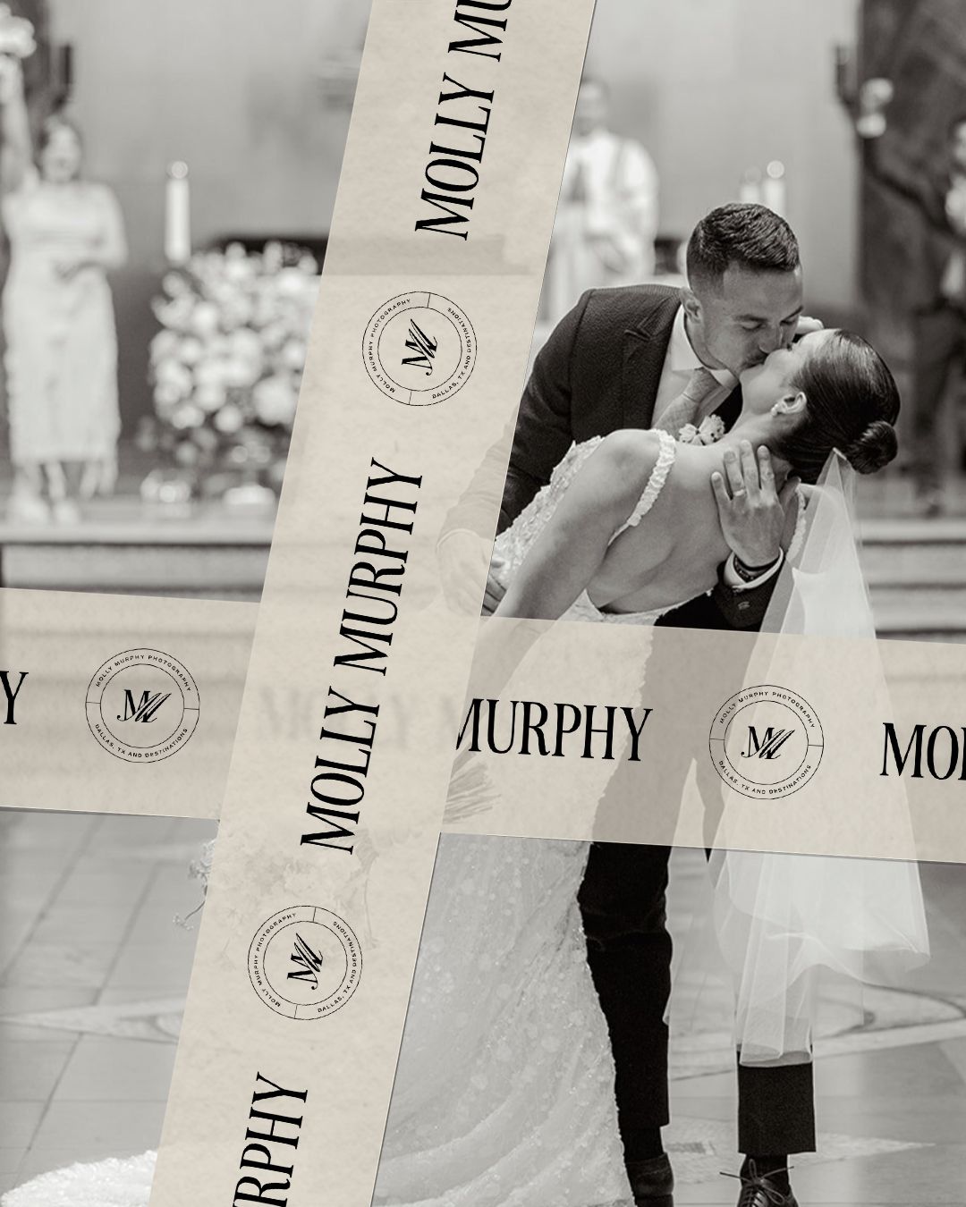
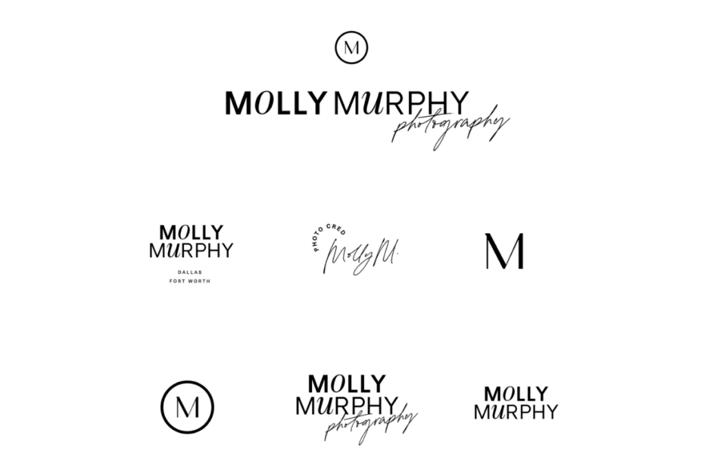
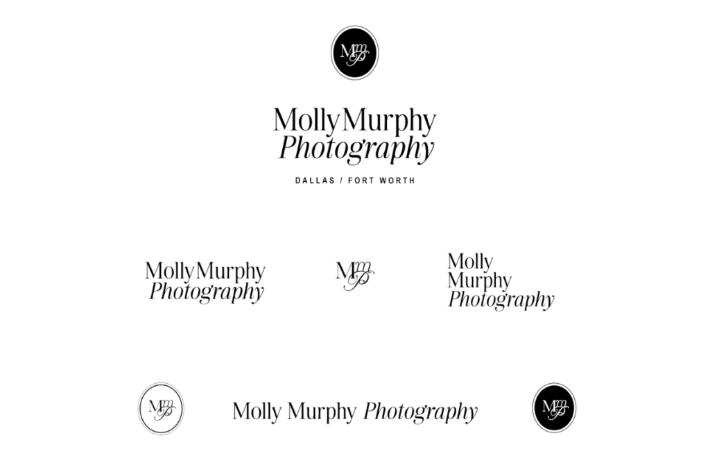
The New Molly Murphy Photography Identity
You’ll see in these final logos that there was a lot from the first design concept that stayed exactly the same. That’s the beauty of starting with such extensive creative direction and research early on. You land on a final design often in the first go (and often your very first idea!) It always at first seems like overkill to send a 20+ page brief with research and ideas, but you can see why it becomes so necessary to the entire process.
Primary Logo
Typelock Alternate Logo
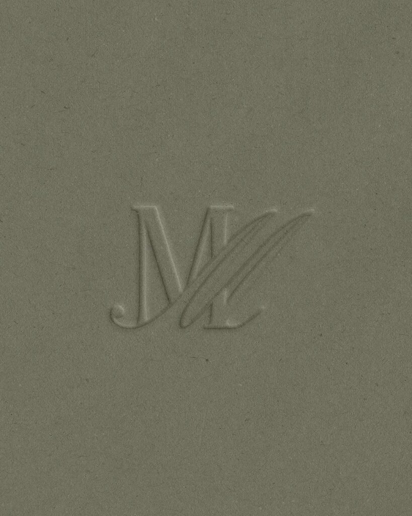
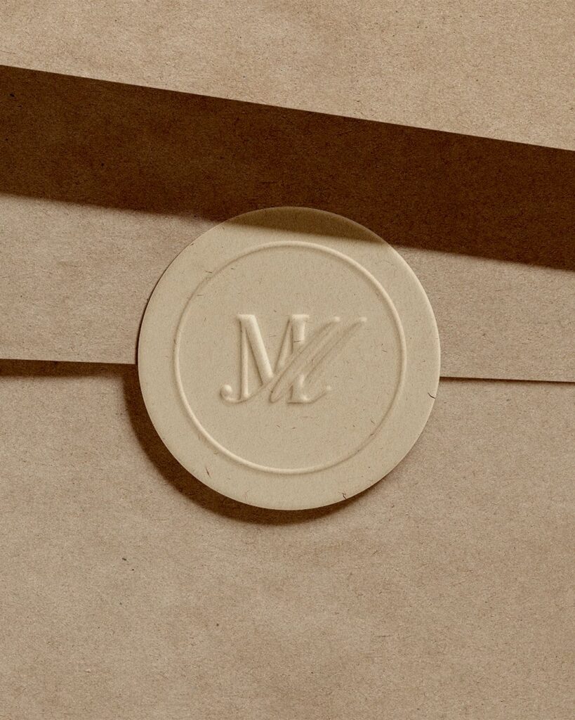
Monogram Logo
Logo Stamp
Secondary Logo
Tagline Logo
Logo Crest
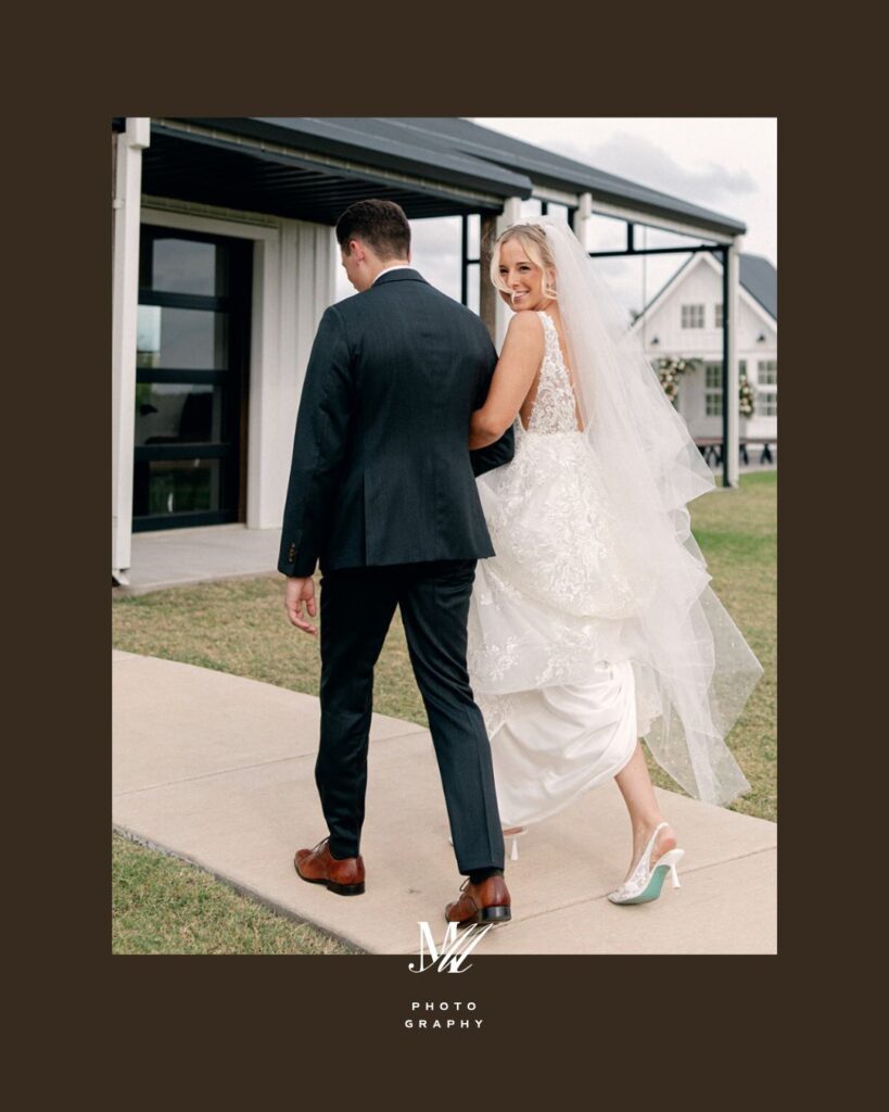
Molly’s Signature
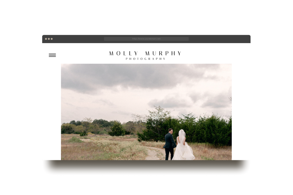
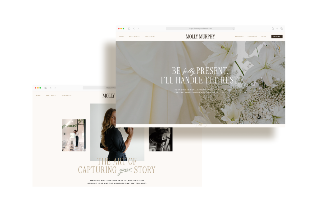
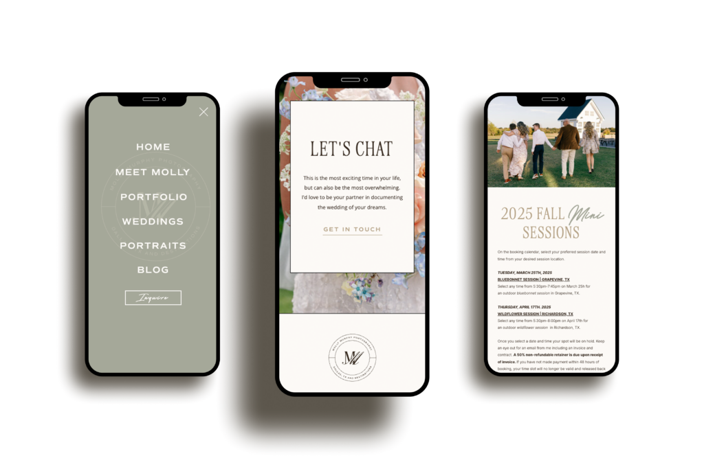
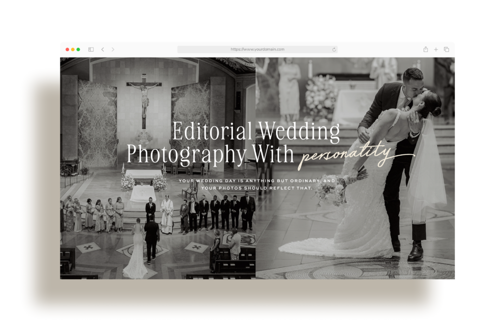
The New Molly Murphy Photography Website
Once the brand identity, colors, and fonts were finalized in a comprehensive brand style guide, we proceeded to the new and refreshed website. We built this site from scratch on the Showit platform, and I’m obsessed with the result! I love creating from scratch and coming up with brand-new ideas and layouts for every page.
Why I Love This Brand
I loved working with Molly because it’s clear just how much she values her clients and how much care she’s put into her work as a photographer. It’s an honor to be a part of someone’s evolving story. To be the first significant investment they’ve made in taking everything to the next level.
I have complete confidence that this new brand and website will not only elevate her existing client care but also represent who Molly is and the quality and care she brings to her work. It’s so rewarding to put something out into the world and showcase a brand, knowing that the business and the founder will deliver on what the brand promises.
Big things are in store for you, Molly Murphy. This is only the beginning. And we are so honored to be part of your story!
Kind Words
Before this rebrand, I had done everything myself from logos to building my website from a free template I found online. It got me far, but I started to feel the gap between the level of work I was producing and how I was showing up online. Kadie didn’t just fill that gap, she elevated everything! She took the heart of what I do and translated it into a brand that felt so much more like me and what I offer. I’ve never felt more proud to share my site or stand behind my brand and I owe that to Kadie’s thoughtfulness and vision! She was so easy going even when I felt like I was asking too much. This whole process reminded me that investing in your business is also an investment in yourself. Thank you Kadie for all your support and working so hard to create this beautiful new chapter in my business. – Molly Murphy
Is your brand ready for its next chapter?
We’d love to help you explore what’s possible. Reach out to start the conversation – we’re here to help you move forward with clarity.