It’s always fun to go through the portfolio graphics from a launch and see the end result, but rarely do you get to see the messy middle of how this brand and project actually came to be. And to me, that’s the most interesting part.
While we always do extensive research before a project begins, there’s something magical about how it falls into place and evolves along the way. You can never reasonably anticipate where it will end up, and that’s what makes it so much fun.
Seeing the process of how we went from an idea to a fully developed rebrand, I hope this gives you some encouragement to know that you don’t have to have it all figured out to get started. You just need to believe that it’s time for a change.
The Vision for Claudia Colombo 2.0
One of the things I love about Claudia is that she is a true expert in her field. Her tagline, “Beauty is an Inside Job,” embodies her holistic beauty philosophy that intertwines internal wellness with external radiance.
Her philosophy is that nurturing our body’s internal environment has a profound impact on our external appearance.
Through personalized facials and tailored treatments, she addresses both the surface and deeper layers of the skin. She also incorporates reflexology, stimulating specific points that correspond to vital organs, thereby enhancing their function and reflecting their health on her client’s face.
This comprehensive method deepens the connection between inner vitality and outer beauty, fostering a balanced state of well-being where true beauty naturally flourishes.
I mean… sign me up.
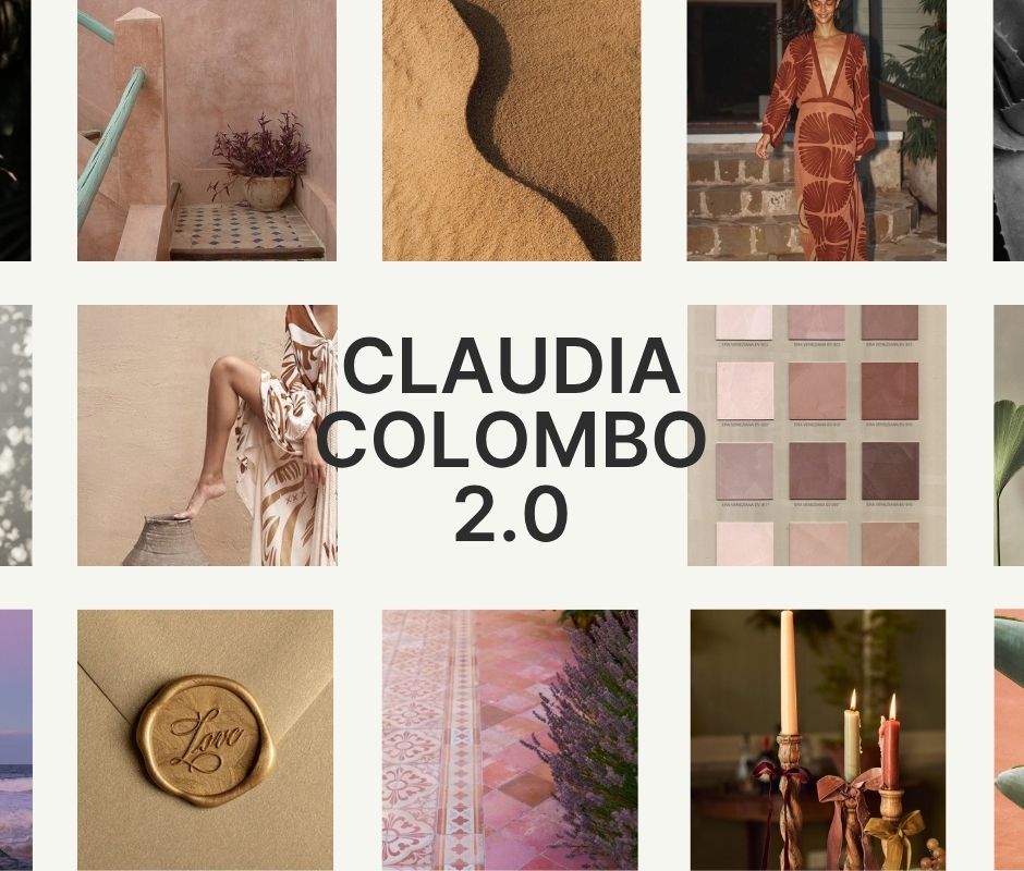
Let’s take a look at some of the inspiration that we found to represent this vision for Claudia Colombo 2.0 and where we planned to take the brand.
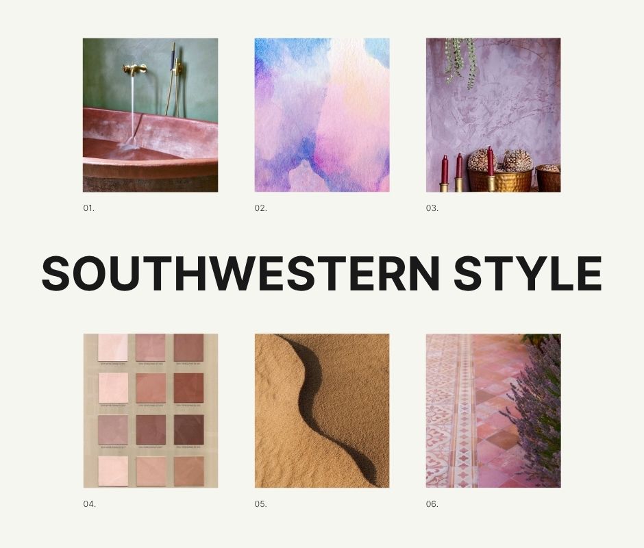
Southwestern Style
Beyond her professional expertise, Claudia is also a deeply interesting human. She has traveled all over the world, gaining experience and crafting her own understanding and philosophy of skin health. She now splits her time between New York and Texas.
We wanted to incorporate more of that American West elegance into her brand without compromising the sharp and sophisticated reputation she’d built in the New York spa industry over the years, working with celebrity clients.
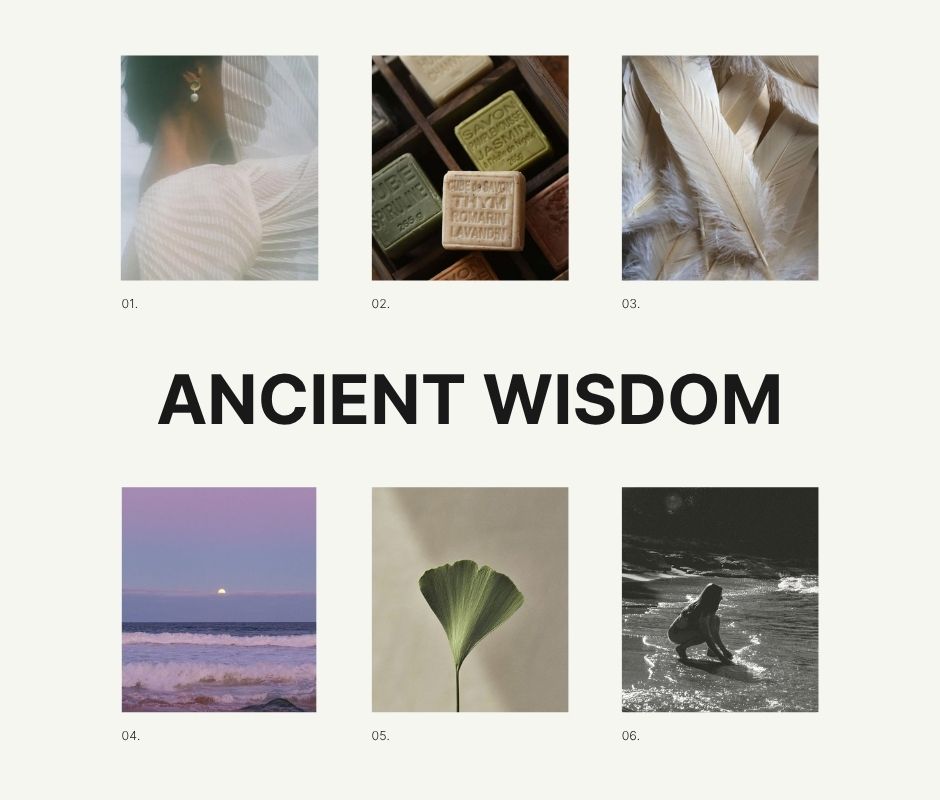
Ancient Wisdom
As a Sage archetype brand, Claudia wanted to embody her ability to solve problems for her clients that others cannot. She truly guides her clients through each of their personal journeys, from aging to life. You should see the pages and pages of raving testimonials we combed through for the website.
But I’m getting ahead of myself…
Her clients describe her as insightful, skillful, and extremely nurturing. The blend of her years dedicated to understanding her craft, becoming excellent in her field, and truly listening to her clients has created a well of wisdom that she extends through everything she does.
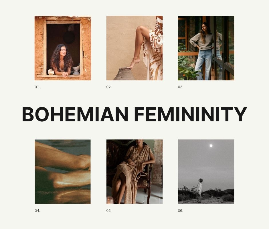
Bohemian Femininity
Personally, Claudia has a beautiful bohemian side to her style—messy hair, makeup-free skin, and the carefree confidence that comes from living a beautiful and healthy life from the inside out. She expresses her natural beauty born from honoring her body, and she teaches and encourages other women to do the same.
We wanted that same wild, natural, and feminine nature to thread its way through the rebrand as well.
Here is the final brand moodboard we ended up with—
Our Creative Approach
Claudia’s previous logo mark was highly symbolic, feminine, and fluid, and still fit perfectly with the vision for where we wanted to take the brand and business. We also wanted to keep all of the beautiful watercolor textures and the mauve undertones of the color palette. We loved the shapes, texture, and concept of the original brand, but we wanted to enhance it.
This is one of the most common misconceptions when it comes to a rebrand, especially a large-scale rebrand where you’re investing a significant amount of resources to shift the direction. You think you’ll get the biggest bang for your buck by burning everything to the ground and starting over.
But you forget that there’s a lot to be said for KEEPING what’s working and refining what’s not. Then, adding more to that to uplevel and enhance the message.
So let’s see how we built a brand around the parts we wanted to keep—
The Original Brand
We decided to keep the logo mark and the watercolor pattern designed by the previous designer. Both truly resonated with Claudia and felt true to her style; the mark worked so well that it could serve as a visual bridge from the old brand to the new.
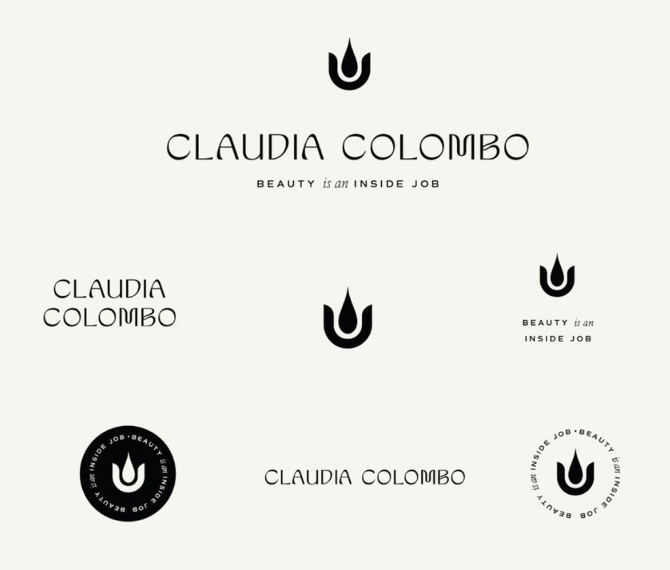
Logo Design Round 1
We didn’t follow our typical three-concept process during this brand immersion because we had an existing mark to work with. It wasn’t that the existing brand was bad by any means; we just felt it was missing something – a certain elegance. And while we already knew we would update the colors and fonts, we decided at the last minute to update and elevate the logo design as well.
Initially, we knew we had the tagline style down. But while we liked the flow of the typeface, it wasn’t quite the vibe we were going for. At first, we decided to make some slight adjustments to the typeface…
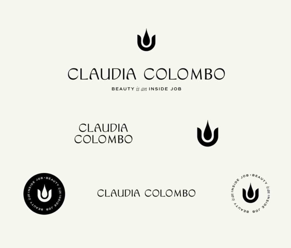
Logo Design Round 2
This next iteration simplified the M and B for a more streamlined, straightforward look, while retaining the fluidity we originally liked. We felt like simplifying the M & B added an elegance and sophistication that the brand needed.
But on further consideration, it wasn’t the structure of the letters that felt off. It was the style of the typography. We wanted something even more elegant, even more personal, with a touch of the ethereal. A bit more feminine. We wanted to communicate the personality and nuance of the brand. So, we opened up our search and decided to take a different direction…
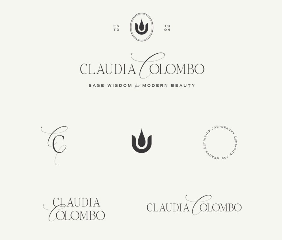
Logo Design Round 3
And with this shift in direction, we hit the nail on the head. We got it. The serif typeface was elegant and classic, and the one scripted letter gave an ethereal and feminine touch that also balanced the entire logo. We knew instantly that we had found the one and could now move on to the next stage of the project.
Brand Style
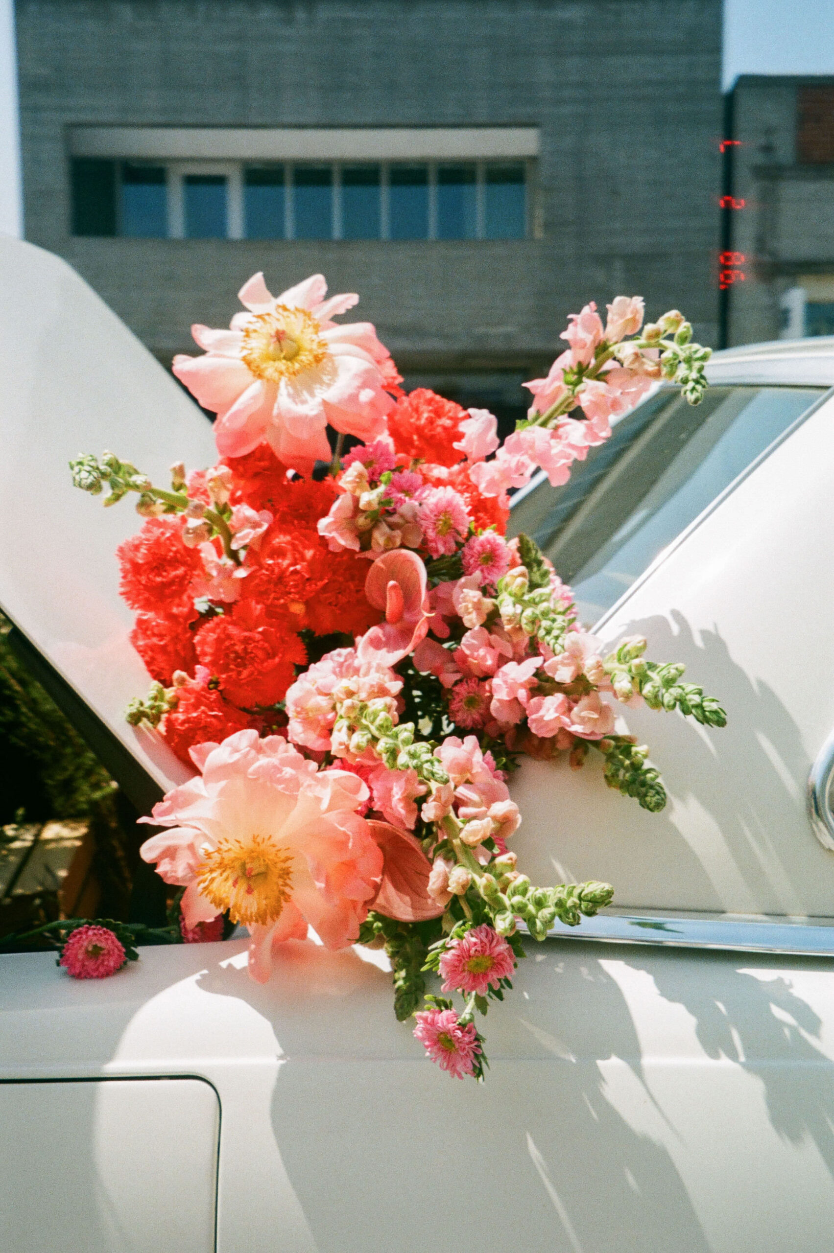
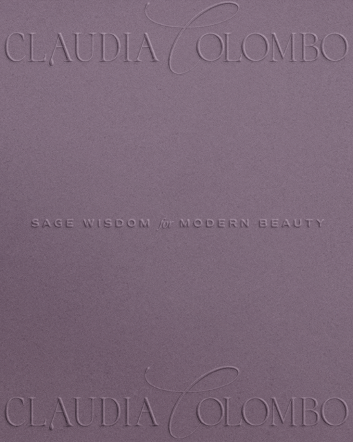
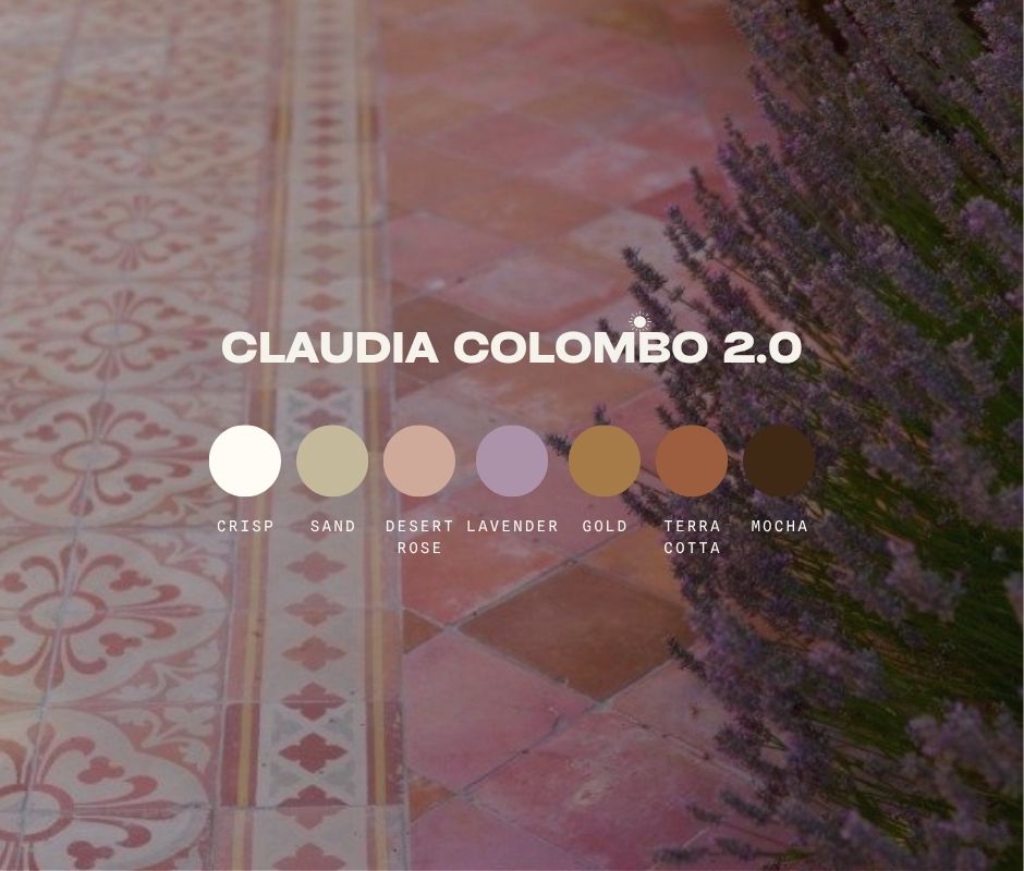
We updated the brand palette with rich chocolates and muted mauves, as well as terra cotta and desert rose pink. The resulting palette was rich, earthy, and ethereal. I don’t often design in shades of purple, and it was absolutely magic to see this palette come to life.
Bringing the Brand to Life
This is when things got really fun! We began thoroughly testing the new brand and applying its elements to various aspects of the brand and business, including email, lead magnets, and packaging.
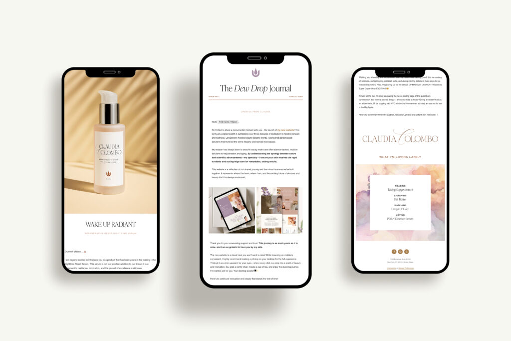
Flodesk Emails
We set up Claudia on Flodesk’s email marketing platform to start sending out her newsletter (The Dew Drop, also a new element of Claudia Colombo 2.0) and a welcome sequence that introduced new clients and customers to the brand while offering them a sweet discount on skincare products for their first visit.
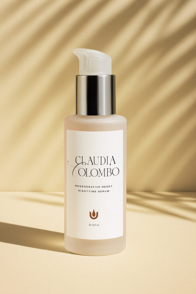
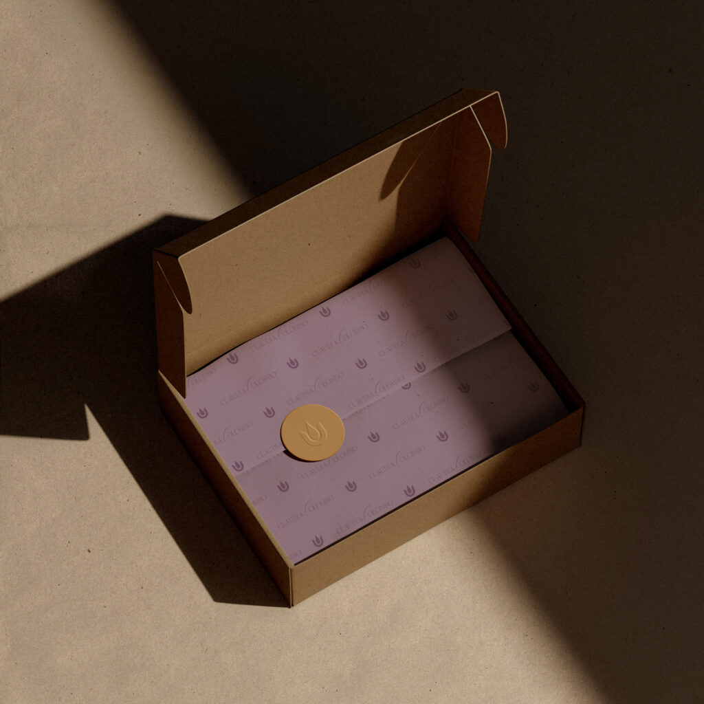
Packaging
We created packaging for Claudia’s night serum and gift card, adding additional brand touches throughout the business and the upcoming website. We even designed infographics for the shop to help customers determine which products to include in their regimen, ultimately aiming to create a white-glove, magical experience for Claudia’s clients.
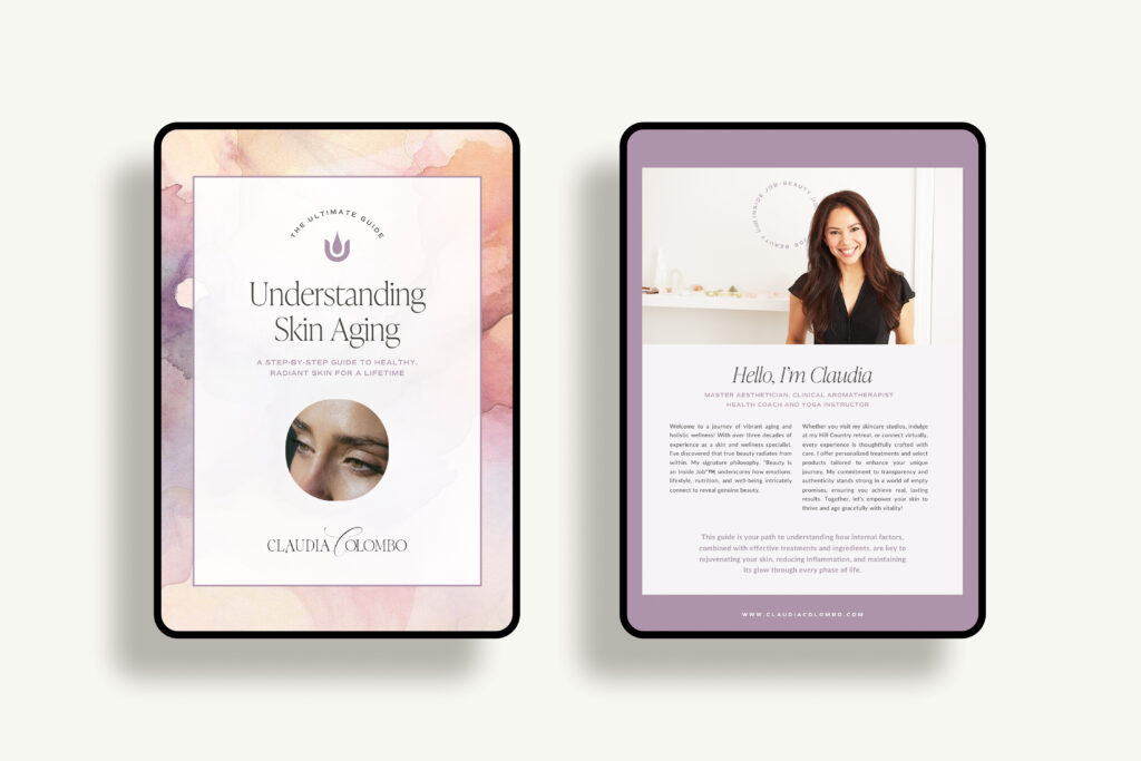
Skincare Guide
While we have several additional resources and guides up our sleeves, the first to be released is Claudia’s Ultimate Skincare Guide, a free, comprehensive e-book for understanding aging skin and the resources available to you to mitigate its effects and age with intention.
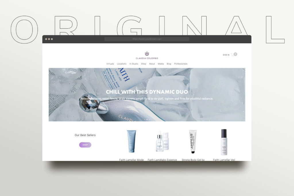
The Website
Claudia originally found our studio through TONIC when she fell in love with the Valencia template and needed help setting it up. As you can see, we went beyond any of the template “constraints” to create a website that was tailored to her brand and best suited her content.
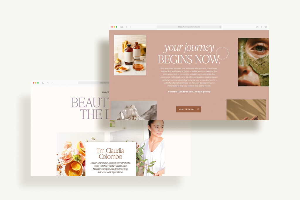
TONIC Transformation
I’m not going to lie, I’m in love with this site. It’s beautiful, organized, interesting, and best of all, it completely feels like home to Claudia.
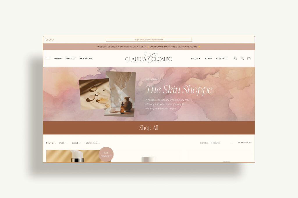
Shopify
Similar to the site we created for Beauty Arts Aesthetic, there was a sister Shopify site that we partnered with Julia from Bungalow Creative to bring to life. We LOVE Julia and she has helped us many times create seamless e-commerce experiences that complement what we create on the Showit side.
The Brand Launch
But a rebrand isn’t over until it’s been shared with the world, and this one was beyond exciting for us to share! After 6 months of planning, designing, refining, and organizing, the launch needed just as much love and attention to celebrate its reveal and all the hard work Claudia and the team did to bring this to life!
Why I Love This Brand
Beyond having a great client to work with and a visually fresh brand look (I can finally say I’ve done a purple brand!!) This was a rewarding project because Claudia is a true expert in her field. I mean, truly. She has archives of testimonials from clients who’ve experienced it.
And every time I presented an idea to Claudia, her ability to execute it was incredible. She’s built something so impressive over the past 20 years and even as we imagined its next iteration, it was so clear how well she’s mastered her craft and served her customers.
This level of devotion makes our job infinitely easier. I hope you’ve enjoyed a behind-the-scenes look at how it all came together!
Is your brand ready for its next chapter?
We’d love to help you explore what’s possible. Reach out to start the conversation – we’re here to help you move forward with clarity.