


Creating your brand’s color palette can be an incredibly inspiring process – even if you don’t consider yourself an artist. Color has a profound psychological impact, shaping perception, emotion, and even consumer behavior. But before you assume color theory is just a dry, technical concept, know this: the right color palette can completely transform how people experience your brand.
When I work with new brands, I love finding the deeper meaning behind their style. We all have personal preferences, and it’s fascinating to see someone’s vision come to life through color choices. This series is meant to explore the relationship between color and branding, helping you better understand how to create a palette that truly resonates with your audience.
Why Color Matters
Studies show that color plays a critical role in branding and consumer decisions:
90% of snap judgments about products are made on color alone.
Color can increase your brand’s recognition by up to 80%
Ads in color do 42% better than ads in black and white
Color is important, but it’s also highly subjective. If you asked 50 people to imagine the color “blue,” each person would picture a slightly different shade. Personal experience, culture, and context all shape our perceptions of color, making it essential to consider your audience when designing a brand palette.
The Psychology of Color in Branding
Each color carries a unique emotional and psychological association. When choosing your brand colors, think about your brand’s personality and the emotions you want to evoke. Are you looking to establish trust and reliability? Blue might be a strong choice. Want to spark creativity and energy? Consider orange. Looking for an air of sophistication and exclusivity? Black could be your go-to.
To help you navigate these choices, we’ve created a deep dive into individual colors, exploring their history, significance, and practical application in branding. In this series, you’ll learn:
The artistic and historical significance of each color
How colors are perceived by consumers in different industries
The psychology behind color choices in branding and marketing
Seasonal color palettes and how to integrate them effectively
Notable brands that use each color and why they work
Research and Inspiration
This series is inspired by a book called The Secret Lives of Color, which was recommended to me by a good friend. This book includes some of the most well-known color tones and gives the story behind their creation and rise in popularity.
Remember that scene from The Devil Wears Prada when Meryl Streep explains the evolution of Cerulean blue? This book is basically an extended version of that scene.
Each post in this series will include…
An introduction to the color family (white, blue, green, etc.)
The attributes associated with that color in marketing and advertising
A few stories about notable tones in the color family (from The Secret Lives of Color)
Seasonal palette examples for using this color in different contexts
Examples of brands who are known for using this color in their brand palette
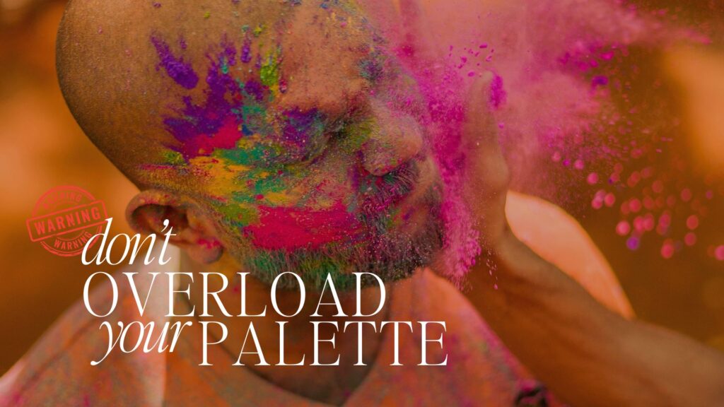
keep it simple
While color can be an incredible branding tool (and a lot of fun to use), selecting too many colors can lead to visual confusion and an overwhelming brand identity. Selecting a few intentional colors ensures clarity, cohesion, and a strong emotional impact, helping your brand communicate its message effectively without overstimulating your audience.
Choosing Colors That Align with Your Brand
Before finalizing your brand’s palette, consider these key questions:
- If your brand were a person, what kind of personality would it have?
- What emotions do you want your brand to evoke?
- How does your brand fit within its industry—does it follow trends or break the mold?
- What colors naturally resonate with your ideal audience?
By aligning your brand’s colors with its personality and purpose, you create a visual identity that feels authentic and intentional.
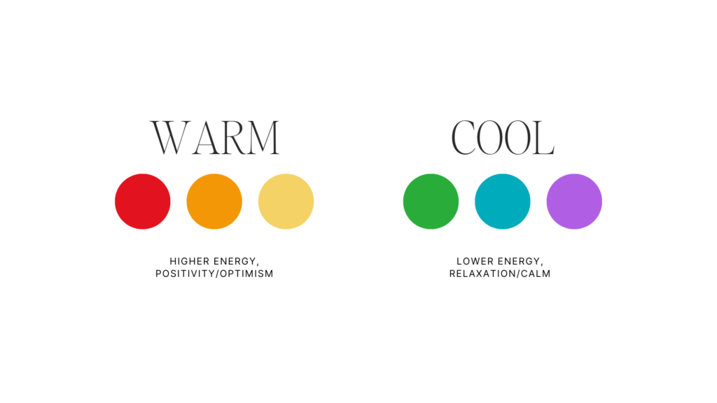
Color Temperature
Color temperature plays a crucial role in branding, influencing the emotions and perceptions associated with a palette.
Warm colors—such as reds, oranges, and yellows—evoke energy, passion, and warmth, making them ideal for brands that want to create excitement and draw attention.
Cool colors—such as blues, greens, and purples—tend to feel calming, professional, and trustworthy, making them a great choice for brands that want to establish reliability and stability.
Understanding the balance between warm and cool tones can help you craft a brand identity that feels intentional and emotionally compelling.
Seasonal Hues
A great way to begin creating a palette for your brand is to identify your brand’s seasonal personality. Before selecting individual colors, it’s best to think of your brand palette as a whole, and consider the overall message you’re trying to communicate.
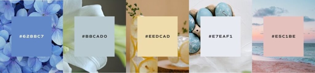
spring palette
A spring palette is full of optimistic energy and new life. The colors in a spring palette have not quite reached their peak intensity, but are crisp, clean, and approachable. This brand is lighthearted and playful, a business that enjoys personal interactions and organized simplicity.
When creating a spring palette for your brand, look for colors that are light, bright, and delicate. This palette is built on potential and growth. Keep colors crisp and clear, and use a stark white and soft charcoal as accent neutrals.
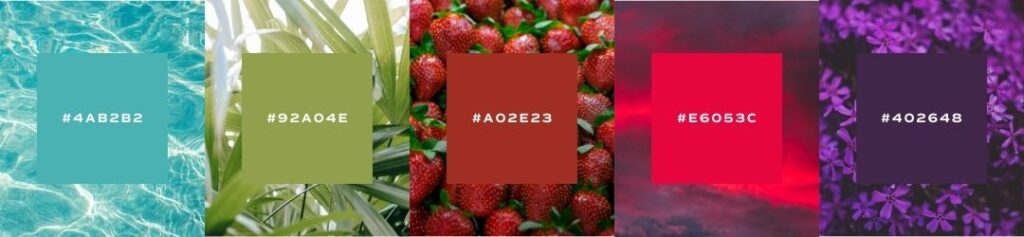
summer palette
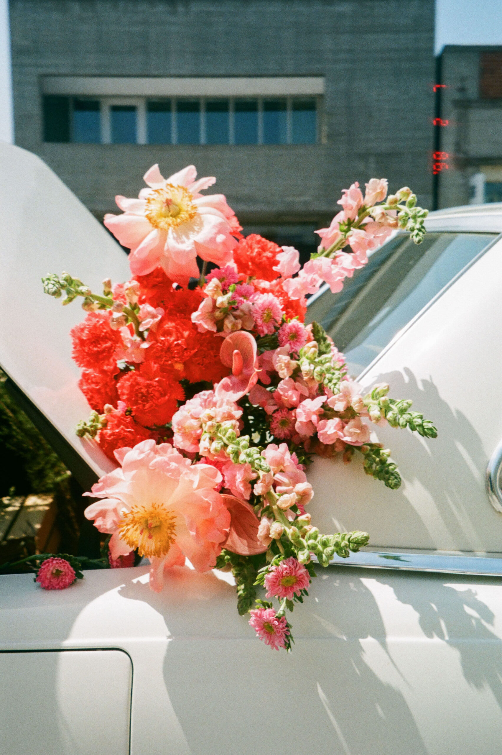
A summer palette is bold, elegant, and strong. This season is when colors reach their peak vibrance and bask in the intensity of the sun. This brand is compassionate, ambitious, and confident, feeling a strong sense of self and inner purpose.
When creating a summer palette for your brand, look for colors that are rich, warm, and vibrant. This palette is humming with energy and enthusiasm. Make sure that your palette is evenly balanced with some contrasting tones, and use a warm black and off-white as accent neutrals.
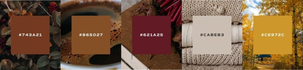
autumn palette
An autumn palette is organic, nurturing, and warm. This season is when colors lean into their muted, earthy counterparts and feel grounded, rooted in warmer undertones. This brand is graceful, passionate, and kind, creating an inclusive community of encouragement and support.
When creating an autumn palette for your brand, look for colors that are muted, natural, and intense. This palette is very grounded in earth tones and colors found in the natural world. Make sure that your palette still uses rich color tones, but paired with softer neutrals, and considering using a dark brown and warm white as accent neutrals.

winter palette
A winter palette is dramatic, minimalist, and edgy. This season is when bright color hues fade away and we become more aware of the high-contrast between color extremes. This brand is distinct, focused, and strong, sure of who they are and their place in the world.
When creating a winter palette for your brand, look for colors that are on both extremes of the brightness scale – pairing deep, intense jewel-tones with crisp and cool lighter neutrals. This palette is meant to feel stark and minimal, so focus on creating a range within two to three color tones.
Exploring the Color Series
Each post in this series takes an in-depth look at a specific color, offering insight into its meaning, usage, and impact on branding. Dive into the psychology of each hue and discover how to strategically incorporate it into your brand:
- Black: The Color of Power & Elegance
- Brown: The Color of Warmth & Stability
- Green: The Color of Growth & Renewal
- Blue: The Color of Trust & Intelligence
- Purple: The Color of Creativity & Luxury
- Red: The Color of Passion & Energy
- Pink: The Color of Playfulness & Charm
- Orange: The Color of Confidence & Enthusiasm
- Yellow: The Color of Optimism & Attention
- White: The Color of Simplicity & Clarity
Each of these colors has a story to tell. Whether you’re looking to refine your brand’s palette or just love learning about design psychology, this series will help you see color in a whole new way.
Save for Later


I’m almost positive the recent (incredible!) brand re-vamp you did for me was within the "winter" palette, and I LOVE it and cannot wait to learn more about the psychology behind it!
Yes ma’am!! I think the seasons add a layer of depth to brand palettes and make them even more fun to work with!